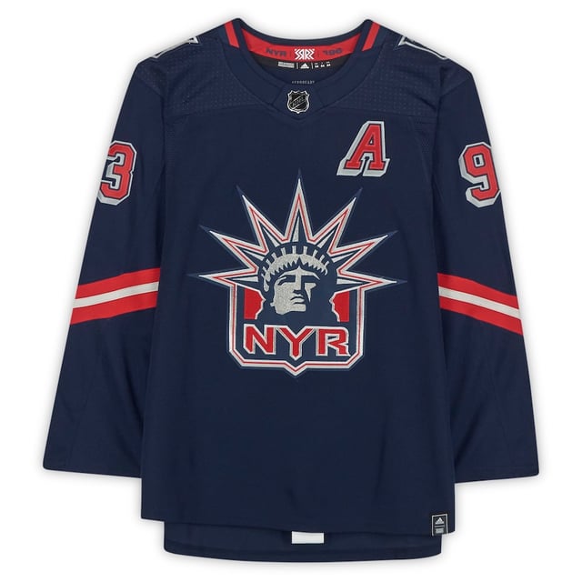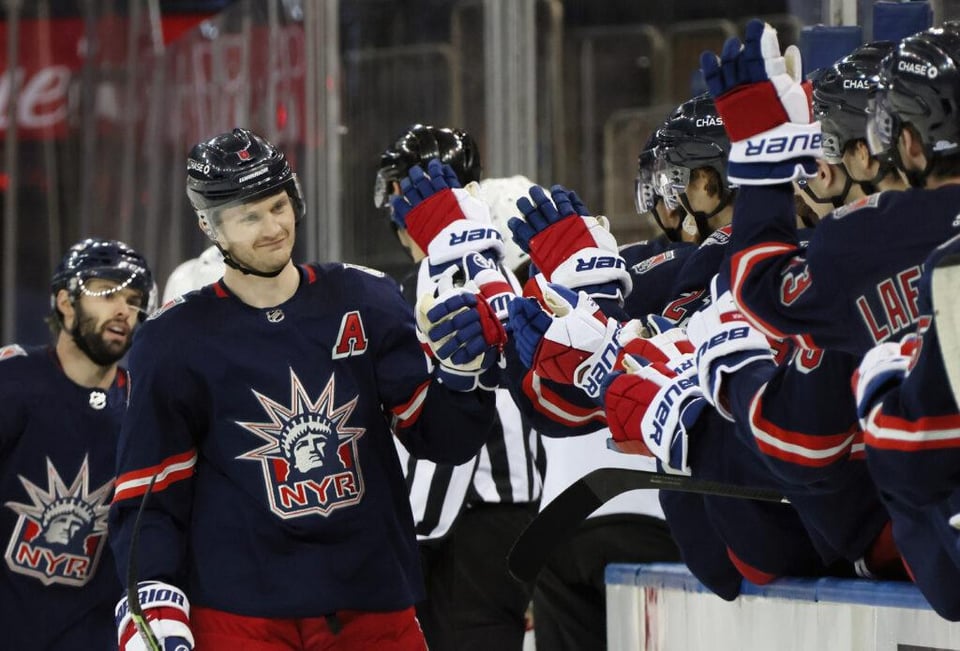


Out of the blue post I know, but is it weird that I perfer the 1.0 to the 2.0? Has in despite the 2.0 being much more true to the concept of the program and having a more expressive colour palette, I just perfer how the 1.0 had a almost premium look to it with it’s more subdued navy base contrasting against the red and sliver. The lack of any any contrasting stripe on the arm selves really gives it a cleaner look alongside with the collar being half filled. But man the logos and especially that number kit looks so HD when it’s on that navy and the lack of any white elements makes them look more concrete in comparison to how the 2.0 is kind of an assault on the eyes (but in a very good way mind you.)
I know it’s seen as a half hearted atempt compared to the 2.0 doing what was expected of this one but fuck me in the ass is this a sweater that I wish the rangers continued to wear this in their jersey rotation as it’s such a sexy jersey.
by SHAWKLAN27


12 Comments
I also prefer 1.0, but I will not be fucking you in the ass… Good day, sir. I said good day!
I love both, really hard to pick a favorite. Can’t go wrong either way.
But neither can ever top the regular home jersey
they half assed it and it came out looking like a practice jersey
The 1.0 looked classier but it was near-impossible to read the numbers on TV
I love all the liberties honestly. I found this version underwhelming at first when it was revealed, but they look really great with the pants and gloves
Hate these jerseys
Love the navy blue but they should’ve just gone full throwback with the original ones from the late 90s
Absolutely love em
The 2.0’s looked like trash, these were at least close to what people wanted. Ultimately tho the liberty’s will always be associated with losing so Im just not too big on them even if they do have a largely nostalgic place in ranger fans hearts
I love and own them both
Not bad !
Wish I bought one or still could