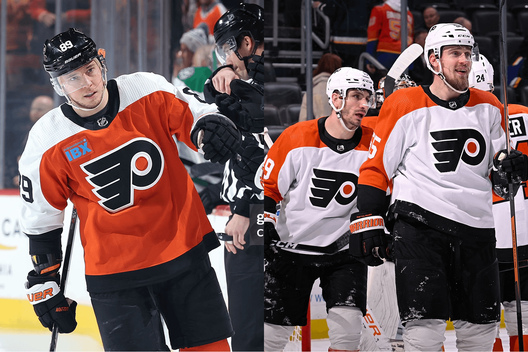
I’ve grown to really like them actually. Now, a lot of that probably has to do with how well the team is performing, but I’ve found myself genuinely liking the more and more as the season has progressed.
I know a lot of us thought immediately that this was a missed opportunity, since they are missing the black striping – but I actually think this is a good thing. They aren’t supposed to be the 80’s/90’s jerseys, they are supposed to signify the new era of orange that the new regime is here to build. They pay homage to the past in a nice way, without stumbling head over heels into another old boys club situation. The best part, it’s all in the correct shade of orange.
And yes, the IBX ad gives me IBS.
HaMerrIk
They’re fine, but I wish the black numbers on the sides were orange and outlined in black.
KhelSkie
They are a pleasent Suprise. I expected they would be garbage for a couple more years.
tommysjawn
Love em. Classic. Big ups to the team for not over doing it. That’s harder than it seems when designing anything.
Perryplat199
They are definitely “flyers” jerseys. I’m just not a fan of the single layer numbers. The jerseys are just fine but the numbers and the captain letters are boring.
diecastsupermodel
Sick. Would be more sicker with black piping a la the 90s unis
pomsky128
They are pretty standard looking flyers
DelcoInDaHouse
Idk, but they appear to be winning jerseys.
Successful-Fig-432
I dig them. I’m thankful there isn’t some obnoxious company name. I know the IBX logo is there but it’s not too intrusive.
findtheramones
love ‘em. personally i think this color looks so much better than what we’ve had
penguininanelevator
The color is so much better than the electric orange the team has been using. I’ve actually become ok with the lack of pipping on the sleeves, it would improve the jersey but it’s not a necessity, and I kind of like that their not an exact replica of the 90s jerseys.
However, the sleeve numbers and Scotty’s A need to be outlined next year. They make the entire jersey look cheap and it takes away from the otherwise much improved look. Especially assuming that next year there will be more than just one player with a letter out there.
dirkomatic
Don’t like the single layer numbers and the font for the “A” is horrible.
The jersey itself is fine. I would prefer the piping, but they are ok without it.
datyoungknockoutkid
Never really understood the hate, and damn there was a lot of it when these were released. I like em, never really had an issue with a lack of an outline.
Ok_Orchid7131
I like them. It’s an updated look. We don’t need the piping or outlines in my opinion. It’s a small move and a good look. The single color number are cool.
IanDre127
I know we have the alt blacks but I do miss the black jerseys that went with this style.
Perryplat199
My answer might change to more positive once i get my Laughton gamer in a few weeks.
bushdid311wow
From a distance, I love them, and the new (old?) shade of orange looks sooo much better, especially seeing it next to the previous unis. Not sure how we all put up with the traffic cone shit for so long.
But…can we please fix the weird black sleeve numbers on the home unis? Why aren’t they orange? And do we really need to keep doing the off-color nameplate thing? What does that add in 2024? It was a “nod to the past” 15 years ago but they barely even used it in the past.
Also nuke the black jerseys. Those were fun for like a year but they just look like shit now with the weird elongated numbers. Do an ACTUAL black jersey based on the current design.
nitropuppy
I think they look kind of flat? If thats the word. I dont want to say plain because i can see them easily getting too busy….
I still hate the ibx. I wish it was white.
meckelangelo
I personally don’t really love them. They’re missing the finer details that would typically have separated a plain, practice jersey from a gameday jersey. The flat numbers look like the cheaper iron-on numbers that most of us played with as kids, rather than genuine embroidered numbers. I don’t know if they need the piping between colors to add that extra little detail, I think that would then just be a direct copy of the 80s/90s jerseys. I’ve also never liked the contrasting nameplate rectangle, that feels like letters on tape slapped on the back.
dab70
They’re fine. I’ll get around to picking one up eventually. I am looking forward to the Stadium Series jersey release
WastelandCecil
Only way they could be better, to me, is the black outline of the Lindros era, but they’re the next best thing. Love’em.
puckhed8
I really love wearing them! I have over 40 different Flyer jerseys going back to the old style from the 70’s/80’s and when I wear the older style I hate them now, fit really wide in the body & arms, whereas the newer style, (starting with reebok edge), have a nice contour fit in the body & arms. The color & design is so similar to the 80’s orange jersey but so much nicer, a nice switch from the last 70’s style orange, (although I really liked them also).
DanTreview
Only downside is the fugly IBX logo. Most teams at least *try* to tie in their logos with the team livery, and I get why IBX should be blue, but blue and orange to me kinda clash
Glass_Channel8431
Nice for a practice jersey. Looks like a Chinese knock off
JiveChicken00
The quality of play has me so distracted that I’ve barely even noticed.
aajax0
Would be great without the blue ad
Due-Wind-3324
I’d say they’re near perfect.
ZachB10
If they’re not going to add black piping, the sleeve number and captain patches need to change. Other than that they’re very close to being perfect.
accountname789
Still hate the bright blue IBX logo. Especially against the orange. Maybe next year the organization will drop them as a sponsor.
rrfloeter
Love them so very much. Only request is being back the old blacks as well
Gaping_Grandfather
Power Ranking:
1. Black Alternate
2. 2019 Stadium Series
3. 2022 Reverse Retro
4. All other jerseys
Vancouver-Ram
Love everything but the blue IBX logo… would be much more tolerable if it were white.
I don’t miss the piping from the 80s/90s jerseys, these have a cleaner look while paying homage to all the past jerseys.
I also would have been happy if they’d kept the previous jersey and just updated the color from pumpkin to burnt orange.
TiredReader87
I miss the old orange. This orange is ugly and always has been.
realdeal411
I like them just need something around the numbers and letters
nearlyzen
I like them, though it feels like they couldn’t make up their mind on certain things, leaving them inconsistent.
1. The orange is fantastic. I immediately saw Eric Lindros flying through the neutral zone, his jersey lifting off his back at speed. And this orange seems even more vibrant and alive than that one. I look forward to seeing it in person.
2. I like the minimalism of no piping and no elbow stripe.
3. But, if they had committed to minimalism, they would’ve switched to ALL single color/layer numbers. Instead, they did single layer on the sleeve and the C & A, but double layer on the back numbers. Weird, make up your mind. Personally, I’ve always loved the classic single color/layer of Detroit and Toronto. But doubles are the norm and would be just great too. Montreal even pulls off the triple color/layer on their whites, which are great. Canucks jerseys of the Bure era did the same.
4. The “A” is positioned wrong, even if you can deal with the single layer. It’s too close to the shoulder color change. Poor design, it looks like a mistake.
5. The contrasting name plates aren’t terrible, but it seemed like this was a good time to drop them. They served their purpose and don’t feel quite right anymore. If the jersey has a single layer vibe, these plates are just wrong. Red Wings are the proper model.
Looking at them again, single layer probably isn’t right for the Flyers because the logo requires 3 colors, not 2 like Detroit and Toronto. Should have gone with the standard 2 layer numbers and dumped the plates.
But the orange is so good 😊
NotABurner6942069
Whose jersey should I buy next and why is it Owen Tippett’s?


36 Comments
I’ve grown to really like them actually. Now, a lot of that probably has to do with how well the team is performing, but I’ve found myself genuinely liking the more and more as the season has progressed.
I know a lot of us thought immediately that this was a missed opportunity, since they are missing the black striping – but I actually think this is a good thing. They aren’t supposed to be the 80’s/90’s jerseys, they are supposed to signify the new era of orange that the new regime is here to build. They pay homage to the past in a nice way, without stumbling head over heels into another old boys club situation. The best part, it’s all in the correct shade of orange.
And yes, the IBX ad gives me IBS.
They’re fine, but I wish the black numbers on the sides were orange and outlined in black.
They are a pleasent Suprise. I expected they would be garbage for a couple more years.
Love em. Classic. Big ups to the team for not over doing it. That’s harder than it seems when designing anything.
They are definitely “flyers” jerseys. I’m just not a fan of the single layer numbers. The jerseys are just fine but the numbers and the captain letters are boring.
Sick. Would be more sicker with black piping a la the 90s unis
They are pretty standard looking flyers
Idk, but they appear to be winning jerseys.
I dig them. I’m thankful there isn’t some obnoxious company name. I know the IBX logo is there but it’s not too intrusive.
love ‘em. personally i think this color looks so much better than what we’ve had
The color is so much better than the electric orange the team has been using. I’ve actually become ok with the lack of pipping on the sleeves, it would improve the jersey but it’s not a necessity, and I kind of like that their not an exact replica of the 90s jerseys.
However, the sleeve numbers and Scotty’s A need to be outlined next year. They make the entire jersey look cheap and it takes away from the otherwise much improved look. Especially assuming that next year there will be more than just one player with a letter out there.
Don’t like the single layer numbers and the font for the “A” is horrible.
The jersey itself is fine. I would prefer the piping, but they are ok without it.
Never really understood the hate, and damn there was a lot of it when these were released. I like em, never really had an issue with a lack of an outline.
I like them. It’s an updated look. We don’t need the piping or outlines in my opinion. It’s a small move and a good look. The single color number are cool.
I know we have the alt blacks but I do miss the black jerseys that went with this style.
My answer might change to more positive once i get my Laughton gamer in a few weeks.
From a distance, I love them, and the new (old?) shade of orange looks sooo much better, especially seeing it next to the previous unis. Not sure how we all put up with the traffic cone shit for so long.
But…can we please fix the weird black sleeve numbers on the home unis? Why aren’t they orange? And do we really need to keep doing the off-color nameplate thing? What does that add in 2024? It was a “nod to the past” 15 years ago but they barely even used it in the past.
Also nuke the black jerseys. Those were fun for like a year but they just look like shit now with the weird elongated numbers. Do an ACTUAL black jersey based on the current design.
I think they look kind of flat? If thats the word. I dont want to say plain because i can see them easily getting too busy….
I still hate the ibx. I wish it was white.
I personally don’t really love them. They’re missing the finer details that would typically have separated a plain, practice jersey from a gameday jersey. The flat numbers look like the cheaper iron-on numbers that most of us played with as kids, rather than genuine embroidered numbers. I don’t know if they need the piping between colors to add that extra little detail, I think that would then just be a direct copy of the 80s/90s jerseys. I’ve also never liked the contrasting nameplate rectangle, that feels like letters on tape slapped on the back.
They’re fine. I’ll get around to picking one up eventually. I am looking forward to the Stadium Series jersey release
Only way they could be better, to me, is the black outline of the Lindros era, but they’re the next best thing. Love’em.
I really love wearing them!
I have over 40 different Flyer jerseys going back to the old style from the 70’s/80’s and when I wear the older style I hate them now, fit really wide in the body & arms, whereas the newer style, (starting with reebok edge), have a nice contour fit in the body & arms.
The color & design is so similar to the 80’s orange jersey but so much nicer, a nice switch from the last 70’s style orange, (although I really liked them also).
Only downside is the fugly IBX logo. Most teams at least *try* to tie in their logos with the team livery, and I get why IBX should be blue, but blue and orange to me kinda clash
Nice for a practice jersey. Looks like a Chinese knock off
The quality of play has me so distracted that I’ve barely even noticed.
Would be great without the blue ad
I’d say they’re near perfect.
If they’re not going to add black piping, the sleeve number and captain patches need to change. Other than that they’re very close to being perfect.
Still hate the bright blue IBX logo. Especially against the orange. Maybe next year the organization will drop them as a sponsor.
Love them so very much. Only request is being back the old blacks as well
Power Ranking:
1. Black Alternate
2. 2019 Stadium Series
3. 2022 Reverse Retro
4. All other jerseys
Love everything but the blue IBX logo… would be much more tolerable if it were white.
I don’t miss the piping from the 80s/90s jerseys, these have a cleaner look while paying homage to all the past jerseys.
I also would have been happy if they’d kept the previous jersey and just updated the color from pumpkin to burnt orange.
I miss the old orange. This orange is ugly and always has been.
I like them just need something around the numbers and letters
I like them, though it feels like they couldn’t make up their mind on certain things, leaving them inconsistent.
1. The orange is fantastic. I immediately saw Eric Lindros flying through the neutral zone, his jersey lifting off his back at speed. And this orange seems even more vibrant and alive than that one. I look forward to seeing it in person.
2. I like the minimalism of no piping and no elbow stripe.
3. But, if they had committed to minimalism, they would’ve switched to ALL single color/layer numbers. Instead, they did single layer on the sleeve and the C & A, but double layer on the back numbers. Weird, make up your mind. Personally, I’ve always loved the classic single color/layer of Detroit and Toronto. But doubles are the norm and would be just great too. Montreal even pulls off the triple color/layer on their whites, which are great. Canucks jerseys of the Bure era did the same.
4. The “A” is positioned wrong, even if you can deal with the single layer. It’s too close to the shoulder color change. Poor design, it looks like a mistake.
5. The contrasting name plates aren’t terrible, but it seemed like this was a good time to drop them. They served their purpose and don’t feel quite right anymore. If the jersey has a single layer vibe, these plates are just wrong. Red Wings are the proper model.
Looking at them again, single layer probably isn’t right for the Flyers because the logo requires 3 colors, not 2 like Detroit and Toronto. Should have gone with the standard 2 layer numbers and dumped the plates.
But the orange is so good 😊
Whose jersey should I buy next and why is it Owen Tippett’s?