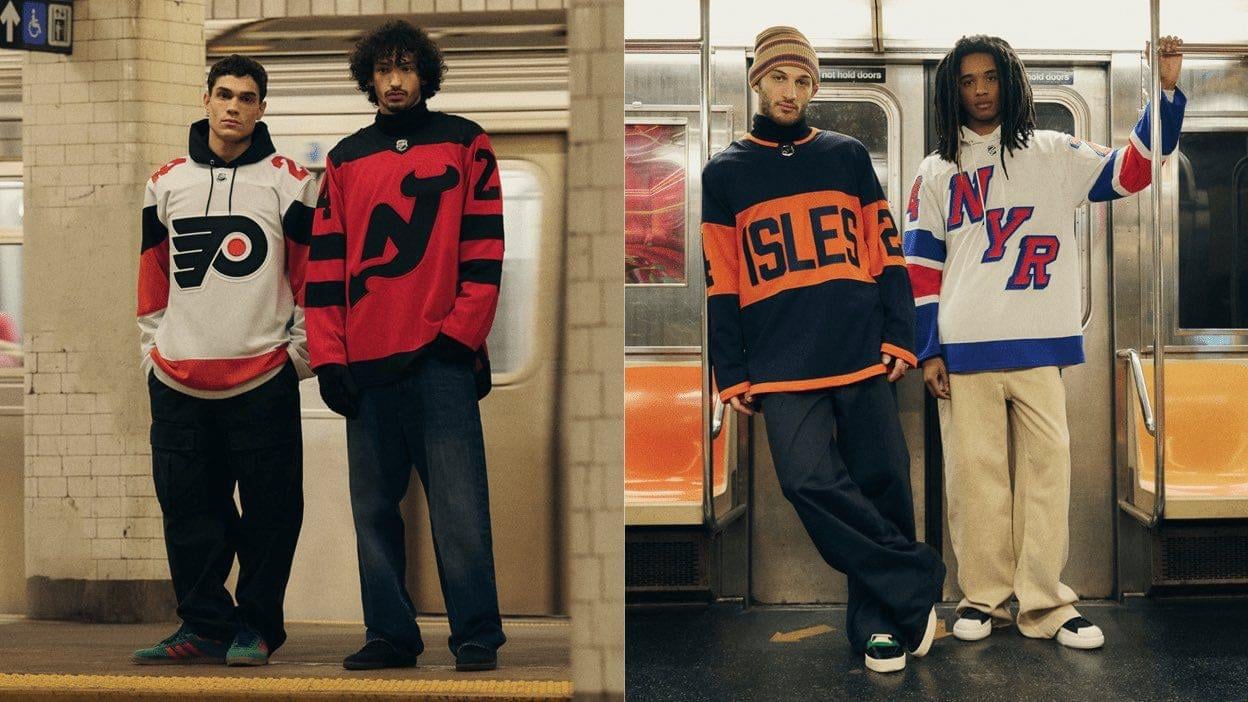
And that rags jersey is leagues above the other 3 (damn it)
LilHomie204DaBaG
It’s like the islanders looked at the flyers stadium series against Pittsburgh jersey and said, sure fuck it why not.
Devils looks like something I would’ve made in nhl 19
Flyers, I mean it’s either that or 3D flyer logo.
Rangers is beautiful, maybe could’ve added blue shoulders
Reallyme77
ISLES lol wtf
Ok-Assistant-2684
So did the Flyers just switch to orange numbers instead of black
JWilesParker
Flyers looking like the Flyers as usual, lol.
xBlackCellx
That Flyers one is so dull. As a Flyers fan, I’m tired of such boring ass jerseys. The only one I really like is our alternate jersey
GroundbreakingCow775
Unsubscribe
guywhois0nline
Rangers goes hard
Odd_Confusion2923
Like what the fuck. Who is designing and approving this shit?
redhotphishpigeons
Why are everyones pants so damn baggy
SillySymphonyIV
All 4 are garbage.
FerretSensei
Three of these could be Flyers jerseys and no one would bat an eyelid.
ThunderGoalie35
Wow. None of them are really great but that Isles jersey is actually horrific
defnotafatguy
Not gonna lie they are all garbage besides NJ, and theirs is ok.
​
Never mind, they are all garbage.
opinukinuk
The flyers just ignoring number trim this season makes the sweaters look so shit and minimal
BlackoutBerryReborn
I wonder if the Isles will rock orange pants with those sweaters
ps_nocturnel
Imo
Flyers>Devils>Rangers>Isles
Flyers has little difference from their regular away but it has enough flavor and life to it. The Devils logo is cool but I’m not a fan of the two toned color. Both NY jerseys are just trash.
These are all not that great but someone please explain to me, without bias, how so many people seem to think the Rangers jersey is any good. I don’t understand what I’m missing.
Putrid-Object-806
Ok now here’s a question, are these better or worse than the all star threads
saucytopcheddar
I love the Devils, Flyers is decent, and I am whelmed with the Rangers. I actually think the Isles will look good on the ice… a one-off event is when you should be bold.
dcd1130
Devils jersey is alright imo. I like it. Clean and simple.
Prandmus
Jersey is a nice pjs set, Philly is different from away? Isles is a throw blanket, and Rangers is odd doormat design.
Due_Muffin_5406
I hate all of them.
Flux_resistor
Devils win this one
mattcojo2
Rangers one looks awesome.
Devils looks good.
Flyers one is a flyers jersey, so meh
I don’t hate how the Islanders jersey looks but we’ve seen this sort of design several times before. Underwhelming.
AdhesivenessFun2060
Isles looks like the fake “hamburglar” jerseys from the flyers first winter classic.


31 Comments
Rangers I really like
Isles is boring but nice
Devils simple but nice
Flyers is just very plain gives me a vibe of their orange jersey from years ago with the silver
Designers: Hey what if we just dont give a fuck? Like, at all? Like put in less than the bare minimum?
That Flyers one is nasty. Extending the black nameplate just doesn’t work.
Edit: If you haven’t seen it, here’s the [actual jersey front](https://media.phillyvoice.com/media/images/1_peCcPOx.width-704.png) and [actual jersey back](https://media.phillyvoice.com/media/images/1_1.width-704.png).
Devils > flyers > Isles
And that rags jersey is leagues above the other 3 (damn it)
It’s like the islanders looked at the flyers stadium series against Pittsburgh jersey and said, sure fuck it why not.
Devils looks like something I would’ve made in nhl 19
Flyers, I mean it’s either that or 3D flyer logo.
Rangers is beautiful, maybe could’ve added blue shoulders
ISLES lol wtf
So did the Flyers just switch to orange numbers instead of black
Flyers looking like the Flyers as usual, lol.
That Flyers one is so dull. As a Flyers fan, I’m tired of such boring ass jerseys. The only one I really like is our alternate jersey
Unsubscribe
Rangers goes hard
Like what the fuck. Who is designing and approving this shit?
Why are everyones pants so damn baggy
All 4 are garbage.
Three of these could be Flyers jerseys and no one would bat an eyelid.
Wow. None of them are really great but that Isles jersey is actually horrific
Not gonna lie they are all garbage besides NJ, and theirs is ok.
​
Never mind, they are all garbage.
The flyers just ignoring number trim this season makes the sweaters look so shit and minimal
I wonder if the Isles will rock orange pants with those sweaters
Imo
Flyers>Devils>Rangers>Isles
Flyers has little difference from their regular away but it has enough flavor and life to it. The Devils logo is cool but I’m not a fan of the two toned color. Both NY jerseys are just trash.
These are all not that great but someone please explain to me, without bias, how so many people seem to think the Rangers jersey is any good. I don’t understand what I’m missing.
Ok now here’s a question, are these better or worse than the all star threads
I love the Devils, Flyers is decent, and I am whelmed with the Rangers. I actually think the Isles will look good on the ice… a one-off event is when you should be bold.
Devils jersey is alright imo. I like it. Clean and simple.
Jersey is a nice pjs set, Philly is different from away? Isles is a throw blanket, and Rangers is odd doormat design.
I hate all of them.
Devils win this one
Rangers one looks awesome.
Devils looks good.
Flyers one is a flyers jersey, so meh
I don’t hate how the Islanders jersey looks but we’ve seen this sort of design several times before. Underwhelming.
Isles looks like the fake “hamburglar” jerseys from the flyers first winter classic.
🚮
Baggy pants came back in style already? Huh…
Jnco making a comeback.