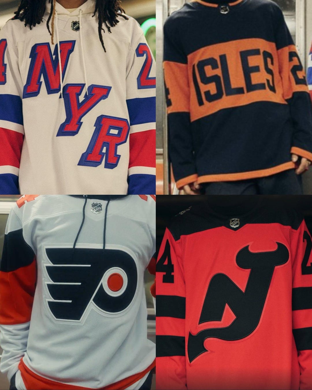
Hate to shit on someone’s 3 minutes of hard work but those Islanders jerseys suck, thought they were the Flyer’s at first. Not like the other’s are winning any awards tho.
E4T_ASS
I hate the Flyers one less by just looking at the others.
Finrad-Felagund
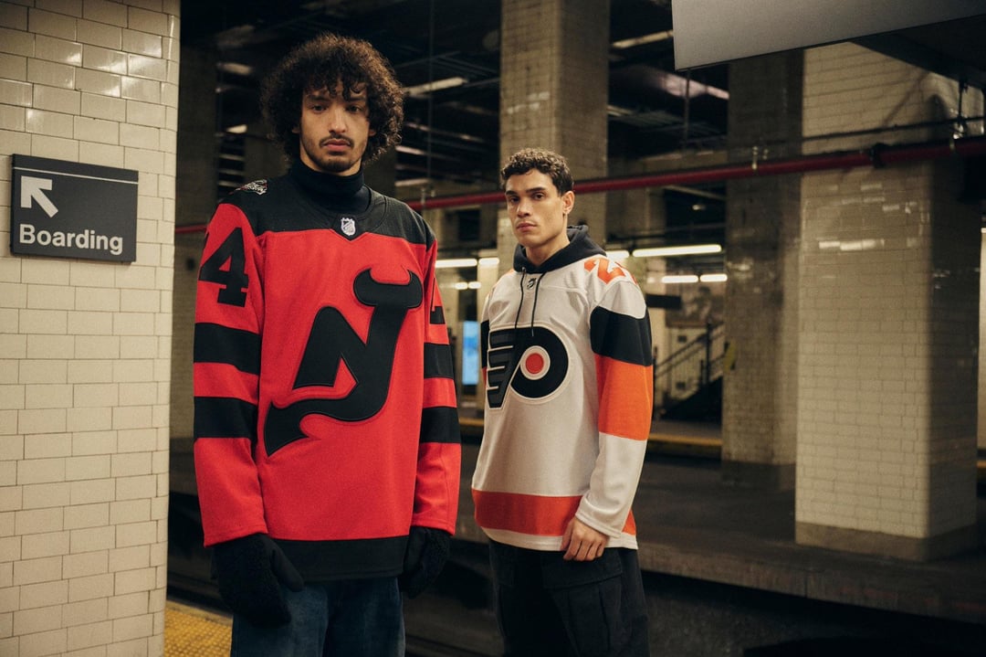
Like the flyers and Devils jerseys, they play with color inversion pretty well.
The New York teams look like jerseys from like a football manager esque 3D engine where they don’t have the rights to make realistic jerseys and just made 2 incredibly generic jerseys
miner88
I figured people would appreciate the photos themselves rather than a link to a twitter video
astovertop
These make me feel even better about the Sharks new Alternates
LordJasus
Definitely whelmed
TimeShade
Flyers one isn’t too bad but then the back design. Pretty much have to get a name on it otherwise.
friskyjude
These are all pretty sick. You guys just have bad taste.
Gonna be grateful for what we had when fanatics takes over I swear
bachlatte
I had zero expectations and yet I’m still disappointed looking at these.
yianni1229
Devils and Rangers are good. Flyers are solid.
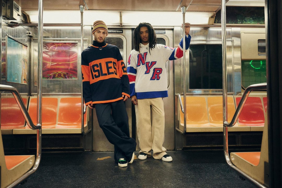
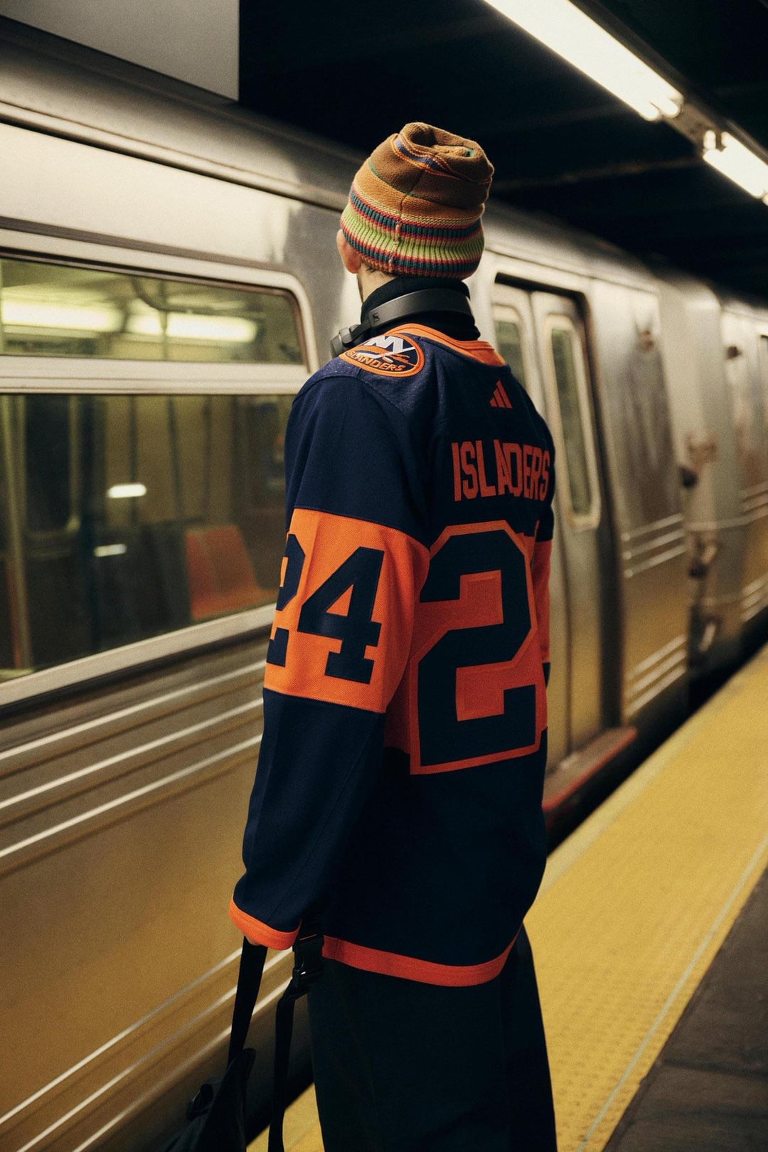
Islanders are horrendous
NeenerNeaner
All of them are very boring. NJ’s is ok because it’s hard to go wrong with red and black. Isles and NYR are awful.
ScrewOff_
Designer saved me like $180 thanks bro
HanSolo5643
I like the New Jersey and Philadelphia Jerseys.
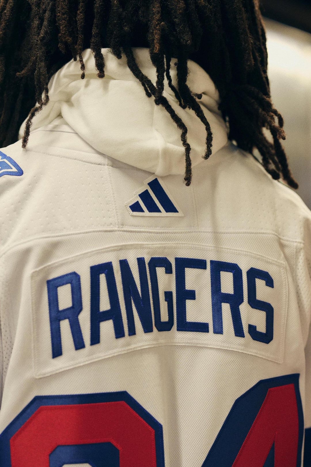
The Rangers one is okay but nothing special.
The Islanders Jersey is awful.
Bojarzin
The Rangers one is okay, though generally I don’t like the diagonal word logos
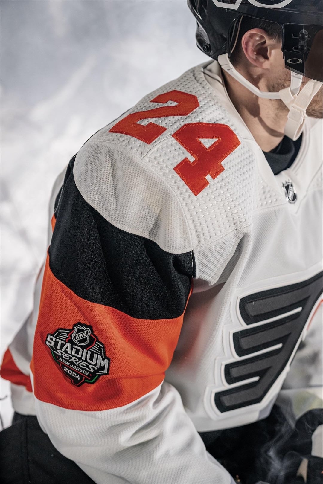
Flyers is okay because the striping is like, kind of unique?
Isles and Devils are really bad to me
MUSTY_BUSSY
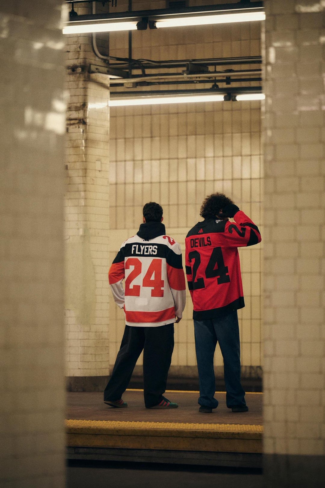
Can we talk about how they used Chambers Street, widely known as the most disgusting station in the system, to promote these jerseys
SemiSolidSnake11
I like all of them individually, but I feel like the matchup colors aren’t very cohesive. Like both the Isles and Devil’s have that dichromatic look, but rather for doing something similar with the Flyers and Rangers, they took a different direction.
lilbismyfriend21
Some of you guys would hate any jersey that came out
theguyishere16
Flyers are easily the nicest imo. The Rangers and Devils are decent. The Isles one sucks.
beastboy4246
Flyers best imo. Devils is fine. Rags and Isles… Could’ve been worse I guess?
Duck_Caught_Upstream
New Jersey A-
Flyers B+
Rangers B
Islanders D-
bud369
Fucking loooooove the Devils one
ColdYellowGatorade
The jersey unveiling pics would be way better if they were waiting for the train at Secaucucs junction.
MeatSack_NothingMore
Everyone here hating the Isles jersey and it’s the only one I like. 10 years from now it’s gonna be re-appraised as cool.
ZookeepergameHot5642
I wish they would show the full uniform when they did this. Seeing the full kit really helps. Was that released? Seeing the players wearing them on the ice always makes them look cooler. I think that will make the devils jerseys look better..I hope they go black shells and all red socks..maybe one or two black stripes on the socks, but not their current socks. The white would look weird. Black helmets are probably a given. Rangers are cool. For me the flyers are not different enough. And the islanders. Oof idk if there’s any helping that.
AfroInfo
The devil’s one goes hard
DLun203
Whoever designed the Isles jersey is obviously a Ranger fan
RocknRollCasserole
NYR > NJD > PHI > > > > > NYI
Select1220
That thing is fucking disgusting
LuckiPigeon
NJ’s 🔥
Simple but clean
Armadillo19
Devils are the best by a country mile IMO. Flyers are fine, Rangers is not my cup of tea, WTF Isles…
Robtachi
I’m a professional graphic designer so my opinion counts more than anyone else’s and is factually correct:
These suck ass.
DickThunder
I’ve always hated the idea of alternate jerseys. It has always seemed like a cheap cash grab and kinda cheap, especially when they’re totally different than the main jerseys. But I actually really like the Devils jersey here. I’m really glad they went with red as the main color instead of reversed black and red. People always tend to request black jerseys but they always seem to end up really boring imho.
Denace86
That devils jersey has me wishing I was a devils fan
edgpavl
I absolutely love myself a minimalistic jersey, and those Devils ones are siiick.
HockeyFan_37
I actually like the Devils one more seeing it on someone, will definitely fully appreciate it in full gear. Not gonna lie, the Flyers’ jersey is sharp.
Individual7091
Islanders need to fire everyone
GRAIN_DIV_20
Most innovative Flyers jersey
DrZoidbergJesus
I don’t love these Devils jerseys, but maybe they will look better in person. At least they’re better than whatever the fuck that Isles jersey is
CarpFlakes420
Don’t love any of these, but don’t hate em either. Wouldn’t have expected much else out of a stadium series jersey
MajorRico155
That devils sweater is clean
ConnectionNeat1589
Why are all of these hot garbage lmao 😂
SteveYzerman_19
HOLY SHIT, Those Devils uniforms are BEAUTIFUL! I would love to see them as an Alternate Jersey! The one they are using now (which is the first one they have ever had for that matter) is TRASH. If they put this jersey on their id rate there kit a 10/10.


43 Comments
There’s low effort and then there’s these jerseys
Hate to shit on someone’s 3 minutes of hard work but those Islanders jerseys suck, thought they were the Flyer’s at first. Not like the other’s are winning any awards tho.
I hate the Flyers one less by just looking at the others.
Like the flyers and Devils jerseys, they play with color inversion pretty well.
The New York teams look like jerseys from like a football manager esque 3D engine where they don’t have the rights to make realistic jerseys and just made 2 incredibly generic jerseys
I figured people would appreciate the photos themselves rather than a link to a twitter video
These make me feel even better about the Sharks new Alternates
Definitely whelmed
Flyers one isn’t too bad but then the back design. Pretty much have to get a name on it otherwise.
These are all pretty sick. You guys just have bad taste.
Gonna be grateful for what we had when fanatics takes over I swear
I had zero expectations and yet I’m still disappointed looking at these.
Devils and Rangers are good. Flyers are solid.
Islanders are horrendous
All of them are very boring. NJ’s is ok because it’s hard to go wrong with red and black. Isles and NYR are awful.
Designer saved me like $180 thanks bro
I like the New Jersey and Philadelphia Jerseys.
The Rangers one is okay but nothing special.
The Islanders Jersey is awful.
The Rangers one is okay, though generally I don’t like the diagonal word logos
Flyers is okay because the striping is like, kind of unique?
Isles and Devils are really bad to me
Can we talk about how they used Chambers Street, widely known as the most disgusting station in the system, to promote these jerseys
I like all of them individually, but I feel like the matchup colors aren’t very cohesive. Like both the Isles and Devil’s have that dichromatic look, but rather for doing something similar with the Flyers and Rangers, they took a different direction.
Some of you guys would hate any jersey that came out
Flyers are easily the nicest imo. The Rangers and Devils are decent. The Isles one sucks.
Flyers best imo. Devils is fine. Rags and Isles… Could’ve been worse I guess?
New Jersey A-
Flyers B+
Rangers B
Islanders D-
Fucking loooooove the Devils one
The jersey unveiling pics would be way better if they were waiting for the train at Secaucucs junction.
Everyone here hating the Isles jersey and it’s the only one I like. 10 years from now it’s gonna be re-appraised as cool.
I wish they would show the full uniform when they did this. Seeing the full kit really helps. Was that released? Seeing the players wearing them on the ice always makes them look cooler. I think that will make the devils jerseys look better..I hope they go black shells and all red socks..maybe one or two black stripes on the socks, but not their current socks. The white would look weird. Black helmets are probably a given. Rangers are cool. For me the flyers are not different enough. And the islanders. Oof idk if there’s any helping that.
The devil’s one goes hard
Whoever designed the Isles jersey is obviously a Ranger fan
NYR > NJD > PHI > > > > > NYI
That thing is fucking disgusting
NJ’s 🔥
Simple but clean
Devils are the best by a country mile IMO. Flyers are fine, Rangers is not my cup of tea, WTF Isles…
I’m a professional graphic designer so my opinion counts more than anyone else’s and is factually correct:
These suck ass.
I’ve always hated the idea of alternate jerseys. It has always seemed like a cheap cash grab and kinda cheap, especially when they’re totally different than the main jerseys. But I actually really like the Devils jersey here. I’m really glad they went with red as the main color instead of reversed black and red. People always tend to request black jerseys but they always seem to end up really boring imho.
That devils jersey has me wishing I was a devils fan
I absolutely love myself a minimalistic jersey, and those Devils ones are siiick.
I actually like the Devils one more seeing it on someone, will definitely fully appreciate it in full gear. Not gonna lie, the Flyers’ jersey is sharp.
Islanders need to fire everyone
Most innovative Flyers jersey
I don’t love these Devils jerseys, but maybe they will look better in person. At least they’re better than whatever the fuck that Isles jersey is
Don’t love any of these, but don’t hate em either. Wouldn’t have expected much else out of a stadium series jersey
That devils sweater is clean
Why are all of these hot garbage lmao 😂
HOLY SHIT, Those Devils uniforms are BEAUTIFUL! I would love to see them as an Alternate Jersey! The one they are using now (which is the first one they have ever had for that matter) is TRASH. If they put this jersey on their id rate there kit a 10/10.