I personally like it. I ordered a Horvat for me and a Sorokin for my wife.
Having said that…is it the best they could have come up with?
NOPE.
But at the end of the day we are Islanders fans. We should be very used to disappointment by now. It could be much worse.
therealdieseld
Better than some of the leaks at least..
FuriousJorge67
Ya know… as a fauxback… I’m here for it. I don’t hate it.
MikeyMike01
Easily the worst jersey in team history
CobraKaiNoMercy
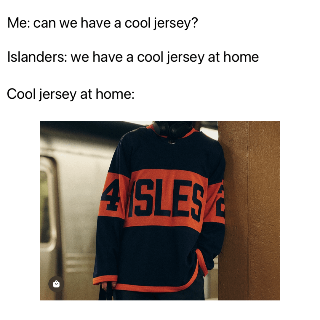
So bummed about the front. I saw the back first and really liked the way the numbers looked contrasting with the orange stripe. If they had just gone with some version of the crest instead of I S L E S it would’ve been 1000x better
Separate-Cow3734
Stinks
mynameismutt
It definitely could’ve been better. It’s a little similar to the Edmonton alternates with that color scheme. But overall I don’t hate it.
JackPlaysBass
“but…but the plimsoll line guys 🤓”
yeah because when I think long island, I think cargo freight shipping. dumb source of inspiration for a dumb jersey.


8 Comments
I personally like it. I ordered a Horvat for me and a Sorokin for my wife.
Having said that…is it the best they could have come up with?
NOPE.
But at the end of the day we are Islanders fans. We should be very used to disappointment by now. It could be much worse.
Better than some of the leaks at least..
Ya know… as a fauxback… I’m here for it. I don’t hate it.
Easily the worst jersey in team history
So bummed about the front. I saw the back first and really liked the way the numbers looked contrasting with the orange stripe. If they had just gone with some version of the crest instead of I S L E S it would’ve been 1000x better
Stinks
It definitely could’ve been better. It’s a little similar to the Edmonton alternates with that color scheme. But overall I don’t hate it.
“but…but the plimsoll line guys 🤓”
yeah because when I think long island, I think cargo freight shipping. dumb source of inspiration for a dumb jersey.