Love them but they’ve been the worst kept secret this past week or so lmfao
BillThePsycho
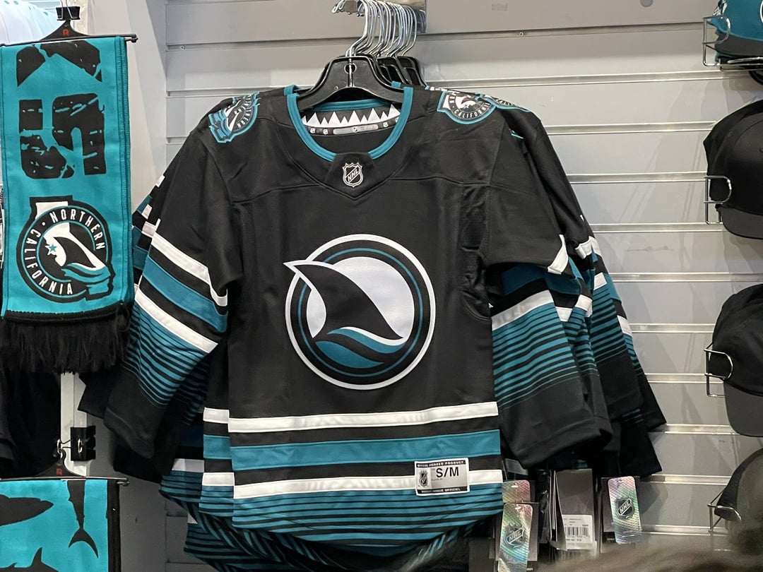
The lines kinda remind me of the [MBFC Crest ](https://i.imgur.com/ahcUZTK.jpg) with the lines turning to waves to show like Land and Sea.
I kinda like it.
jonbcalderon
They didn’t have the Adidas ones at sharks pro shop?
plam92117
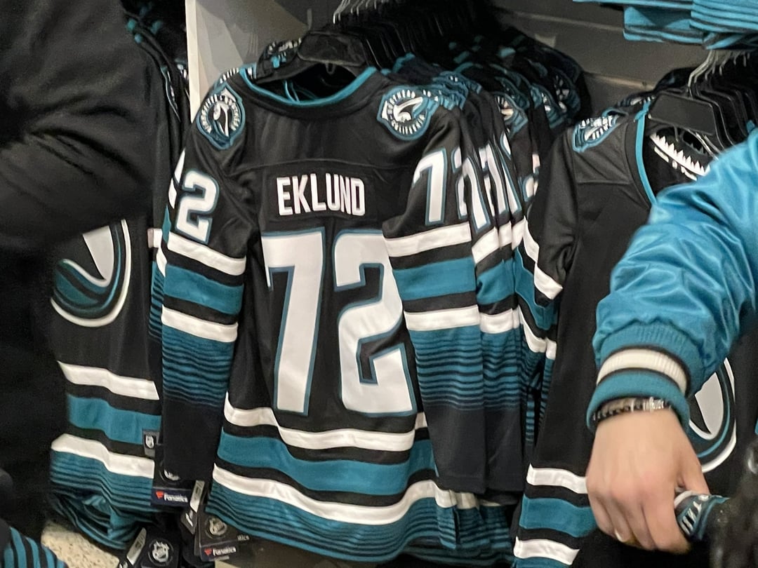
Oh god. Is this the start of the Fanatics era? I’m curious if they made any quality improvements.
marbanasin
I almost think they’d look better if they lost the OG striping and just moved the serape homage up to that height on the jersey. With maybe, maybe, one solid white line to give a clean break from black and then have the teal/black pattern trail down.
As it is it just feels like those flourishes are too far down on the design. Too far away from the normal striping region.
thingsandstufffs666

Unhappy_Quarter154
Damn… I thought I would hate them but holy wow lol
nanana_catdad
I call em the dinner plate jersey. Wish they did something with the fin that didn’t look like my grandmas fine china with a shark fin on it…
PNWFilmscape

danieldeceuster
The black stripes on the arms and waist that are above/below the thick teal stripes should have been silver. Would have been perfect.


11 Comments
Love them but they’ve been the worst kept secret this past week or so lmfao
The lines kinda remind me of the [MBFC Crest ](https://i.imgur.com/ahcUZTK.jpg) with the lines turning to waves to show like Land and Sea.
I kinda like it.
They didn’t have the Adidas ones at sharks pro shop?
Oh god. Is this the start of the Fanatics era? I’m curious if they made any quality improvements.
I almost think they’d look better if they lost the OG striping and just moved the serape homage up to that height on the jersey. With maybe, maybe, one solid white line to give a clean break from black and then have the teal/black pattern trail down.
As it is it just feels like those flourishes are too far down on the design. Too far away from the normal striping region.

Damn… I thought I would hate them but holy wow lol
I call em the dinner plate jersey. Wish they did something with the fin that didn’t look like my grandmas fine china with a shark fin on it…

The black stripes on the arms and waist that are above/below the thick teal stripes should have been silver. Would have been perfect.
https://preview.redd.it/k7tsnjf5fuec1.jpeg?width=469&format=pjpg&auto=webp&s=72a19e552d889834b1e9d9571b51914aed3dca83
Wow that quality looking like a wet reusable grocery bag