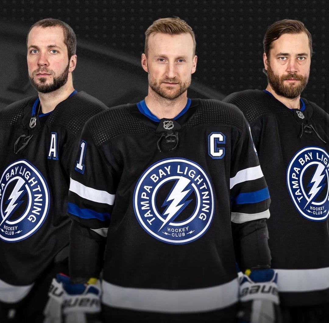
is this a third or new homes? hope this is the new look, no more Tampa Bay Maple Leafs
im_wudini
Meh, they’re fine. Which is what you want I guess.
Prayredditdies
This looks like some back the blue bs
FaithlessnessInner36
Meh
MailConsistent1344
Kucherov doesn’t look hungover. Is this AI?
TimeNat
Meh, looks like practice jerseys
DistributionSilly597
Dart target
Hungry_Definition450
Where’s the one with the Pirate skull on it?
Denver-Hockey
Colors are fine but the logo reminds me of a practice jersey.
T0macock
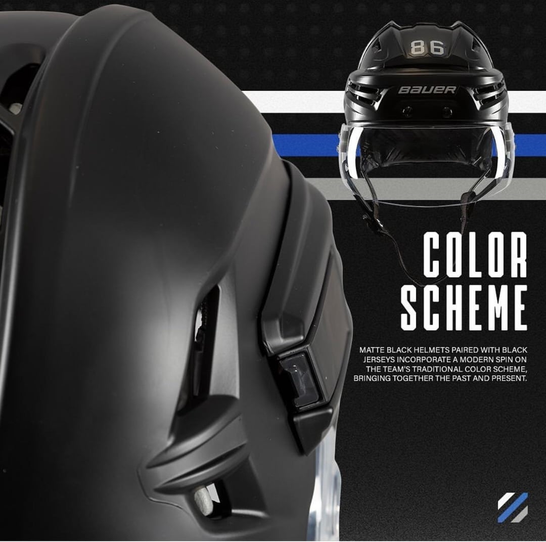
Matte buckets are such a better stylistic choice than those terrible chromed ones.
Iliketomeow85
At least they aren’t just copying the Leafs but the whole “hockey club” bit seems forced and corny
epzik8
I hate these uniforms, and I hate the Lightning.
SomeJerkOddball
Black is overdone, but this is an improvement from the rip-off Leaf jerseys. They’d have been better off going with grey/silver.
The logo would be better as a rondel without words, but it’s also a step up over the current logo.
Mediocre_Cucumber199
Zzzzzzzzzzzz.
BulbaGodofWar
Thank god. Now the inevitable Tampa-Toronto playoff series won’t be such a confusing mess to watch.
bkantor15
They look like the hawks from mighty ducks D1.
Happy they brought back the black/blue/white combo. They looked too much like the leafs earlier
8rownLiquid
Looks like Hedman and I are getting similar amounts of sleep.
SimplyViolated
‘Hockey club’?!?! What is this?!? Rec league!?!
bwoah07_gp2
The logo reminds me of the practice jersey, but I actually like that.
The black base colour is nice, so overall it’s nothing flashy or tremendous but this is real solid! **8.5/10**
EmerysMemories1106
They need to remove the term “hockey club. When I see the word “club” it makes me think of something that a bunch of 11-12 year old neighborhood kids came up with.
Aackland
it’s not terrible. like the colours, put the primary logo on there and it might be a winner
AgainstTheGrain44
Tampa Bay Lightning Hockey Club?
hrryyss
Looks like a practice jersey logo. All it’s missing is “Property of” above it.
TiredReader87
More Tampa Bay Lightning jersey mediocrity
At least their modern jerseys aren’t nearly as ugly as the ones from the 90s
darelectro
So they have gone full “blue lives matter”?
Intrepid_Anybody9380
Don’t look too bad and I’m just happy they are easier to distinguish from the Leafs now
Rebargod202
Hockey club.
Typical-Ad-6730
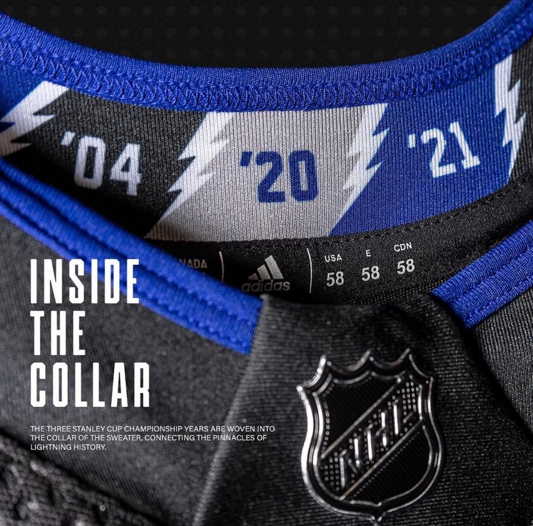
Is it me or do these guys look like they are being held hostage? Their eyes look so weird. They certainly don’t look like elite athletes. The logo and font are weak. I love the cup years in the collar though.
PoopSlinger23
Black. Very original. Lots of thought put into this.
bingbong6977
Not a fan. Why not use those sick pirate jerseys they wore earlier this year?
CarlSpackler22
Arm & Hammer Lightning.
“The Standard of Purity”
NitroCircus399-2
I wish we brought back our 04 throwbacks
Maybe_A_Donkey
At least it doesn’t look like the Gatorade logo anymore.
Gratitude89
“You lost it for yourself”
“Let’s shake their hands”
“Good work, captain Duck”
– Gunnar Stahl
lead_farmer_mfer
Color scheme is much better, closer to the original and less like the Leafs.
Logo is meh.
Madi3400
Are these permanent or alternates?
firesofpompeii
Tampa’s jerseys have just been meh for so long. These work as an alt, but they’re still just okay. Personally I don’t like these types of circle crests. They’re basic and easy and any team can do it.
Tampa just need a redesign all around. They don’t have a personality.
fraxior
these are dope
DrDrangleBrungis
Whoa a black jersey
Responsible-Cow-1807
Are these their permanent ones? Or like a alt
Bigboyrickx
Kinda ugly tbh
Ketachloride
It’s weird, with such a simple brand identity, this team struggles so much to make non-boring or non ugly stuff.
Shame the flash logo is already taken
Deliximus
So meh.
PloddingClot
Good thing is says Hockey Club on it, us dumb old boys wouldn’t be able to figure out what we’re watching.
ScrumpyRumpler
What’s the deal with teams drastically changing their jersey/logo every 5-10 years?
rgc7421
Stay with the current jerseys
Neans888
Thank god my team also has victory stripes or we’d never have a chance against them.


48 Comments
is this a third or new homes? hope this is the new look, no more Tampa Bay Maple Leafs
Meh, they’re fine. Which is what you want I guess.
This looks like some back the blue bs
Meh
Kucherov doesn’t look hungover. Is this AI?
Meh, looks like practice jerseys
Dart target
Where’s the one with the Pirate skull on it?
Colors are fine but the logo reminds me of a practice jersey.
Matte buckets are such a better stylistic choice than those terrible chromed ones.
At least they aren’t just copying the Leafs but the whole “hockey club” bit seems forced and corny
I hate these uniforms, and I hate the Lightning.
Black is overdone, but this is an improvement from the rip-off Leaf jerseys. They’d have been better off going with grey/silver.
The logo would be better as a rondel without words, but it’s also a step up over the current logo.
Zzzzzzzzzzzz.
Thank god. Now the inevitable Tampa-Toronto playoff series won’t be such a confusing mess to watch.
They look like the hawks from mighty ducks D1.
Happy they brought back the black/blue/white combo. They looked too much like the leafs earlier
Looks like Hedman and I are getting similar amounts of sleep.
‘Hockey club’?!?! What is this?!? Rec league!?!
The logo reminds me of the practice jersey, but I actually like that.
The black base colour is nice, so overall it’s nothing flashy or tremendous but this is real solid! **8.5/10**
They need to remove the term “hockey club. When I see the word “club” it makes me think of something that a bunch of 11-12 year old neighborhood kids came up with.
it’s not terrible. like the colours, put the primary logo on there and it might be a winner
Tampa Bay Lightning Hockey Club?
Looks like a practice jersey logo. All it’s missing is “Property of” above it.
More Tampa Bay Lightning jersey mediocrity
At least their modern jerseys aren’t nearly as ugly as the ones from the 90s
So they have gone full “blue lives matter”?
Don’t look too bad and I’m just happy they are easier to distinguish from the Leafs now
Hockey club.
Is it me or do these guys look like they are being held hostage? Their eyes look so weird. They certainly don’t look like elite athletes. The logo and font are weak. I love the cup years in the collar though.
Black. Very original. Lots of thought put into this.
Not a fan. Why not use those sick pirate jerseys they wore earlier this year?
Arm & Hammer Lightning.
“The Standard of Purity”
I wish we brought back our 04 throwbacks
At least it doesn’t look like the Gatorade logo anymore.
“You lost it for yourself”
“Let’s shake their hands”
“Good work, captain Duck”
– Gunnar Stahl
Color scheme is much better, closer to the original and less like the Leafs.
Logo is meh.
Are these permanent or alternates?
Tampa’s jerseys have just been meh for so long. These work as an alt, but they’re still just okay. Personally I don’t like these types of circle crests. They’re basic and easy and any team can do it.
Tampa just need a redesign all around. They don’t have a personality.
these are dope
Whoa a black jersey
Are these their permanent ones? Or like a alt
Kinda ugly tbh
It’s weird, with such a simple brand identity, this team struggles so much to make non-boring or non ugly stuff.
Shame the flash logo is already taken
So meh.
Good thing is says Hockey Club on it, us dumb old boys wouldn’t be able to figure out what we’re watching.
What’s the deal with teams drastically changing their jersey/logo every 5-10 years?
Stay with the current jerseys
Thank god my team also has victory stripes or we’d never have a chance against them.
Eh, they’re mid