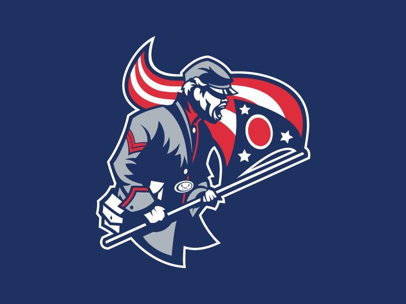
I wouldn’t want it on the main part of the jersey but that would look cool on the shoulder.
BreadMancbj
Much better .. a logo that explains the name
Cannon-Goes-Boom
I really like that, but I don’t know about main logo. Maybe 3rd, but I don’t like it more than the cannon.
ThunderousDemon86
Secondary logo, not main.
WeyherMan
Main logo? Nah. Shoulder patch?? Hell yeah
Mattsive
I would hate it and ask why that guys lips are so swollen
Horsefeathers34
Embrace the Cannon with cream and navy you cowards!
NathanEmory
Goes hard
Has horror vibes too with the soldier’s facial expression. Feels like am image from a story about hauntings at Gettysburg
SaveTore
No thank you. Cannon, please.
bdougy
Gray was the other side’s colors…
AndysGold
Terrible
mahjzy
I could live with it, and may even come around to liking it… but we don’t need it.
Cannon logo is the best CBJ has had and honestly the thirds should be moved to permanent home jerseys.
Zarg0n7
I would feel bad
Allatura19
A grey clad soldier?
Navyblazers2000
I know the guy who drew it. I think he’d tell you it needs some work and he’s improved quite a bit since then, which was like over ten years ago. Like the left hand, for instance.
knukklez
I’d feel terrible if that was our logo
What’s with the face?
Strange flag
Far too much GRAY on the Blue Jacket
Details would get lost – ammo pack, inverted sticks on the buckle
Why are there so many sharp angle spike designs on the coat
what is the white outline shape in between the soldier and the flag supposed to do, just looks a bit weird and oddly phallic
thelordcommanderKG
I’d abandon the team if we adopted a Confederate as our primary logo
cbj4L
Hell nah
Howdoyoudo614
Not great, why is he so angry
Lootar63
The Union wore blue……. hence the BLUE Jackets
smith288
What are his lips? Or mustache?
roaringelbow
there is no team in the world that should have a confederate soldier for their logo
CapBrink
The Columbus Grey Jackets?
chaenorrhinum
100% people would start drawing dicks going into that gaping maw of a mouth
cnpeters
We already got the stars on the Ohio flag wrong. Let’s make it wronger
pkenny72
Change the flag pole to a hockey stick, put the actual Ohio flag on it, and change him from a confederate solider to a union soldier. It would make for a nice shoulder patch.
Zilphyr
To be honest, even if the jacket was blue, I think it looks really amateur for an nhl team’s logo. It’s just not sharp/“clean” the way nhl logos look. It looks like clip art or like something some kid would come up with as their expansion team’s logo in the NHL video games. I don’t mean to insult whoever made the logo, just it would not be good as the hockey team’s on-ice logo imo!
joe_lmr
if Doug MacLean was a graphic designer
OhioNHLHockeyFan2489
Yes change grey to Blue for sure! ….but I’d rather see it as like a shoulder patch or 3rd jersey logo. Cool incorporate the Canon underneath the flag pole possibly….
Ok_Dragonfly4244
No. Just no.
Ok-Royal-3803
Insert a cock and balls into his wide open mouth
radios_appear
>grey jackets
Kayla_canadian
Haha. Nope.
oh_io_94
Jacket needs to be blue lol and the mouth looks weird af
myownmoses
I want the cannon. All cannon all the time.
MsEscapist
Mouth needs to close so the other teams can’t photoshop their mascots fucking ours.
Also gray coat? wtf?
salamandersnuggles
Bad.. wtf is this
jimmysledge
Inappropriate
Darth_Vicious
Is he storming the Capitol?
Andypants_
It would be like the Mike Babcock of logo changes. Let’s make sure OP doesn’t have access to JDs email.
CrownOfDusk
Not as a main logo, not as a secondary, not as a tertiary. Nowhere near CBJ
RhysNorro
# WAY DOWN SOUTH IN THE LAND OF TRAITORS, SNAKES AND ALLIGATORS


42 Comments
I wouldn’t want it on the main part of the jersey but that would look cool on the shoulder.
Much better .. a logo that explains the name
I really like that, but I don’t know about main logo. Maybe 3rd, but I don’t like it more than the cannon.
Secondary logo, not main.
Main logo? Nah. Shoulder patch?? Hell yeah
I would hate it and ask why that guys lips are so swollen
Embrace the Cannon with cream and navy you cowards!
Goes hard
Has horror vibes too with the soldier’s facial expression. Feels like am image from a story about hauntings at Gettysburg
No thank you. Cannon, please.
Gray was the other side’s colors…
Terrible
I could live with it, and may even come around to liking it… but we don’t need it.
Cannon logo is the best CBJ has had and honestly the thirds should be moved to permanent home jerseys.
I would feel bad
A grey clad soldier?
I know the guy who drew it. I think he’d tell you it needs some work and he’s improved quite a bit since then, which was like over ten years ago. Like the left hand, for instance.
I’d feel terrible if that was our logo
What’s with the face?
Strange flag
Far too much GRAY on the Blue Jacket
Details would get lost – ammo pack, inverted sticks on the buckle
Why are there so many sharp angle spike designs on the coat
what is the white outline shape in between the soldier and the flag supposed to do, just looks a bit weird and oddly phallic
I’d abandon the team if we adopted a Confederate as our primary logo
Hell nah
Not great, why is he so angry
The Union wore blue……. hence the BLUE Jackets
What are his lips? Or mustache?
there is no team in the world that should have a confederate soldier for their logo
The Columbus Grey Jackets?
100% people would start drawing dicks going into that gaping maw of a mouth
We already got the stars on the Ohio flag wrong. Let’s make it wronger
Change the flag pole to a hockey stick, put the actual Ohio flag on it, and change him from a confederate solider to a union soldier. It would make for a nice shoulder patch.
To be honest, even if the jacket was blue, I think it looks really amateur for an nhl team’s logo. It’s just not sharp/“clean” the way nhl logos look. It looks like clip art or like something some kid would come up with as their expansion team’s logo in the NHL video games. I don’t mean to insult whoever made the logo, just it would not be good as the hockey team’s on-ice logo imo!
if Doug MacLean was a graphic designer
Yes change grey to Blue for sure! ….but I’d rather see it as like a shoulder patch or 3rd jersey logo. Cool incorporate the Canon underneath the flag pole possibly….
No. Just no.
Insert a cock and balls into his wide open mouth
>grey jackets
Haha. Nope.
Jacket needs to be blue lol and the mouth looks weird af
I want the cannon. All cannon all the time.
Mouth needs to close so the other teams can’t photoshop their mascots fucking ours.
Also gray coat? wtf?
Bad.. wtf is this
Inappropriate
Is he storming the Capitol?
It would be like the Mike Babcock of logo changes. Let’s make sure OP doesn’t have access to JDs email.
Not as a main logo, not as a secondary, not as a tertiary. Nowhere near CBJ
# WAY DOWN SOUTH IN THE LAND OF TRAITORS, SNAKES AND ALLIGATORS