Those are all terrible. Should just stick with what they have now
DonCorlealt
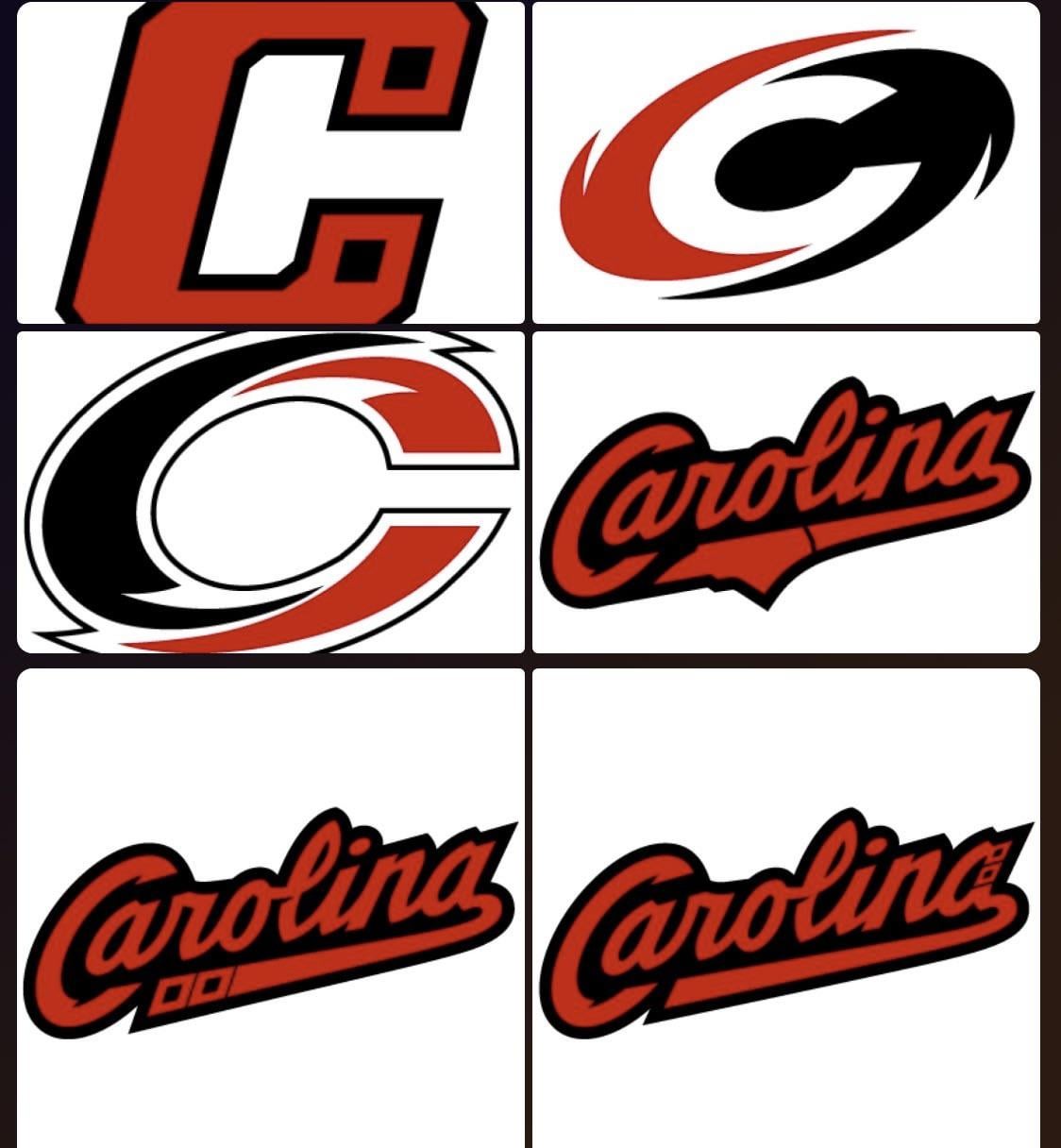
Not opposed to them changing their logo. But their current one is better than all 6 of these options. So if these are the only choices, they might as well keep what they have
Lil_Boosie_Vert
all of these hoop dicks
kngnxthng
The hurricane flag logo is better than all of these and if they want to switch they should permanently adopt that.
Top_Contract_4910
Looks like the logos off-brand soda companies would use.
Interesting-Ice9319
Did they get AI to create these…
dexterthekilla
They look like they were made by AI
35RoliSmith41
I like their logo. These all suck compared to what they have.
natty_mh
Hockey stick with the hurricane flag on it or nothing.
big-chicago-guy
these are just amended baseball/football logos? i see guardians, bears, cubs and cardinals.
another team that chose a terrible name/logo combo that seriously hampered the development of the franchise just like the wild and thrashers. non-entities right from jump street. no history and no aesthetic – bad combo.
anyhow teuvo rules.
Talkin-Muffin
Might as well rename the team to Carolina Colas
McMetal770
The last three with the lettering are sensationally terrible. If you got a first year graphic design student with delusions of grandeur high on ether and told them to make a logo for a teeball franchise, that’s what you would get.
ShartRat
Their logo is fine as is why worry about changing it to one of these? If they were going to change it though why wouldn’t they do something based off of the alternate jersey? These make no sense.
Poop_and_Pee69
They’re all fuckin bad. Oof.
The hurricane flag jersey is rad though.
suckysuckythailand
I don’t like any of them
lowley6
3 corporate logos and 3 baseball logos… am I missing something? I thought this was a hockey team
ScienceMountain2709
Difficult to make a wind and a flag look cool.
632612
I second what another said. These are all for a baseball team, not hockey. Hell, the last three are just classic baseball cursive.
YoungFA91
Wow they all suck
Virtual-Orchid-8793
Why are they trying to reinvent the wheel there’s nothing wrong with the current logo
Proskills500
The bottom left is the only one that looks decent but it only makes sense on the jersey not as a logo
Ornery_Definition_65
If it ain’t broke…
SSM1228
Garbage. Just rock the flag. Even their stadium series were trash. Idk why they need to change anyway. It’s not like they have a long history.
darthduder666
I think they should keep the logo they have now, but change their colors.
It would be sick for them to use the Whalers colors with their current logo and jersey design as their primary.
DungeonMaster45
Aaaand they’re all as ugly or worse than the current ugly logo.


28 Comments
Screams baseball
Trash
Those are all terrible. Should just stick with what they have now
Not opposed to them changing their logo. But their current one is better than all 6 of these options. So if these are the only choices, they might as well keep what they have
all of these hoop dicks
The hurricane flag logo is better than all of these and if they want to switch they should permanently adopt that.
Looks like the logos off-brand soda companies would use.
Did they get AI to create these…
They look like they were made by AI
I like their logo. These all suck compared to what they have.
Hockey stick with the hurricane flag on it or nothing.
these are just amended baseball/football logos? i see guardians, bears, cubs and cardinals.
another team that chose a terrible name/logo combo that seriously hampered the development of the franchise just like the wild and thrashers. non-entities right from jump street. no history and no aesthetic – bad combo.
anyhow teuvo rules.
Might as well rename the team to Carolina Colas
The last three with the lettering are sensationally terrible. If you got a first year graphic design student with delusions of grandeur high on ether and told them to make a logo for a teeball franchise, that’s what you would get.
Their logo is fine as is why worry about changing it to one of these? If they were going to change it though why wouldn’t they do something based off of the alternate jersey? These make no sense.
They’re all fuckin bad. Oof.
The hurricane flag jersey is rad though.
I don’t like any of them
3 corporate logos and 3 baseball logos… am I missing something? I thought this was a hockey team
Difficult to make a wind and a flag look cool.
I second what another said. These are all for a baseball team, not hockey. Hell, the last three are just classic baseball cursive.
Wow they all suck
Why are they trying to reinvent the wheel there’s nothing wrong with the current logo
The bottom left is the only one that looks decent but it only makes sense on the jersey not as a logo
If it ain’t broke…
Garbage. Just rock the flag. Even their stadium series were trash. Idk why they need to change anyway. It’s not like they have a long history.
I think they should keep the logo they have now, but change their colors.
It would be sick for them to use the Whalers colors with their current logo and jersey design as their primary.
Aaaand they’re all as ugly or worse than the current ugly logo.
These are objectively terrible