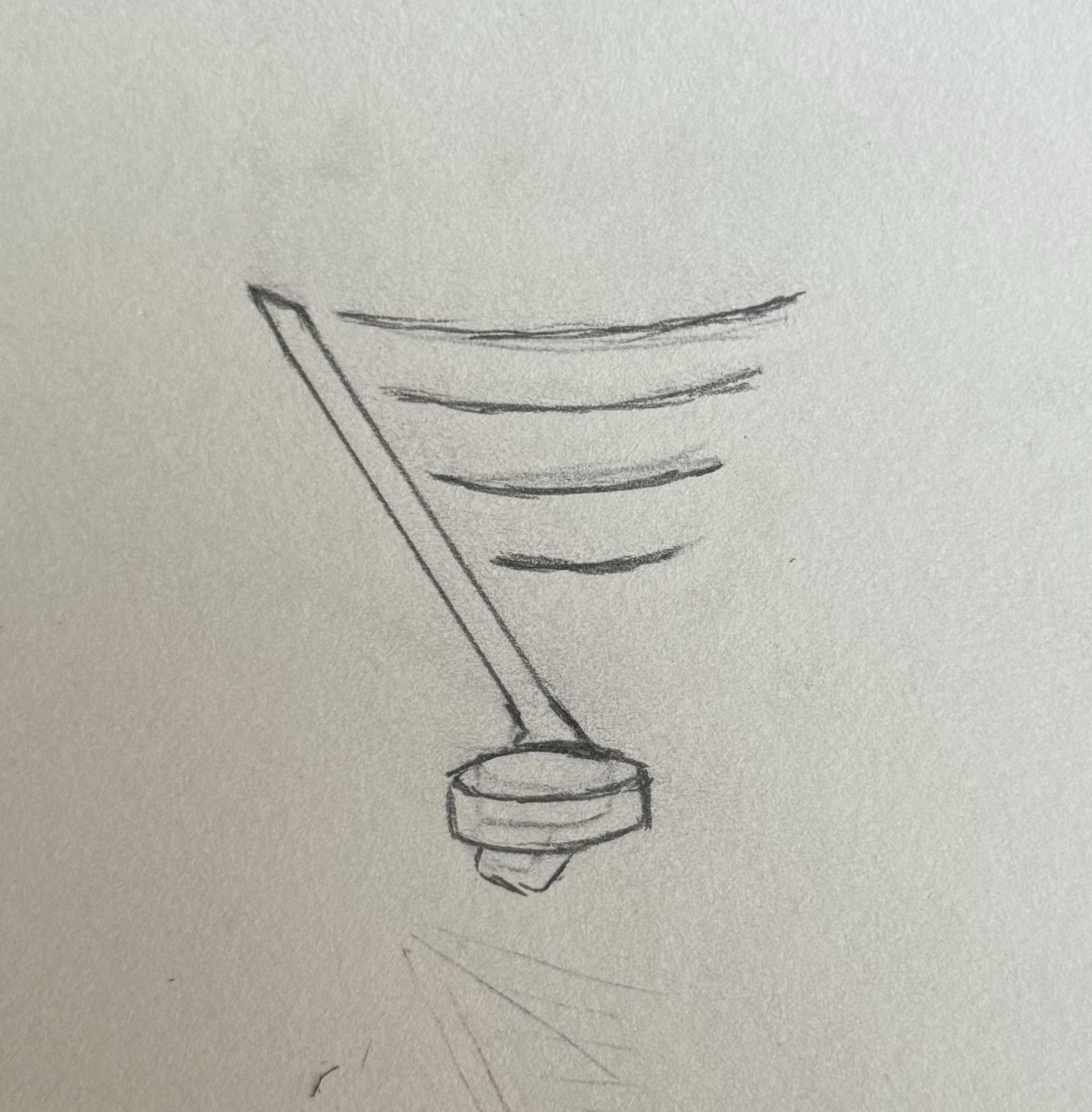
This concept popped into my head and I can’t let it go. I think it works really, really well.
I usually dislike logos with pucks/sticks because it sometimes comes across as corny or forced, but it’s pretty seamless here.
Anybody wanna take a stab at improving it?
by Sad-Perspective4702


6 Comments
Love the concept. Would have to see a cleaner more intricate sampling to make a real judgement call tho
This is the only redesign of the logo I haven’t absolutely hated. I wouldn’t mind this on a shirt or a hat, would not want to replace the real logo.
Love it! The suggestion of changing the wing to musical stanza is great while keeping the note looking like a 1/4th beat.
Artistic renditions are cool with me
Not a Blue’s fan (but not a hater either). This popped up on my main feed.
I think what would make the concept stronger would be if you *didn’t* worry about showing the blade of the stick. Make the handle very clearly a stick handle, and have it as if the puck is coming towards the viewer (therefor justifying it being big enough to block the whole blade of the stick, and make a perfect music note.
Alternatively, flip the stick upside down so the stick blade can form the “wing” at the top of the note.
Hoping you guys can put together a streak and snatch up a wild card spot!
Not a fan and not a musician, but I saw what you were going for. It looks really cool to me. Try flipping the stick blade so it’s a left handed blade. Right now it looks like a right handed blade starting to do a lacrosse goal to me. If you flip the blade, it would line up behind the puck and stand out less. Or curve the blade behind the puck so it’s a small gap between the puck and stick blade. That way it’ll accentuate the puck as the dot.