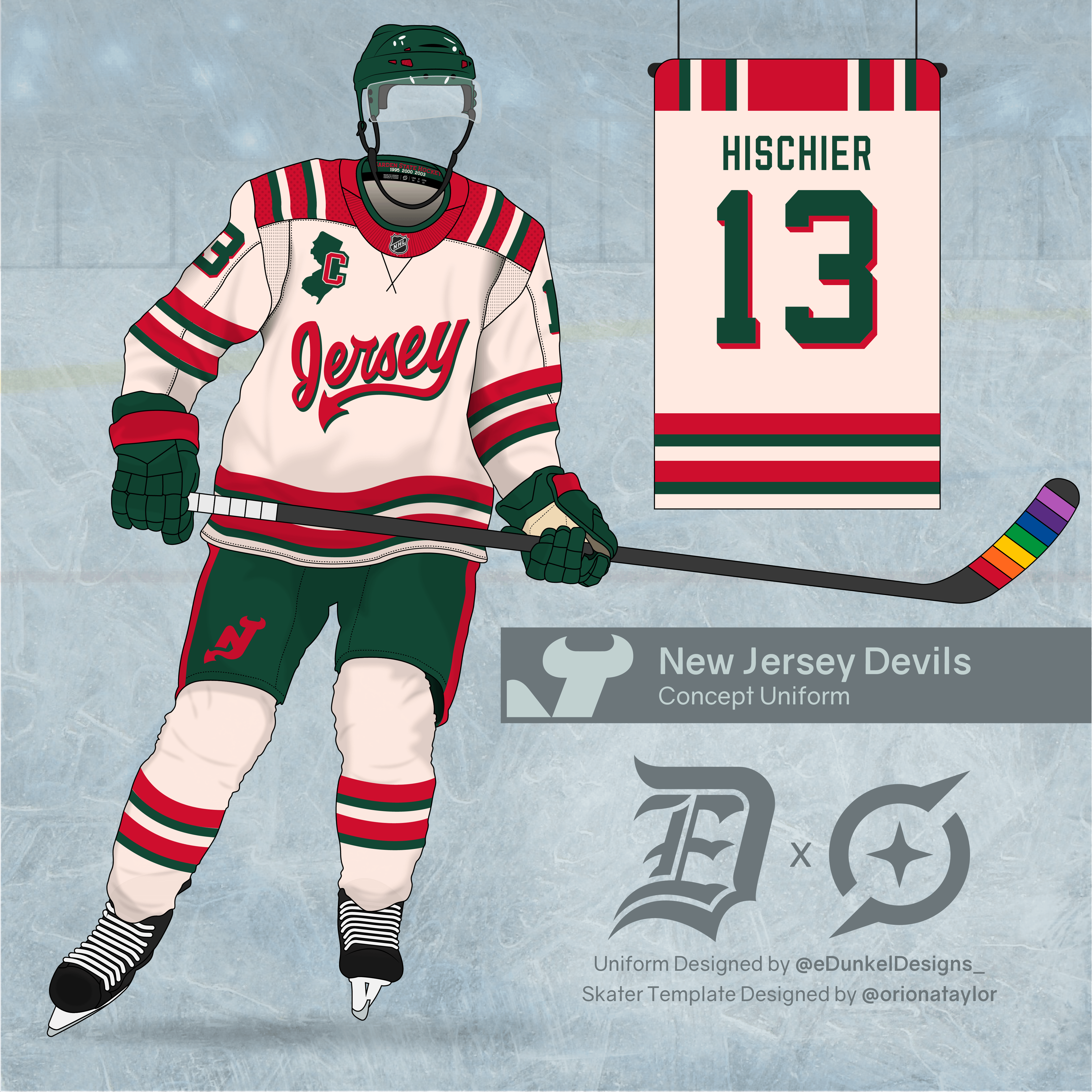
I posted some jersey concepts last year. This was the design that was the most well received. I’ve wanted to make a full kit for a while now. Hope you enjoy it!
SevenwithaT
Remove “Jersey” and put our regular logo in red/green and it’s a 10/10
I really like this though
nostradamefrus
Yea I’d probably buy this immediately lol
nostradamefrus
Yea I’d probably buy this immediately lol
Reddit apparently glitched out and posted this twice
Willing-Bear4862
Love it!!! Would be a great on ice jersey.
MJDiAmore
So perfect you know the NHL would never come up with such a thing
fartswhenhappy
This is phenomenal.
myerburg311
love it
Imsorrymanyt
I wish there were a way to like pitch designs to whoever’s in control of them idk maybe there is idk, but this is great.
Mr7three2
Im not a fan of our red and green but this is really good
-Fahrenheit-
I may be in the minority, but I dislike the OG red/green/white color scheme, and much prefer the red/black/white.
That being said, this is about as good as red/green/white gets.
DawgMutt05
looks like the Italian flag colored soda cup design scheme from any NYC metro area pizzeria if you ordered it from the soda fountain & they poured/served it to you….as opposed to grabbing a bottle or can from the cooler yourself
This would be amazing. It would certainly be better than the black alternative uniforms. Being better than those uniforms isn’t hard to do though.
yianni1229
I’ll never understand how leagues release bad jerseys, fans come up with shit that’s so much cooler
DeadEnd3001
No.
Get rid of the “Jersey” script font. It doesn’t work. Awful design choice when they made the 3rd jerseys to begin with. And I hope the 3rds are eventually locked in the vault and done away where they’ll stay hidden in the annals of time.
Everything else is acceptable.
PEPE_22
Pretty cool work! The shoulders is the only part I don’t really like.
Effective-Bus
Omg I’m obsessed with this!!!
Brilliant-Chapter202
I like the color combo… not sure about the “jersey” thing lol it’s fun for a laugh lol
Also keep the state image and Captain. That is a nice touch
rodger_klotz
If we scrap the other jersey jersey than 100 percent. I don’t like moving away from the regular logo, it’s too good to not display prominently on the sweaters
chefboleson
jersey logo replaced by the logo on the pants and this is perfect
TheNightRain68
Looks good. While I do prefer our red black white color scheme, I always did like red white green almost as much. They need to bring that back for a future alt jersey
NYtoJers
I fuck with these
xxfatpigxx
The tail on the Y is a really cool touch and ties it back into the Devils brand nicely. Vintage white with red and green really works for me here. Has a super old school vibe with the heavy striping.
I think I’d like red numbers with a green drop shadow rather than green with red shadow like you did. The gloves, pants and helmet still carry a nice balance of green in the uniform overall.
The one knock I have is that I’m not sold on the state outline/captaincy letter combo. Maybe the state lives somewhere else as a cool accent mark on its own but the New Jersey state outline doesn’t really lend itself to housing a letter inside it.


29 Comments
I posted some jersey concepts last year. This was the design that was the most well received. I’ve wanted to make a full kit for a while now. Hope you enjoy it!
Remove “Jersey” and put our regular logo in red/green and it’s a 10/10
I really like this though
Yea I’d probably buy this immediately lol
Yea I’d probably buy this immediately lol
Reddit apparently glitched out and posted this twice
Love it!!!
Would be a great on ice jersey.
So perfect you know the NHL would never come up with such a thing
This is phenomenal.
love it
I wish there were a way to like pitch designs to whoever’s in control of them idk maybe there is idk, but this is great.
Im not a fan of our red and green but this is really good
I may be in the minority, but I dislike the OG red/green/white color scheme, and much prefer the red/black/white.
That being said, this is about as good as red/green/white gets.
looks like the Italian flag colored soda cup design scheme from any NYC metro area pizzeria if you ordered it from the soda fountain & they poured/served it to you….as opposed to grabbing a bottle or can from the cooler yourself
Simplify the striping just a bit and I’m so in.
It looks great, which means Fanatics won’t do it
…oh and the Staal sisters won’t like it…
https://preview.redd.it/7swwpzaz7uzc1.jpeg?width=1125&format=pjpg&auto=webp&s=23ae81da97d4d17fce48357b84e44803c42f1869
Dhgate is selling a similar one
That’s fucking amazing
I like parts of this design.
This would be amazing. It would certainly be better than the black alternative uniforms. Being better than those uniforms isn’t hard to do though.
I’ll never understand how leagues release bad jerseys, fans come up with shit that’s so much cooler
No.
Get rid of the “Jersey” script font. It doesn’t work. Awful design choice when they made the 3rd jerseys to begin with. And I hope the 3rds are eventually locked in the vault and done away where they’ll stay hidden in the annals of time.
Everything else is acceptable.
Pretty cool work! The shoulders is the only part I don’t really like.
Omg I’m obsessed with this!!!
I like the color combo… not sure about the “jersey” thing lol it’s fun for a laugh lol
Also keep the state image and Captain. That is a nice touch
If we scrap the other jersey jersey than 100 percent. I don’t like moving away from the regular logo, it’s too good to not display prominently on the sweaters
jersey logo replaced by the logo on the pants and this is perfect
Looks good. While I do prefer our red black white color scheme, I always did like red white green almost as much. They need to bring that back for a future alt jersey
I fuck with these
The tail on the Y is a really cool touch and ties it back into the Devils brand nicely. Vintage white with red and green really works for me here. Has a super old school vibe with the heavy striping.
I think I’d like red numbers with a green drop shadow rather than green with red shadow like you did. The gloves, pants and helmet still carry a nice balance of green in the uniform overall.
The one knock I have is that I’m not sold on the state outline/captaincy letter combo. Maybe the state lives somewhere else as a cool accent mark on its own but the New Jersey state outline doesn’t really lend itself to housing a letter inside it.