
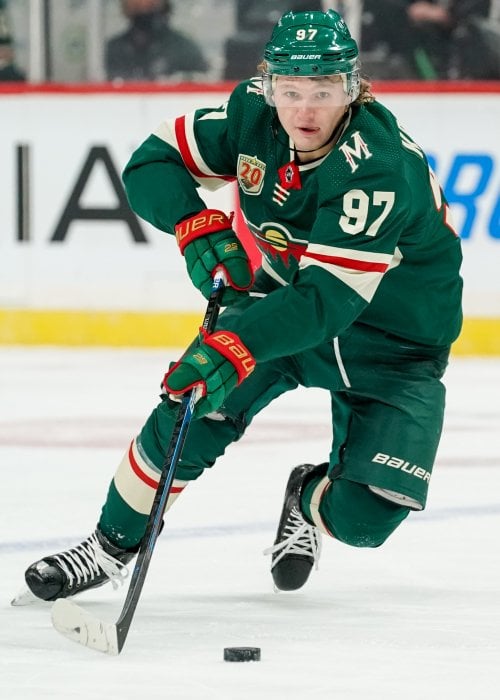
[JFresh] Icethetics reports that the Minnesota Wild will be switching to North Stars colours in 2025-26 as part of a rebrand.
@Icethetics reports that the Minnesota Wild will be switching to North Stars colours in 2025-26 as part of a rebrand. #MNWild pic.twitter.com/lkWEuhDMvX
— JFresh (@JFreshHockey) June 12, 2024
by DecentLurker96

44 Comments
What about the logo will be the same as the alt they used this season?
Hate it
Fucks sake.
lol I just posted this but it got removed for similar content. Hate this rebrand and color change😡
i like the alternates i dont fucking want this NO NO NO
Well, guess I won’t be buying any more merch. I’m not from Minnesota and the North Stars moved before I was born, have no connection to them—I fell in love with the Wild. Hate this nostalgia bait. Colors are hideous, look like Team Subway. Just so disappointing. If all they do is promote the Reverse Retros I’m gonna hate them. Ugh. Just really disappointed by this.
No thank you
Why the fuck would they do that?!
Like, the Northstar throw-backs are fine as a third/alternate and I’m sure they sell a bunch of sweaters at the Hockey Lodge, but this is the Minnesota Wild! Iron Range red, forest green, harvest gold, Minnesota wheat, and white, those are the colors! Don’t backtrack on 25 years of history for some bullshit, Boomer nostalgia.
Ugh. I hate it.
I’m fine with this.
Who greenlit this tom-fuckery?
I don’t agree with this direction at all, but if this is true and the seal is broken, they might as well go 100% on this. Try to get the North Stars name and history back from Dallas. Similar to the NBA’s Charlotte Bobcats/Hornets arrangement. Half assing it is just stupid.
Not on the same level as the bs going on with pwhl mn but is mn hockey trying to make the wrong choice at every possible chance right now?
I’m a little surprised by the reaction to this, thought it would be popular.
I, for one, am a big fan. I’ve always had to really TRY to like the Christmas color scheme. Never have fully liked it.
The Northstar colors though, I have always adored.
https://preview.redd.it/z99cqm3as56d1.jpeg?width=1284&format=pjpg&auto=webp&s=9f7a11ffdffa6e211d1ac8a1dc5ee7b5cdc7dc86
Wish they would bring back these jerseys for a few games
Man why? I get the nod to the North Stars but the Minnesota Wild are completely different
I don’t know what you all are smoking. I’m a sucker for the old colors.
I hate these jerseys so much. They have released 3 different types of these jerseys! Ya I get it the north stars were a part of Minnesota but they should bring back the OG jerseys. Maybe change them a little but stop shoving the north stars down our throats.
Please say sike
Fuck that. We are the Wild, not the North Stars. Fucking boomers ruin everything.
Say sike right now 😭
The only good thing about this is that it will piss off Dallas fans.
I’m sure this will go over well here.
As someone that doesn’t go into a rage anytime the North Stars are brought up, I don’t like this. The RR 2.0 were a good 3rd jersey. Wearing them 6 times a year was a nice homage without getting in the way of the Wild’s own unique branding.
The Wild have pretty solid branding and the forest green fits the “Wild” name. If the teams wants to make more $$ on jerseys, they should’ve stuck with releasing a 3rd jersey post-reverse retro which was long rumored but kept getting shelved.
Even though I don’t like this change, the teams knows how their sales go. Just because Redditors hate anything North Stars related doesn’t mean the fans out in the real world do. The RRs probably sold so well that the team felt they had to go in that direction.
This color scheme at least sniffed the Cup. LFG! Haters just remember we have a super deep prospect pool.
make it a 3rd jersey
PLEASE GOD YES
When Russo posts this then I’ll pay attention
Ownership is only looking at the past at this point. Trying to make an easy $.
Here’s the thing, a rebrand isn’t a bad thing. But this ain’t it.
Nostalgia is a hell of a drug…
Green is my favorite color
Yellow is my least favorite
This is some serious inner conflict
🤮The North Stars are dead. Get over it already!
I grew up a North Stars fan and became a Wild fan when they started up. I will always love the North Stars and always hate Norm Green, but this is a miss by the Wild. I like the retros for a third, I think it’s wonderful and a nice callback. But the Wild are not the North Stars. This is a bad call.
Why
Stop rebranding everything every 5 years
This does not seem like a good idea to me, am I alone on this?
Just publicly call Dallas a bunch of pussies and change the name to North Stars.
If we are being honest the Wild name is kind of weak on its own. The thing that makes the whole brand work is the deep woods aesthetic the brand cultivates. Thus the wild beast logo. Thus the cabin theming in Xcel ECT ECT. The dark green communicates that so much better than the old North Stars colors; And I say this as I’m getting my RR2 customized.
All going back to the North Stars colors full time says is “hey remember our heritage? Remember when we were better?”
No we just want wheat
I don’t necessarily like the decision. I’m not up in arms about it either.
But all of the vitriolic responses in this thread towards…boomers, I guess…is a bit weird. Like guys, our hockey team is still here, unlike some markets, and they’re just changing colors to a scheme this state once had. The senior citizens aren’t trying to steal your happiness from you.
Probably not gonna go over super well here, but I like them more. I Never really was a fan of the red and green together to be honest.
https://preview.redd.it/49lv6p1yu56d1.jpeg?width=1569&format=pjpg&auto=webp&s=30f37331e6e69ab585664f50e8f3b3b31474b124
“I like the rebrand”
Too bad fanatics will completely botch the on-ice product and have me hate it.
Why?!!!
I like the original colors what the actual fuck! I get it northstars jerseys are nice and all but why not have them as a cool third jersey. Ugh this is so not cool.
Damnit…I love our current jersey set-up with the retros in the mix. I thought that was a *perfect* happy medium.
Dark green just screams “forest” and the red/wheat trim pop out great on it.
I’ll have to see the jersey designs to make an opinion…will they be the retros? Will it be a different style with the new colors…who knows.
No no no no no NO
NOOOOOOO!!!
Putting up with the Greenbay Subway jerseys a few times per year is enough. That color scheme completely negates the beautiful detail of our logo, which is widely regarded as the best logo design in the NHL (or all of professional sports if you’re THG).