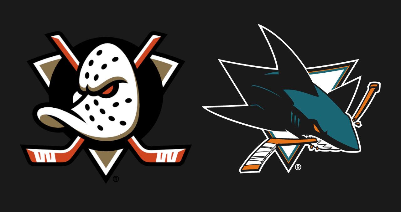
I’ve grown to love the Sharks logo. The teal actually adds depth to the Shark and makes it seem less flat like the original.
As for the Mighty Duck, it is iconic and this somehow makes it even cleaner. Colours is someone’s pref but the shape and shading adds a lot to it.
CitizenNaab
We have mountain
Stetzy93
Ours hasn’t changed notably in 40 years
minos157
Wait if the requirement is a hockey stick than the Isles also have a fun logo!
Strypes4686
There is no logo as classic,intricate and recognizable as the Winged Wheel.
chacotacotoes
Because Utah
greenstar91
I think pens have a fun logo
g-melo
NHL has the best variety of logos, they can’t all have the same vibe or they would be the NFL.
Vast_Sandwich_5245
We literally have a wheel and wing.
Steakholder__
Bro we literally have a leaf, it’s the most fun logo in all of sports
Bulky_Cranberry6005
Old panthers logo was so much better.
iseeabluemoonrising
We have a great one we just don’t use it
RepublicWonderful
They arnt the evil ducks, just mighty.
scarlet_speedster985
Kinda wish the Ducks had brought back the eggplant and teal (and maybe changed the name back to *Mighty* Ducks) but I’m really just glad to see the duck mask back!
mckeeusta
Kracken have a pretty cool design
TrueAttorney6373
At least they are not letter logos like in MLB.
EmperorXerro
I love the original ‘91 Sharks jersey
sfshark_6
While the original sharks logo will always be my favorite, I still love the “new” logo (hard to believe that was 17 years ago). The updated fin logo from the Cali-fin 3rds is amazing too.
As for the ducks, they knocked this rebrand out of the park
EnglishMajorRegret
These are easily the two best new team logos. Call me biased as a Hawks fan but the best of the old guard is the hawks and the Red Wings.
On a semi related note, I genuinely hate Pavel Datsyuk for being my all time favorite player because it put me in a position to accept the Red Wings away as the best sweater in hockey and overall best jersey in sports. Then them being in the East took away a lot of good healthy animosity toward them, and then I get in a conversation with Red Wings fans and remember I hate them for a reason.
My favourite logo ever was the phx coyote. And he gone
VastFaithlessness980
You’re right. The Kings should have gone with a new logo of an actual King with a hockey stick.
The_Cozy_Burrito
Grew up loving the mighty ducks logo
joecan
Fuck Anaheim forever for their awful rebrand.
You were the Mighty Ducks now you’re just a bunch of birds that shit on cars.
Electrical_Fig6656
Hopefully this is a sign it’s getting better
IcaIIwom3nMommy
Nhl easily has the best logos in all of sports, especially in North America, mlb, and nba have a lot of awful and mediocre logos
Prigglesxo
From a design standpoint, I’m kind of obsessed with the Flyers logo
Loudlaryadjust
Wait till you see the Yeti
HotStreak000
I honestly like all of our logos.
Jazzar1n0
I love that sharks logo
StackThePads33
It’s kind of hard to do fun logos with some of the teams, particularly the older teams. Maybe we could find some wacky artists and throw some ideas around or something


37 Comments
Make up for the great logos with shitty rosters.
More logos with orange hockey sticks!
We have a bear, lake and some trees?
I’ve grown to love the Sharks logo. The teal actually adds depth to the Shark and makes it seem less flat like the original.
As for the Mighty Duck, it is iconic and this somehow makes it even cleaner. Colours is someone’s pref but the shape and shading adds a lot to it.
We have mountain
Ours hasn’t changed notably in 40 years
Wait if the requirement is a hockey stick than the Isles also have a fun logo!
There is no logo as classic,intricate and recognizable as the Winged Wheel.
Because Utah
I think pens have a fun logo
NHL has the best variety of logos, they can’t all have the same vibe or they would be the NFL.
We literally have a wheel and wing.
Bro we literally have a leaf, it’s the most fun logo in all of sports
Old panthers logo was so much better.
We have a great one we just don’t use it
They arnt the evil ducks, just mighty.
Kinda wish the Ducks had brought back the eggplant and teal (and maybe changed the name back to *Mighty* Ducks) but I’m really just glad to see the duck mask back!
Kracken have a pretty cool design
At least they are not letter logos like in MLB.
I love the original ‘91 Sharks jersey
While the original sharks logo will always be my favorite, I still love the “new” logo (hard to believe that was 17 years ago). The updated fin logo from the Cali-fin 3rds is amazing too.
As for the ducks, they knocked this rebrand out of the park
These are easily the two best new team logos. Call me biased as a Hawks fan but the best of the old guard is the hawks and the Red Wings.
On a semi related note, I genuinely hate Pavel Datsyuk for being my all time favorite player because it put me in a position to accept the Red Wings away as the best sweater in hockey and overall best jersey in sports. Then them being in the East took away a lot of good healthy animosity toward them, and then I get in a conversation with Red Wings fans and remember I hate them for a reason.
No Hfun League
(H is silent)
give some NHL team the [Syracuse Crunch’s old logo](https://content.sportslogos.net/logos/2/516/full/2163.gif)
YOU THINK A SHARK KILLING A HOCKEY STICK IS FUN??
WHAT ARE YOU SOME KIND OF LUNATIC???
ok i need sleep now
My favourite logo ever was the phx coyote. And he gone
You’re right. The Kings should have gone with a new logo of an actual King with a hockey stick.
Grew up loving the mighty ducks logo
Fuck Anaheim forever for their awful rebrand.
You were the Mighty Ducks now you’re just a bunch of birds that shit on cars.
Hopefully this is a sign it’s getting better
Nhl easily has the best logos in all of sports, especially in North America, mlb, and nba have a lot of awful and mediocre logos
From a design standpoint, I’m kind of obsessed with the Flyers logo
Wait till you see the Yeti
I honestly like all of our logos.
I love that sharks logo
It’s kind of hard to do fun logos with some of the teams, particularly the older teams. Maybe we could find some wacky artists and throw some ideas around or something
They do