
If not allowed, please delete! I come in as a designer and friend haha
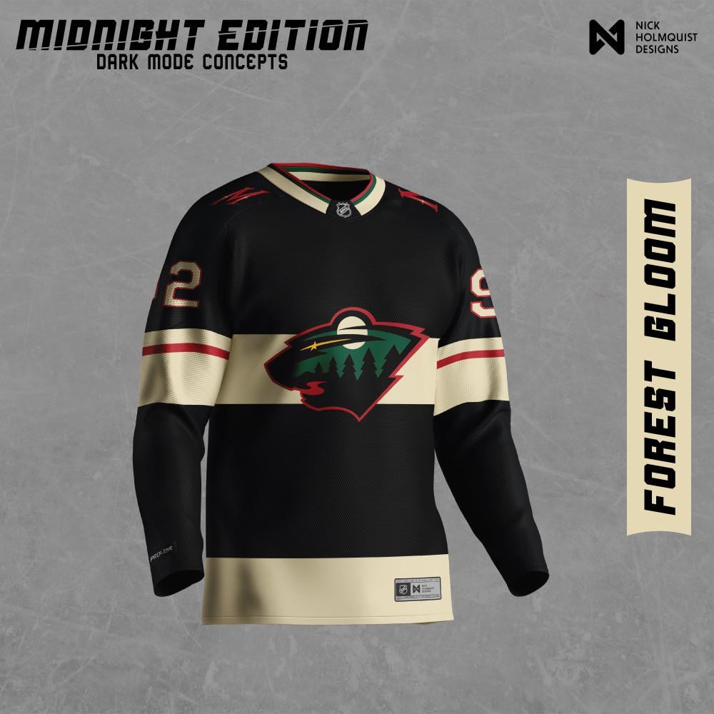
I decided to make a "dark mode" jersey for all NHL teams and wanted to share!
I'm mainly doing this for my benefit as a designer to learn more about how teams have constructed their jerseys, logos, and colors. This was a lot of fun and I hope you all enjoy!
by IslandTwig

16 Comments
This looks really cool. Sadly hipsters and old men want us to rehash the N. Stars for all eternity so we’ll never see something like this.
Thanks for sharing, it really does look nice
The green background of the logo looks odd to me. I’m sure you tried the red in there but I’d imagine with the darker trees, the red might make it look like dusk which could be cool.
I can’t tell if the jersey is black or a really dark green. I’m hoping it’s a really dark green!
I’d buy the heck out of this
I like it. I’d really like it if it was really really dark green instead of black
I agree with the others comments. If this a dark shade of green then absolutely. Otherwise there are just too many “black” concepts/unis already out there in the league.
I think if you take the red outline around the logo I would like it a lot more
This would be a neat thing to do for something like Black Out ALS, which Iowa did last year.
Nighttime forest is a good concept to think about for future jerseys, though. I like the idea of bringing in colors that make you think of a dark lake in a pine forest
https://preview.redd.it/8dml6929bqbd1.png?width=4000&format=png&auto=webp&s=e03c4a8855e9ea743b93d9140af17071690fa55f
Here is a dark green version everyone is asking for
Forrest gloom is certainly a name lol
Shut up and take my money!
Would be a cool one off jersey. Thought it kinda reminds me of the Dallas Stars constellation jersey.
Oh, I like.
I’m typically anti-black for black’s sake uniforms, but this is pretty sharp. The dark green one is a bit better though.
Really dig these
Dark green I could get behind
These are kinda good. They’re just missing one thing that really makes it pop.