
If not allowed, please delete! I come in peace
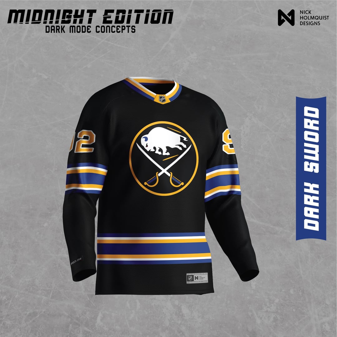
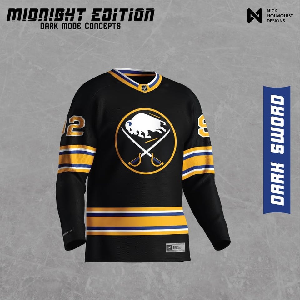
I decided to make a "dark mode" jersey for all NHL teams.
I'm mainly doing this for my benefit as a designer to learn more about how teams have constructed their jerseys, logos, and colors. This was a lot of fun and I hope you all enjoy!
I was also indecisive on what color to make more prominent so you got two 😅
by IslandTwig

11 Comments
Looks a whole lot like our 2010 jerseys. Midnight blue instead of royal. I think I speak for the whole fanbase when I say we prefer the current royal.
Having said that, the stripes may be sacrilege on the first picture, but I dig it for an alternate.
I like the idea. Though I think you need to differentiate it from the 2010s era jersey better. I feel like if you went entirely black, blue, and white that would be really interesting
I really like that first one, very nice
I’d like an all black and white kit even jersey and logo black and white that’d be clean
St Louis Sabres
I really like these!
A “dark mode” jersey is an interesting concept but there needs to be a bit more blue sticking around to keep the jersey unique to the team and even so in a lot of cases jerseys done in this style will end up looking more like another team that primarily uses black. The first jersey needs the blue field inside the logo to remain, the second has so little blue and the yellow stands out so much that it feels like a Bruins or Penguins jersey. Coupled with the fact that Buffalo has a black alternate jersey this would ultimately be a difficult concept to execute in a way that felt unique without losing the identity you are altering.
I’d love the first one if the logo remained blue
2nd one just looks like the Bruins jersey but with a Sabres crest.
Do you mean “Dark SWORD”?
Ooh that first one is nice
Bit more contrast seems needed
So much darkness