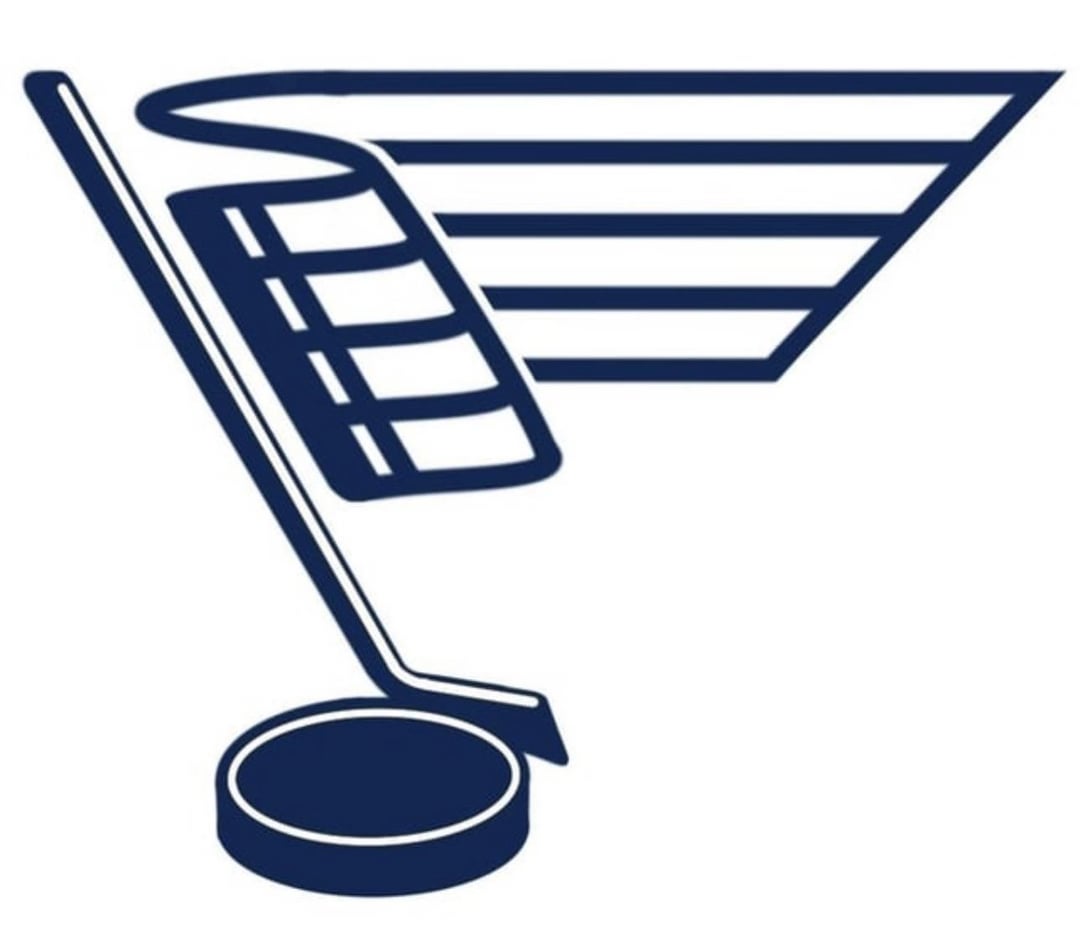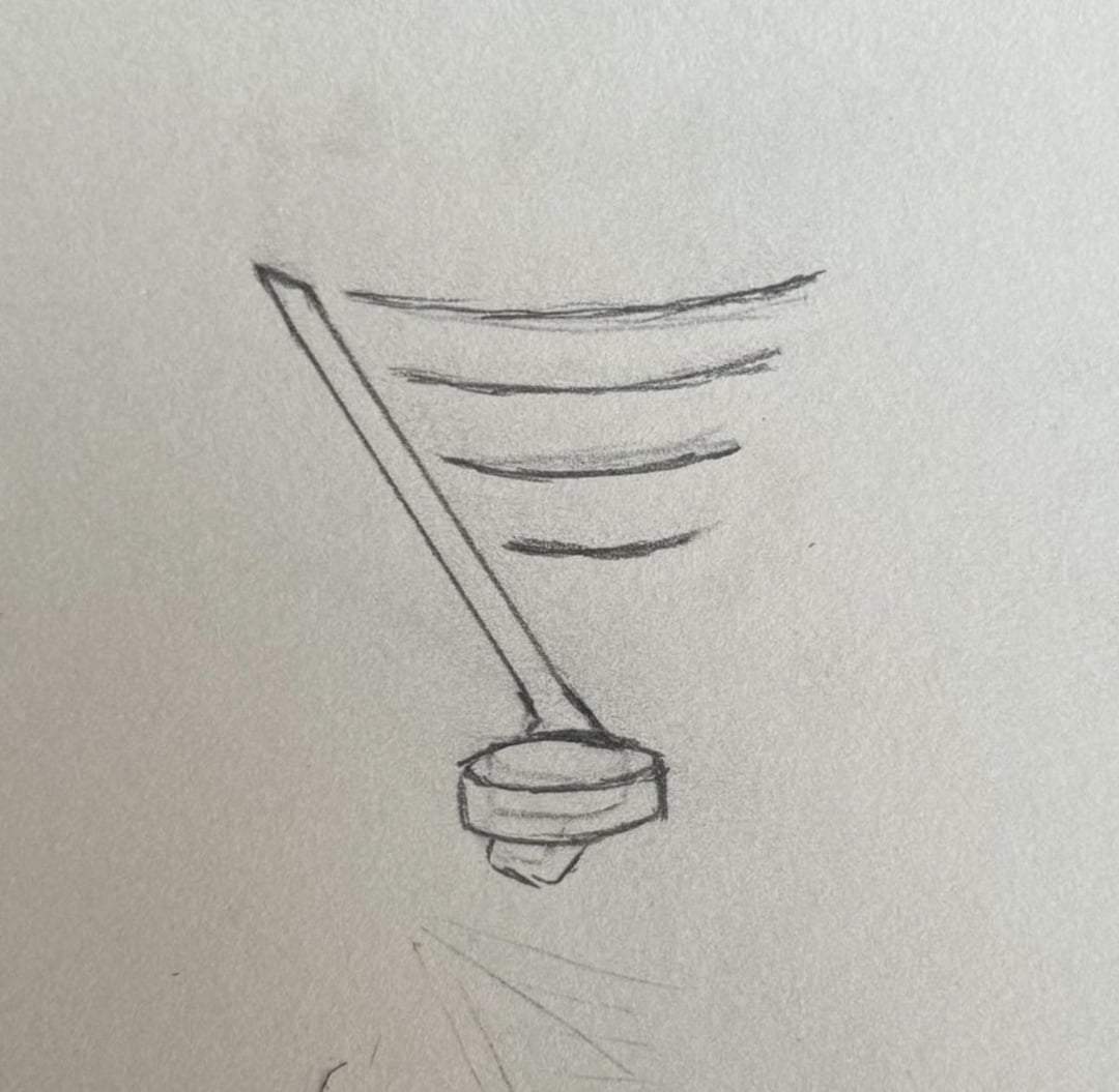


(Swipe to see the version prior to this, and swipe again for the original “lightbulb” idea sketch.)
Offseason boredom hit me hard, so I finally picked this back up after being stuck for a while.
I started by refocusing the design on the proportions of the heritage Bluenote. The “staff” is now shaped more like the actual winged note, which does a lot for the brand readability.
Next, I worked incessantly on the puck. Y’all suggested motion lines, which was definitely the right move. I went through several iterations before landing on something that looked good AND resembled the shape of the original note AND didn’t just look like the Canes logo, lmao.
Today, I revisited the stick. I was fond of the old design, but was really unpleased with the toe of the stick not fitting within the form-factor of the heritage note. After reading back through some suggestions, I saw someone recommend using a stick with a curved toe to meld into the shape a bit better. Running with that idea, I pulled up a 3D model of a stick and rotated it around until I found the right angle. I couldn’t be happier with the change!
After going with a slimmer stick design, I also decided to slim down the lines on the staff. IMO, it also reads better as a musical staff, since the actual staff lines on sheet music are pretty thin, and things like bar lines/repeat signs are more bold.
I think this is pretty close to final – but I should probably stop saying that in every post, lol. My next move is to find someone competent enough in Adobe Illustrator to vectorize this and fix any little proportion issues, dings, and dents. Hit me up if that sounds like you, and you’d be willing to hop on as a passion project!
Hoping to pitch this to the org… perhaps as a branding element, or perhaps just for licensed merch, but will go an alternate route (🏴☠️) for the fans if that doesn’t bring any fruit.
The season can’t get here soon enough. LGB!
by Sad-Perspective4702


6 Comments
It’s called the blue “note” for a reason
Honestly, the sketch looks a lot better to me than your final product. The sketch seems to embody the “note” part of the “blue note” a lot better while emphasizing the hockey tie in. The flags of the note shouldn’t be rendered as a staff.
I like it a lot! Creative take to replace the note flags with musical bars.
thumbnail looked like a shopping cart
As a fan, Id say don’t mess with perfection. As a graphic designer/educator by trade, I encourage conceptual thinking. So I’ll give my two cents.
Theres a lot to look into here. While the base sketch you have is not much, you can work with it nicely as a concept. That said. Taking it to a more refined version is where I think it’s losing its potential.
When we think of logos and branding as a whole, context is everything. Very seldomly you’ll want more dainty lines on something that wants to have impact or showcase a brand or an alternative to a brand. Unless we were going for something fancy like a fine dining restaurant or boutique store where script fonts and icons are often seen, generally it’s a good idea to be more bold. This includes both typography and lines/shapes in the actual logo. Since we aren’t talking typography at this point we only have a logo. So it’s easier to break down and see what we can change.
First thing I would look into is shape weight. The narrow lines are making it look too complicated. I’ve attached a quick sketch that takes your idea, and simplifies it with just that single adjustment, allowing the shapes to flow and speak for themselves.
https://preview.redd.it/frouubqiqdhd1.png?width=3024&format=png&auto=webp&s=69b5ff8d8a6a6f400d401218f9d935208a0075ba
The next issue you’re running into is the awkwardness that the stick and puck themselves are creating. There will always be an overlap that is causing issues and forcing you into a singular direction that doesn’t bode well with the added complexity already created by the line work. My initial above took it out completely. But I’ll post a secondary of an option I think could work for you as well.
You know, I don’t hate it. But I feel it takes away from the blue note thing. It’s no longer immediately recognizable as a music note at all. We as fans know what it is, but I feel like if you showed this to someone who’s not into hockey, they wouldn’t see a music note at all. Just a flag.
But, as a logo in general, I think its pretty neat.