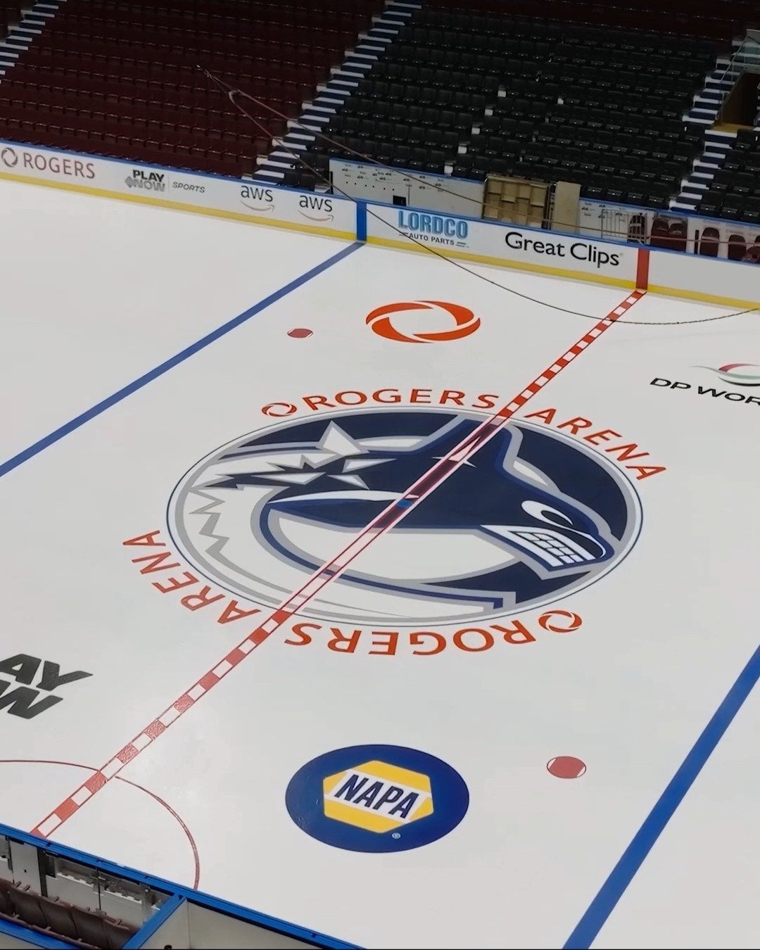
My immediate reaction is I don’t like it but I don’t hate it.
cbstyles_
Get’s a thumbs up from me. I’ve been wanting them to use the home logo colours for a while now.
Sea_Intern_4680
Kinda looks like the Jets logo in the back
thewinn
Still painting lines, kinda surprised at that wonder why they haven’t switched to freeze in decals.
StuckInHoleSendHelp
To me it looks like a graphic that got misaligned in InDesign
DishwasherFromSurrey
I like it. Unique.
scotts_tots_founder
It’s interesting. If I were critical of one thing it’s that the design might make the puck less visible on the TV in more of the center ice area (I’m sure it won’t make much difference for players on ice)
Edit: just googling some of the other logos with dark colours and I think my complaint is a big nothing burger
mudermarshmallows
Nice. Like that it emphasizes the blue a lot more, though the bottom left edge not having a blue border might take me a bit to get used to.
CamaroGirl96
Actually now that I’ve looked at it more I like it. The orca seems bigger and it fills the circle more. They are using the home jersey orca this time, so it makes sense they didn’t want to have the bottom of the logo just white with the outline.
I am curious though. I thought the redline had to be the red/white all the way through the logo. Here it isn’t and I really think it looks great, but I am wondering if this is the final product or they just took the pic before the redline was completed?
JW98_1
The only thing I don’t like about it is how the pattern for the red line isn’t for the whole line. A couple of other teams have done this, as well.
h_danielle
hey better question… where are the new black seats?!?!?!?!?!
Buffalorocks1
Nah
greenlamp12345
Probably just a coincidence cause of where the orca blocks the outside circle but it looks like they slapped a blue Rogers logo underneath the orca lol
CJK_420
It being off center kinda bothers me lol looks poorly done..
Zychotic
Felt jarring at first but I like having the home colours and cutting off the bottom kind of emphasizes the orca breaking out of the ice for me. I’m kind of digging it now.
seymourbuttz214
It’s good idea makes the logo bigger, I think the execution looks kinda meh. I say screw it and put the Skate logo for home opener or something. Oh wait they won’t do that, prob too pricey to change the logo at centre ice right, can’t use any of the record high prices for tickets being sold last and this season ffs
saucytopcheddar
You know what I hate about the orca logo? Whenever it’s by itself, it doesn’t match any of our colour schemes (blue/green, red/black/yellow or even blue/maroon).
If you see it on a blue t-shirt, the colour scheme looks like it belongs to the Leafs. You see it on a blue car flag, it looks like the Leafs.
Our centre ice logo doesn’t match any of our jerseys!!!
Nuck_1198
I don’t hate it cause its pretty clean, but the proportions are throwing it off for me, the bottom half being cutoff makes it look “incomplete” lol.
Maybe they should have kept the logo the same size as last year but include this border to fill out center ice better.
They could’ve replicated our practice jersey logos but with this colour pallette, sort of I guess?
It’s basically been the same orca layout since 1998 with the exception of 2011 and 2020 so it’s kinda nice to change it up a bit
HDXHayes
The outside circle comes from the skate logo if anyone is wondering why it looks familiar but can’t place it. It’s a nice touch.
Jaded-Ad-289
What’s the blue shaded part supposed to represent?
ImAnAfricanCanuck
I think it’s awesome.
metered-statement
Is there a side by side, past and present photo?
Bayne7096
Why not just a solid circle behind the logo? Seems odd to try and create a ring behind an enlarged logo… unless they have other ideas with the blue circle thing


25 Comments
I don’t know.
My immediate reaction is I don’t like it but I don’t hate it.
Get’s a thumbs up from me. I’ve been wanting them to use the home logo colours for a while now.
Kinda looks like the Jets logo in the back
Still painting lines, kinda surprised at that wonder why they haven’t switched to freeze in decals.
To me it looks like a graphic that got misaligned in InDesign
I like it. Unique.
It’s interesting. If I were critical of one thing it’s that the design might make the puck less visible on the TV in more of the center ice area (I’m sure it won’t make much difference for players on ice)
Edit: just googling some of the other logos with dark colours and I think my complaint is a big nothing burger
Nice. Like that it emphasizes the blue a lot more, though the bottom left edge not having a blue border might take me a bit to get used to.
Actually now that I’ve looked at it more I like it. The orca seems bigger and it fills the circle more. They are using the home jersey orca this time, so it makes sense they didn’t want to have the bottom of the logo just white with the outline.
I am curious though. I thought the redline had to be the red/white all the way through the logo. Here it isn’t and I really think it looks great, but I am wondering if this is the final product or they just took the pic before the redline was completed?
The only thing I don’t like about it is how the pattern for the red line isn’t for the whole line. A couple of other teams have done this, as well.
hey better question… where are the new black seats?!?!?!?!?!
Nah
Probably just a coincidence cause of where the orca blocks the outside circle but it looks like they slapped a blue Rogers logo underneath the orca lol
It being off center kinda bothers me lol looks poorly done..
Felt jarring at first but I like having the home colours and cutting off the bottom kind of emphasizes the orca breaking out of the ice for me. I’m kind of digging it now.
It’s good idea makes the logo bigger, I think the execution looks kinda meh. I say screw it and put the Skate logo for home opener or something. Oh wait they won’t do that, prob too pricey to change the logo at centre ice right, can’t use any of the record high prices for tickets being sold last and this season ffs
You know what I hate about the orca logo? Whenever it’s by itself, it doesn’t match any of our colour schemes (blue/green, red/black/yellow or even blue/maroon).
If you see it on a blue t-shirt, the colour scheme looks like it belongs to the Leafs. You see it on a blue car flag, it looks like the Leafs.
Our centre ice logo doesn’t match any of our jerseys!!!
I don’t hate it cause its pretty clean, but the proportions are throwing it off for me, the bottom half being cutoff makes it look “incomplete” lol.
Maybe they should have kept the logo the same size as last year but include this border to fill out center ice better.
They could’ve replicated our practice jersey logos but with this colour pallette, sort of I guess?
Like this: [https://vanbase.ca/cdn/shop/files/jersey-7.png?v=1719442121](https://vanbase.ca/cdn/shop/files/jersey-7.png?v=1719442121)
It’s basically been the same orca layout since 1998 with the exception of 2011 and 2020 so it’s kinda nice to change it up a bit
The outside circle comes from the skate logo if anyone is wondering why it looks familiar but can’t place it. It’s a nice touch.
What’s the blue shaded part supposed to represent?
I think it’s awesome.
Is there a side by side, past and present photo?
Why not just a solid circle behind the logo? Seems odd to try and create a ring behind an enlarged logo… unless they have other ideas with the blue circle thing
Gets me excited for the new season.