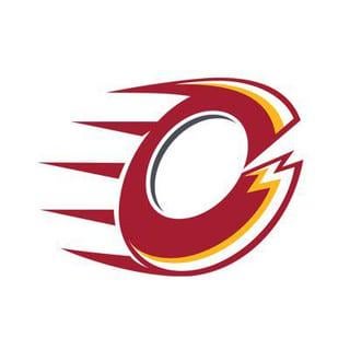
Someone in another thread said “if the Flames and Cavaliers had a baby” and now I can’t unsee it
ActionKestrel
Is it suppose to be a wheel?
Sammybeaver88
Just take a took at the merch as well, all red and yellow with hints of white. Wonder where that’s from….
ThespennyYo
These names are pretty bad.
forty6andto
That is just awful
Unuhpropriate
Send them a cease and desist.
Next week they’ll be the Ottawa Calgarys.
Nikademis
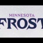
I think all the logos are mid at best. Boston is probably the best of them, followed by Minnesota and Toronto. Ottawa is the most scuffed-ass wish Flames knockoff
Maleficent-Comfort-2
Ottawa Calgary Flames
(Stolen from another thread)
MTBguy1774
Holy. Did every one of these organizations put down fortnite late last night and then remembered the home work assignment from a year ago was due in the morning? Maybe the Frost and their logo get a passing grade, but barely.
TL10
Graphic Design is my Passion.
Cannabis-Revolution
I have this logo on my fridge. My toddler made it for the flames


12 Comments
Immediately reminded of Mangiapane’s logo design
Someone in another thread said “if the Flames and Cavaliers had a baby” and now I can’t unsee it
Is it suppose to be a wheel?
Just take a took at the merch as well, all red and yellow with hints of white. Wonder where that’s from….
These names are pretty bad.
That is just awful
Send them a cease and desist.
Next week they’ll be the Ottawa Calgarys.
I think all the logos are mid at best. Boston is probably the best of them, followed by Minnesota and Toronto. Ottawa is the most scuffed-ass wish Flames knockoff
Ottawa Calgary Flames
(Stolen from another thread)
Holy. Did every one of these organizations put down fortnite late last night and then remembered the home work assignment from a year ago was due in the morning? Maybe the Frost and their logo get a passing grade, but barely.
Graphic Design is my Passion.
I have this logo on my fridge. My toddler made it for the flames