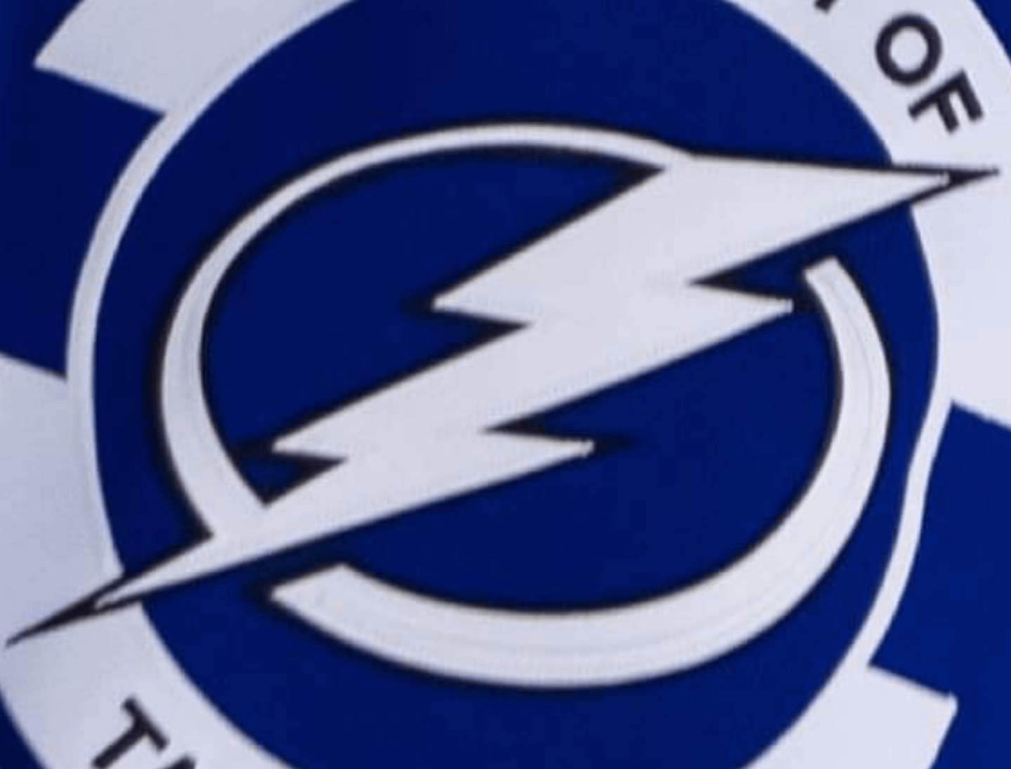
I like the look of the main logo with the black outline.by TheDJStrong Atlantic DivisionEastern ConferenceTampa Bay Lightning Prev Post Man Do They Ever Need This… September 26, 2024 Next Post Your weekly /r/predators roundup for the week of September 19 – September 25, 2024 September 26, 2024 4 Comments FUPaladin11 3 days ago It’s sharp.The nerd in me wants this cell shaded now. Allen_Koholic 3 days ago I maintain that the current uniform set would look so. much. better. if they added small black accent lines to the stripes. jfleegs 3 days ago They just need make our primaries black and add silver pipping to the logo and stripes. IAmKingDaddio 3 days ago I love the black thirds. Would like to see those become primary, or go with a black primary with blue accents of our main designWrite A CommentYou must be logged in to post a comment.
Allen_Koholic 3 days ago I maintain that the current uniform set would look so. much. better. if they added small black accent lines to the stripes.
jfleegs 3 days ago They just need make our primaries black and add silver pipping to the logo and stripes.
IAmKingDaddio 3 days ago I love the black thirds. Would like to see those become primary, or go with a black primary with blue accents of our main design


4 Comments
It’s sharp.
The nerd in me wants this cell shaded now.
I maintain that the current uniform set would look so. much. better. if they added small black accent lines to the stripes.
They just need make our primaries black and add silver pipping to the logo and stripes.
I love the black thirds. Would like to see those become primary, or go with a black primary with blue accents of our main design