The flyers can’t afford to change their logo. It’s to ingrained. Nothing will ever replace it.
RepresentativeAir735
I think the team needs to be sold as soon as possible.
DastardlyRidleylash
If it’s not going back to the 90’s design, it’s not worth changing for. The Flyers’ look is too iconic to fuck with it, and it’ll get utterly obliterated if it’s not as good as either of the fan-favourite looks.
Also, why the hell would you change the jerseys *while the team sucks*? That’s Rebrand 101; you change when you *come out* of a rebuild, not *during* the shit part.
Perryplat199
The last time the flyers did a real full redesign we got the ugly reebok whatever’s that only lasted 3 years. I have zero expectations and am prepared to be disappointed. Sigh.
Edit: actuly I do have 1 small unwanted expectation. probably good chancethey go back to primary black.
NSOS_throwaway
Biggest miss the flyers ever had was not making their winter classics the standard home uniform. Best jerseys they ever had. Everything they’ve come up with recently looks pretty bad IMO
smbiggy
i want those t shirts that have naked bodies with bikinis but with gritty
rossdowdell
The different colored nameplate is clumpy. I’ve never liked it.
The font for the numbers has remained the same forever. Don’t change that.
This is putting lipstick on a pig. Dressing up a team differently is a mental diversion. Win games and no one will like or dislike the sweater the players wear more or less.
Stonetoothed
🤞🏻2012 Winter Classic inspired🤞🏻
Anthemz
Go back to our black home jerseys from the late 90’s/early 2000’s you cowards!
FlyersTime
Just put the Comcast logo on the jersey and finish this stupid fucking franchise off.
vinny8244
They need to go back to the 90s jerseys. The reverse retros last year were sick too they should have kept them as an alternate.
Micksar
Whatever they do… I just hope they get rid of the highlighter orange.
Ok_Orchid7131
For me the pinnacle would be the late 90’s Black Jersey and the 2012 Winter classic jersey. The current white one is fine, or the Throwback inspired ones right before the current ones.
Dental_Hygene433
Lfg, that is so hype. Yeah, it’s prolly gonna be worse, but it will at least extend our very limited jersey history for a mediocre team.
jonnorc
I have my doubts given the state of the organization these days, but I wouldnt mind adding a secondary logo to a potential new third jersey. I like that we are one of the few teams that just have a primary logo, but for a third jersey it would be a nice change.
Roll-Me-Through
K.I.S.S.
emjayar08
At least give us a shoulder patch or some sort of branding expansion. We have to be the only team with just one logo. One great logo at that.
well-oiled_machine
The Teal that was promised.
ykcin978
Could distract the playoff hopeful crowd for another year
Phillysean23
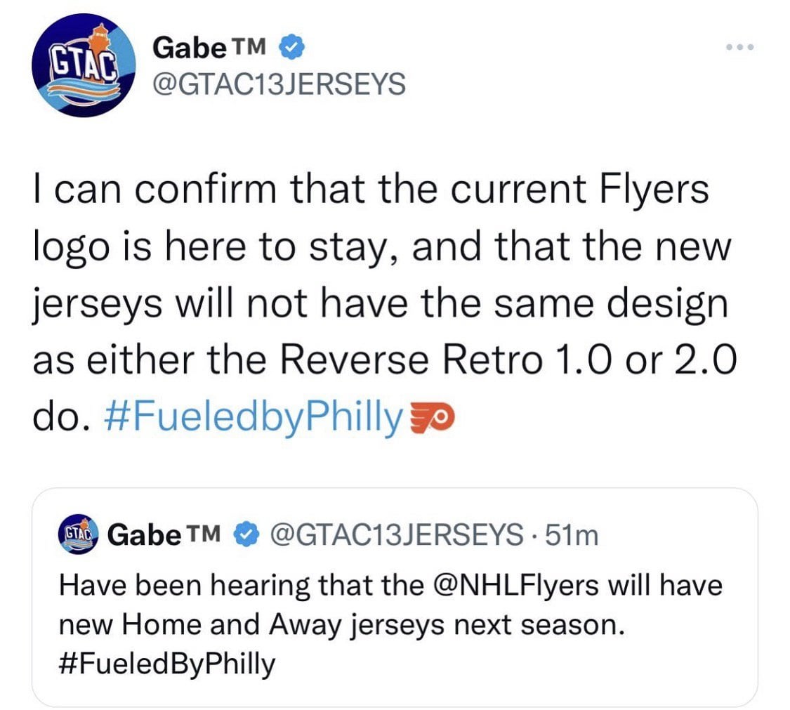
So the old logo is in? Everyone laughed at the new New Jersey jersey jersey but fuck at least that makes their jerseys look different. They’ve won more cups than have had logos
lilbismyfriend21
Comcast spectacor is so out of touch it wouldn’t shock me if they came out with a new logo. So I am happy with this
FighterFoos23
Love it. Hoping we get something like the 2012 Winter Classic. Otherwise go back to the Lindros era jerseys.
thegoodnamesrgone123
Changing the jerseys, maybe throwing ads on them while playing like ass. I think the decision makers are getting off on making us hate them.
msivoryishort
looks like the giroux era is going to match up exactly with the traffic cone jersey era, which seems fitting


24 Comments
The flyers can’t afford to change their logo. It’s to ingrained. Nothing will ever replace it.
I think the team needs to be sold as soon as possible.
If it’s not going back to the 90’s design, it’s not worth changing for. The Flyers’ look is too iconic to fuck with it, and it’ll get utterly obliterated if it’s not as good as either of the fan-favourite looks.
Also, why the hell would you change the jerseys *while the team sucks*? That’s Rebrand 101; you change when you *come out* of a rebuild, not *during* the shit part.
The last time the flyers did a real full redesign we got the ugly reebok whatever’s that only lasted 3 years. I have zero expectations and am prepared to be disappointed. Sigh.
Edit: actuly I do have 1 small unwanted expectation. probably good chancethey go back to primary black.
Biggest miss the flyers ever had was not making their winter classics the standard home uniform. Best jerseys they ever had. Everything they’ve come up with recently looks pretty bad IMO
i want those t shirts that have naked bodies with bikinis but with gritty
The different colored nameplate is clumpy. I’ve never liked it.
The font for the numbers has remained the same forever. Don’t change that.
This is putting lipstick on a pig. Dressing up a team differently is a mental diversion. Win games and no one will like or dislike the sweater the players wear more or less.
🤞🏻2012 Winter Classic inspired🤞🏻
Go back to our black home jerseys from the late 90’s/early 2000’s you cowards!
Just put the Comcast logo on the jersey and finish this stupid fucking franchise off.
They need to go back to the 90s jerseys. The reverse retros last year were sick too they should have kept them as an alternate.
Whatever they do… I just hope they get rid of the highlighter orange.
For me the pinnacle would be the late 90’s Black Jersey and the 2012 Winter classic jersey. The current white one is fine, or the Throwback inspired ones right before the current ones.
Lfg, that is so hype. Yeah, it’s prolly gonna be worse, but it will at least extend our very limited jersey history for a mediocre team.
I have my doubts given the state of the organization these days, but I wouldnt mind adding a secondary logo to a potential new third jersey. I like that we are one of the few teams that just have a primary logo, but for a third jersey it would be a nice change.
K.I.S.S.
At least give us a shoulder patch or some sort of branding expansion. We have to be the only team with just one logo. One great logo at that.
The Teal that was promised.
Could distract the playoff hopeful crowd for another year
So the old logo is in? Everyone laughed at the new New Jersey jersey jersey but fuck at least that makes their jerseys look different. They’ve won more cups than have had logos
Comcast spectacor is so out of touch it wouldn’t shock me if they came out with a new logo. So I am happy with this
Love it. Hoping we get something like the 2012 Winter Classic. Otherwise go back to the Lindros era jerseys.
Changing the jerseys, maybe throwing ads on them while playing like ass. I think the decision makers are getting off on making us hate them.
looks like the giroux era is going to match up exactly with the traffic cone jersey era, which seems fitting