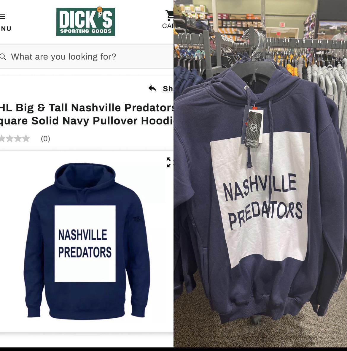
Its for the fans that dont like saber toothed tigers
majorBotHead
Hilariously bad
peedge0419
That’s all it takes to work in fashion design these days?
MiltonFludgecow
Looks like it belongs to the Lightning it’s so bland and boring.
TheKrowDontFly
It’s possibly an improvement over most of their merch, TBH. I used to joke about any game the Blues played that it was “ugly sweater night”, but the predators have long since eclipsed St Louis ever deserving jokes like that.
Your downvotes are the tears that water my garden of chaotic truth.
computalgleech
I maintain that it had to have been a placeholder image that accidentally got sent through to be made. What kills me is that the “Nashville” isn’t even centered over the “Predators” lmao.
I bought one
smartbaddie
I would unironically buy this. Speaking as a NYR fan. Lmao this is weirdly hilarious
Interesting_Fly_9701
I like it
DeadCatsBouncing
This is why I am on Reddit. God bless you.
ENFJPLinguaphile
At least put the logo on the design for clarity’s sake!!


10 Comments
Its for the fans that dont like saber toothed tigers
Hilariously bad
That’s all it takes to work in fashion design these days?
Looks like it belongs to the Lightning it’s so bland and boring.
It’s possibly an improvement over most of their merch, TBH. I used to joke about any game the Blues played that it was “ugly sweater night”, but the predators have long since eclipsed St Louis ever deserving jokes like that.
Your downvotes are the tears that water my garden of chaotic truth.
I maintain that it had to have been a placeholder image that accidentally got sent through to be made. What kills me is that the “Nashville” isn’t even centered over the “Predators” lmao.
I bought one
I would unironically buy this. Speaking as a NYR fan. Lmao this is weirdly hilarious
I like it
This is why I am on Reddit. God bless you.
At least put the logo on the design for clarity’s sake!!
Nashville
(Team Logo)
Predators
For example.