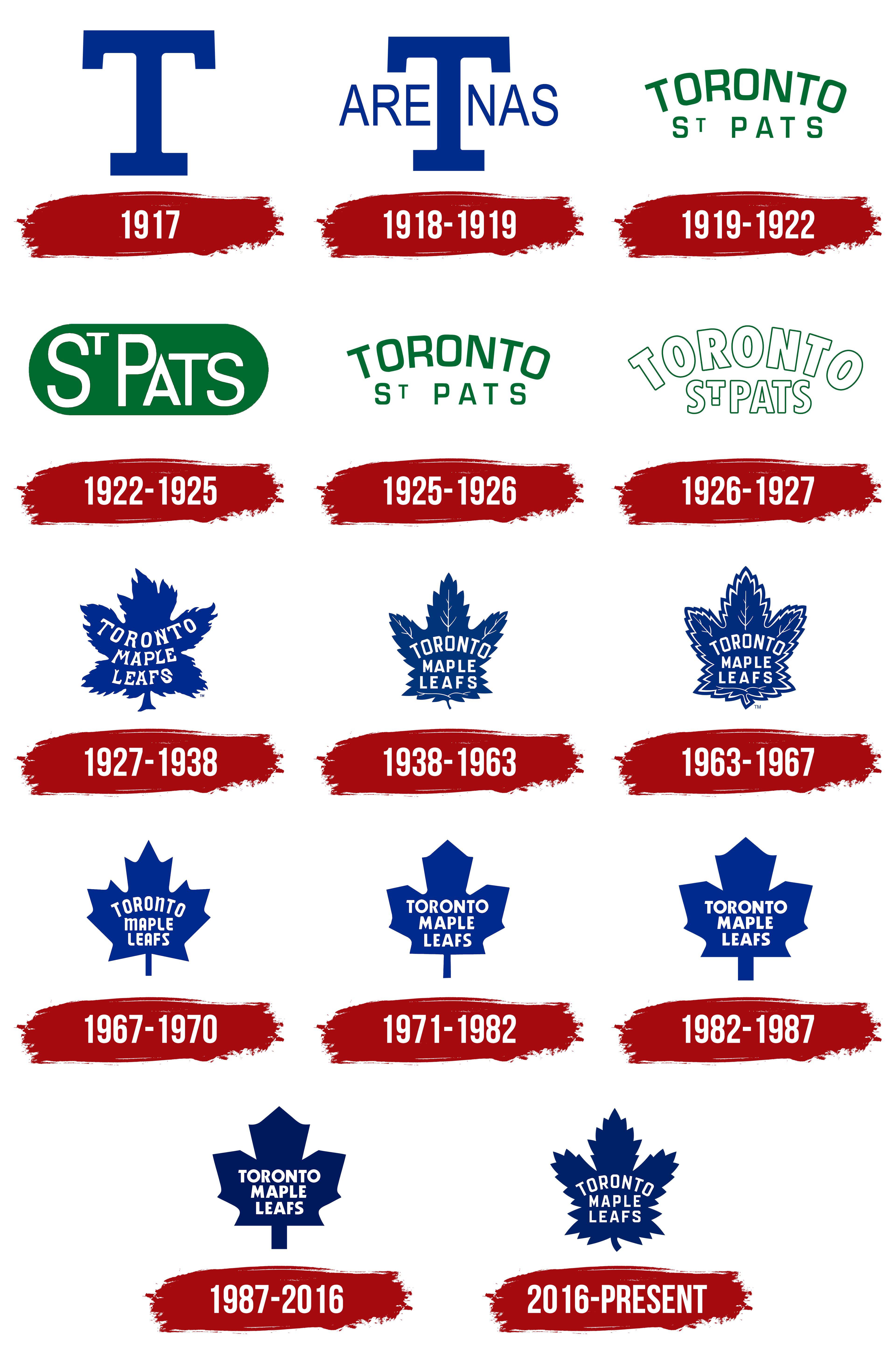
The one that Matthews and Marner wear! Maybe the two best Leafs ever
Rowdy_Roddy96
63/67 is absolutely classic and iconic. Honestly I wish they added that same border to our current logo and make our jerseys like the Sundin Era 3rds from the early 2000s would be lovely
wildriles
Someone in another thread describes 1927-38 as “season one Simpsons”…. They so nailed that lol
MaddVentures_YT
Obviously 63-67, but I do like the hidden stuff within the current logo
Experttom
I hate them all now
Lightz29
Idk if it’s weird for me to say 27-38
Jmac24mats13
63-67 all day. Goes along with my favorite Leafs jersey as well, the alternate one they wore in the 2000s
MoneyIsntRealGeorge
Latest by far
layers_of_grey
love what they did in ’87. i bet there were consultants.
GopnikSmegmaBBQSauce
1917, when we still thought smoking was healthy
ltDoBeLikeThat_
63-67 and 16-XX
DaltonFitz
63-67, I loved when we used it on alternates.
bigcaulkcharisma
63-67 with 27-38 in a close second
HowieFeltersnitz
Purely from a design and aesthetics standpoint, the current logo is the best imo. However the vibes it gives me can only be described as pain.
GloriousMacMan
1927 – present. Just love that blue Maple Leaf!!
MittsMarner
It didn’t make this list, but the 45-48 white logo with red text is awful, but also a great piece of trivia.


35 Comments
Current for sure. Best of all worlds.
Current by far
63-67
I’m an AreTnas man myself.
Current.
The 63-67 logo is also beautiful, and of the “cookie cutter” leaf logos the 67-70 is the best.
I like the current one
It’s not even a competition … the 63-67 is one of the best logos of the entire NHL existence.
I wish they would make it our third jersey again.
I’ve always loved that ‘67-‘70 one.
This may be a hot take but I gotta go with 27-38.
I like the weird energy of 27-38
I can never get past the fact the 1927 logo looks like a drunk toddler drew it.
Current one.
Wtf is wrong with the 27-38? Also the late 80s us best.
I like 38-63
T
The new one is missing the leaf veins. That’s the best version.
https://en.m.wikipedia.org/wiki/Toronto_Maple_Leafs#/media/File%3AToronto_Maple_Leafs_2016_logo.svg
63-67 is the the true logo. Honorable mention to 67-70 and current logo. And Ballard can rot in hell with his logo.
[I’m sorry, but where is the 1927 Green Leaf?](http://m.nhluniforms.com/MapleLeafs/MapleLeafs08.html)
87-16
The one that Matthews and Marner wear! Maybe the two best Leafs ever
63/67 is absolutely classic and iconic. Honestly I wish they added that same border to our current logo and make our jerseys like the Sundin Era 3rds from the early 2000s would be lovely
Someone in another thread describes 1927-38 as “season one Simpsons”…. They so nailed that lol
Obviously 63-67, but I do like the hidden stuff within the current logo
I hate them all now
Idk if it’s weird for me to say 27-38
63-67 all day. Goes along with my favorite Leafs jersey as well, the alternate one they wore in the 2000s
Latest by far
love what they did in ’87. i bet there were consultants.
1917, when we still thought smoking was healthy
63-67 and 16-XX
63-67, I loved when we used it on alternates.
63-67 with 27-38 in a close second
Purely from a design and aesthetics standpoint, the current logo is the best imo. However the vibes it gives me can only be described as pain.
1927 – present. Just love that blue Maple Leaf!!
It didn’t make this list, but the 45-48 white logo with red text is awful, but also a great piece of trivia.