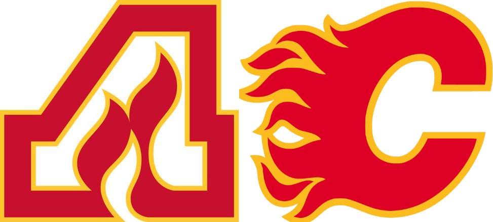
What makes me mad is that they use the Atlanta A for the assistant captain’s A and not a little flames C for the captain. Blown opportunity to be awesome.
Top-Sympathy-9414
C
a_qualified_expert
Either way, each respective logo should be used for the “A” or “C” patch
Parka_lad
Whoever came up with a name like the Flames was a f*cking genius
BitterDecoction
None. The C is better.
JustStayHumble
C
DragLongjumping3714
C
42northside
Calgary
Shiny_Mew76
The C is the best, but i love how they use the A for their alternative captains.
I’d prefer they never do, but if the Flames ever had to relocate to a city that doesn’t start with a C, they should use the Atlanta Logo for Alt Captains, and the C for the Captain.
DevilJacket2000
I never liked the fact they had a black C for a while. Red hot C and a white hot C just made sense.
jigglywigglydigaby
As much as I can’t stand the Flames, both these logos are some of the best the league has ever seen. Just great designs imo
ogfuelbone12
Atlanta for me
Clean_Priority_4651
Same logo and concept, just different letters. That C looks more vicious.
Ketachloride
Atlanta is *dramatically* better
Ancient_A
The A
OrangeAdenaline
A
99titan
I went to games at the Omni as kid with the A logo on my kid jersey. I’m kinda partial to it.
seniorcadman
A
DLoadingisGOAT
they’re both fire imo
Terrible_Nail4145
The c is better. More dynamic and bolder color. Has more symmetry. The flames read better too.
origamimissile
Both are fire
CitizenNaab
The Flames
Flanny709
C!
Tkachuks-Mouthguard
C
Legacy_1_X
The C is better.
MoneyKilla25
What’s funny is that Alberta had wild fires and Calgary Flames just picked the perfect team name and logo 🔥🔥🔥🔥🔥🔥🔥🔥
itsMurphDogg
Thought that was the Arby’s logo lol
Fridayfreeday
Nothing wrong with the A, it’s actually kind of lit (hehe) but the flaming C is better in my opinion
Maximum_Badger5604
C is better
Vinniebahl
The original Atlanta
Lopajsgelf
The A imo
lolololololokj
I like the flames logo better
Slyarroyo
The C
peaceandloved
Atlanta and it’s not even close ….. iconic.
MochiSauce101
The c wins
ckow31
C forsure
TheBonePoet
Calgary.
stinkybunger
C
nickypoopoo69
As a Canucks fan in Calgary, both make me sick
HostileSkittles
I mean, the Atlanta Flames logo makes more sense to begin with because the inspiration for the name was General Sherman’s “March to the Sea” when he burned down half the state of Georgia. There aren’t many places in the world that make me think LESS of flames than Calgary.


47 Comments
I like the C.
The C no question it just kinda pops more
C of red.. or a of gaaaaaaaayyyyyyyy /s
A
A
Atlanta
What makes me mad is that they use the Atlanta A for the assistant captain’s A and not a little flames C for the captain. Blown opportunity to be awesome.
C
Either way, each respective logo should be used for the “A” or “C” patch
Whoever came up with a name like the Flames was a f*cking genius
None. The C is better.
C
C
Calgary
The C is the best, but i love how they use the A for their alternative captains.
I’d prefer they never do, but if the Flames ever had to relocate to a city that doesn’t start with a C, they should use the Atlanta Logo for Alt Captains, and the C for the Captain.
I never liked the fact they had a black C for a while. Red hot C and a white hot C just made sense.
As much as I can’t stand the Flames, both these logos are some of the best the league has ever seen. Just great designs imo
Atlanta for me
Same logo and concept, just different letters. That C looks more vicious.
Atlanta is *dramatically* better
The A
A
I went to games at the Omni as kid with the A logo on my kid jersey. I’m kinda partial to it.
A
they’re both fire imo
The c is better. More dynamic and bolder color. Has more symmetry. The flames read better too.
Both are fire
The Flames
C!
C
The C is better.
What’s funny is that Alberta had wild fires and Calgary Flames just picked the perfect team name and logo 🔥🔥🔥🔥🔥🔥🔥🔥
Thought that was the Arby’s logo lol
Nothing wrong with the A, it’s actually kind of lit (hehe) but the flaming C is better in my opinion
C is better
The original Atlanta
The A imo
I like the flames logo better
The C
Atlanta and it’s not even close ….. iconic.
The c wins
C forsure
Calgary.
C
As a Canucks fan in Calgary, both make me sick
I mean, the Atlanta Flames logo makes more sense to begin with because the inspiration for the name was General Sherman’s “March to the Sea” when he burned down half the state of Georgia. There aren’t many places in the world that make me think LESS of flames than Calgary.
The C and it’s not even close