I’m a graphic and sports designer creating a series of new / revised jersey sets for each NHL team. If you’re interested in seeing the rest of the designs, they can be found on my Reddit and Instagram pages. I appreciate all feedback, so let me know what you think! Hope you enjoy it.
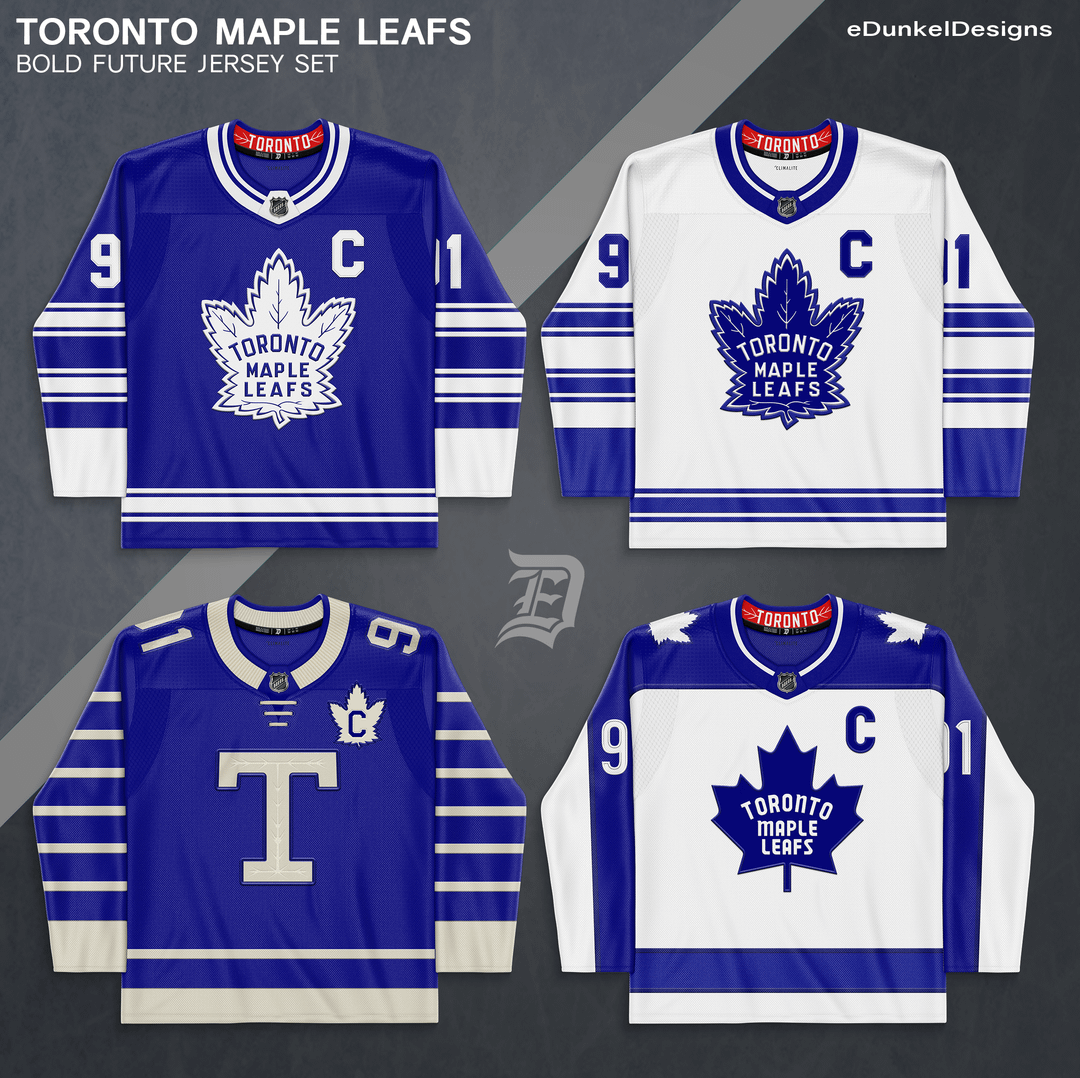
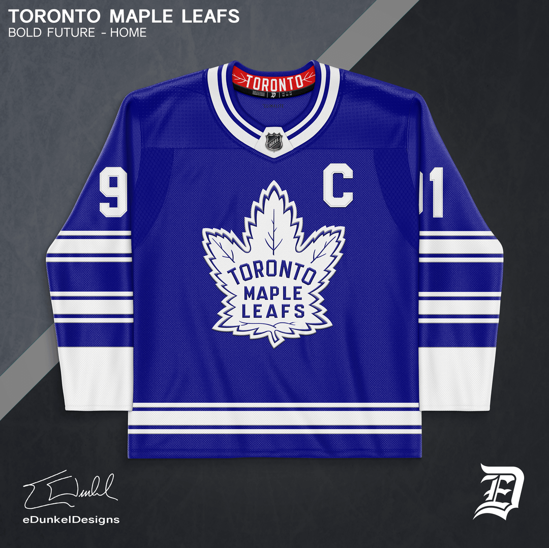
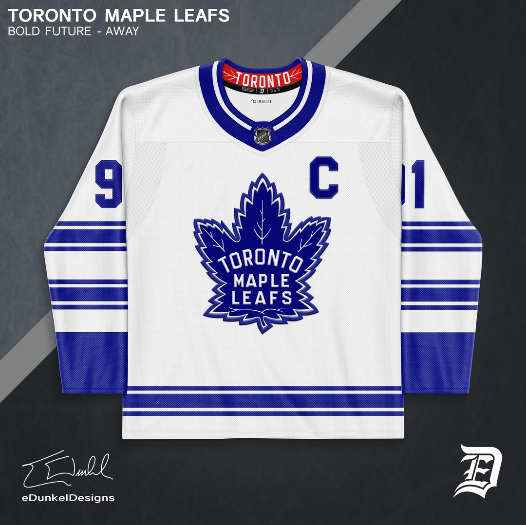
Being an Original 6 team, the Leafs haven’t had much deviation in their uniforms. However, the team still has a lot of rich history to be expressed in their uniforms.
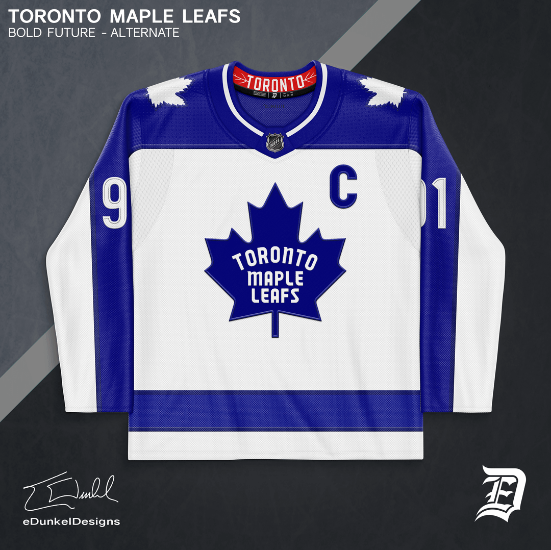
The Home and Away uniforms are a culmination of the team’s century of history. I originally got the idea for this jersey pattern when I did my Color Rush series 3+ years ago. The jerseys combine aspects from their current uniforms (the striping positioning), their original blue uniforms from 1927 (the stripes themselves), and their 1960’s uniforms (the colored cuffs and collars). Red is present in the collar representing the 1940’s era dynasty which featured the logo’s wordmark in red. All these elements represent the most successful periods of Leafs hockey.
The first alternate is a Toronto Arenas throwback. It features bar laces to reflect the stripe patterns, a classic cream colored sweater knit collar, and a subtle leaf design in the “T” logo.
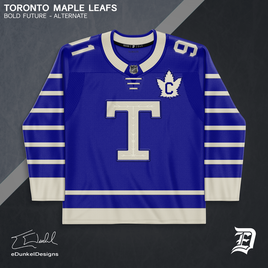
The second alternate is a controversial jersey due to the team’s poor play during it’s original era of the 1970’s. However, it’s an incredibly clean and bold design. The Maple Leafs need to push through a lot of adversity this coming season. Might as well prove the doubters wrong in a “cursed” jersey.
Ok_Economics_8202
All 4 are the greatest leaf jerseys I’ve ever seen
swint6996
These are gorgeous. Don’t know what everybody else thinks but I would GLADLY welcome a subtle redesign based on some of the past gems worn by the Leafs (Sundin era alternate especially).
Send these ideas to the Leafs ASAP!!!!!
KrugsDukeHut
These are beautiful! Nice work!
jessicajewls
Amazing, the captains patch on the heritage is genius
reevthetree
Nice work dude. Heritage captain patch is brilliant. 9.99/10. The 0.01 is because I selfishly want blue shoulders back on the whites. The large blue collar is a solid compromise though.
lou_reed_ketamine
Really hope to see the fuzzy leaf back at some point.
JamesCurtis24
Only thing I’d say is ditch the red. I know it’s maybe a call back to the very early Leaf logo, but it just doesn’t mesh for me. Maybe try green. Give it the St. Pats touch.
The_Quackening
These are amazing.
I really love the blue shoulders on the white jersey
freakypsycho
I’d be so happy if we had these
VanAgain
I’ll make the usual grumbling noises about the Ballard logo, but gotta admit it’s clean af.


11 Comments
I’m a graphic and sports designer creating a series of new / revised jersey sets for each NHL team. If you’re interested in seeing the rest of the designs, they can be found on my Reddit and Instagram pages. I appreciate all feedback, so let me know what you think! Hope you enjoy it.
Being an Original 6 team, the Leafs haven’t had much deviation in their uniforms. However, the team still has a lot of rich history to be expressed in their uniforms.
The Home and Away uniforms are a culmination of the team’s century of history. I originally got the idea for this jersey pattern when I did my Color Rush series 3+ years ago. The jerseys combine aspects from their current uniforms (the striping positioning), their original blue uniforms from 1927 (the stripes themselves), and their 1960’s uniforms (the colored cuffs and collars). Red is present in the collar representing the 1940’s era dynasty which featured the logo’s wordmark in red. All these elements represent the most successful periods of Leafs hockey.
The first alternate is a Toronto Arenas throwback. It features bar laces to reflect the stripe patterns, a classic cream colored sweater knit collar, and a subtle leaf design in the “T” logo.
The second alternate is a controversial jersey due to the team’s poor play during it’s original era of the 1970’s. However, it’s an incredibly clean and bold design. The Maple Leafs need to push through a lot of adversity this coming season. Might as well prove the doubters wrong in a “cursed” jersey.
All 4 are the greatest leaf jerseys I’ve ever seen
These are gorgeous. Don’t know what everybody else thinks but I would GLADLY welcome a subtle redesign based on some of the past gems worn by the Leafs (Sundin era alternate especially).
Send these ideas to the Leafs ASAP!!!!!
These are beautiful! Nice work!
Amazing, the captains patch on the heritage is genius
Nice work dude. Heritage captain patch is brilliant. 9.99/10. The 0.01 is because I selfishly want blue shoulders back on the whites. The large blue collar is a solid compromise though.
Really hope to see the fuzzy leaf back at some point.
Only thing I’d say is ditch the red. I know it’s maybe a call back to the very early Leaf logo, but it just doesn’t mesh for me. Maybe try green. Give it the St. Pats touch.
These are amazing.
I really love the blue shoulders on the white jersey
I’d be so happy if we had these
I’ll make the usual grumbling noises about the Ballard logo, but gotta admit it’s clean af.