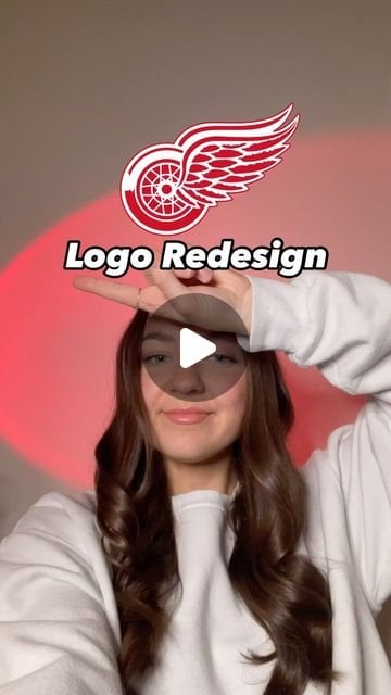
Love everything except it can’t face the wrong way.. my brain is rejecting it because of that.
SauceHankRedemption
Nice concept for sure but when comparing to the best logo in sports, it’s just always gonna fall short
kudjan89
I like it, I don’t want it to be used, but I like it!
jasonstcool
I might boycott the wings if they ever did something like this
toughs1331
Hard pass
PitifulPossum
Seems like blasphemy but its cool
snboarder42
I dont hate it. Its not better, but I don’t hate it. Which is about the highest level you can get from fans haha
JohnWad
Why try and re-design a legendary logo? No.
magikarp-sushi
The wing is too simplified and it’s facing the wrong way.
I’ve seen worse
kingpinnn
Don’t freaking touch it
AlwaysForeword
Meh. Don’t mess with a good thing
Xavias
Ya don’t mess with the winged wheel.
poopiehands
Redwings from Temu
TrellyFPV
Boy the people here did not pass the vibe test lol acting like this is an official logo replacement application
Tiamats_Wrath
It’s a fun take on the design, but I still prefer keeping it simple with a wing and a wheel.
Goatwhatsup
It’s just too perfect as it is. Like, it’s a winged wheel, but I see it as one piece, if that makes sense.
AFreePeacock
Better than I was expecting but
No
LtDouble-Yefreitor
I actually really like this a lot. I don’t want it on the sweater, but I’d buy the hell out of a t-shirt or hat with this on it.
CamouflageGoose
I like it. Would be a cool outdoor game jersey
TurdFerguson_PhD
Is it kind of neat? Sure.
Would I throw an absolute fit and possibly get violent if anyone ever touches our logo? Yes. Absolutely.
ceedeereddit1
Typically am a big fan of her logos, but this one isnt it. Its hard to redesign a clssic. Interesting concept tho.
No-Acanthaceae-8196
Touching our logo is like trying to remake citizen Kane or Casablanca. Your heart might be in the right place, and you can have noteworthy talent, but you’re always going to fall short of the original
ajr6
I’m glad they had fun designing that….Now throw it away
MakeItTrizzle
100% certified garbage. Like repainting the Sistine Chapel.
YoTrumpBeBuddDwyer
It’s really fucking stupid. Just, no.
PoopSlinger23
Thanks, I hate it. Our logo needs zero updates.
cowboycoffeepictures
fun, but no thanks.
Snowmins
I think most of this accounts redesigns are trash, this is no different lol.
RJazz909
I don’t hate it but it doesn’t top the Winged Wheel
With all the beautiful details in the og logo, this new one just feels a little too on the bare side for me


30 Comments
Love everything except it can’t face the wrong way.. my brain is rejecting it because of that.
Nice concept for sure but when comparing to the best logo in sports, it’s just always gonna fall short
I like it, I don’t want it to be used, but I like it!
I might boycott the wings if they ever did something like this
Hard pass
Seems like blasphemy but its cool
I dont hate it. Its not better, but I don’t hate it. Which is about the highest level you can get from fans haha
Why try and re-design a legendary logo? No.
The wing is too simplified and it’s facing the wrong way.
I’ve seen worse
Don’t freaking touch it
Meh. Don’t mess with a good thing
Ya don’t mess with the winged wheel.
Redwings from Temu
Boy the people here did not pass the vibe test lol acting like this is an official logo replacement application
It’s a fun take on the design, but I still prefer keeping it simple with a wing and a wheel.
It’s just too perfect as it is. Like, it’s a winged wheel, but I see it as one piece, if that makes sense.
Better than I was expecting but
No
I actually really like this a lot. I don’t want it on the sweater, but I’d buy the hell out of a t-shirt or hat with this on it.
I like it. Would be a cool outdoor game jersey
Is it kind of neat? Sure.
Would I throw an absolute fit and possibly get violent if anyone ever touches our logo? Yes. Absolutely.
Typically am a big fan of her logos, but this one isnt it. Its hard to redesign a clssic. Interesting concept tho.
Touching our logo is like trying to remake citizen Kane or Casablanca. Your heart might be in the right place, and you can have noteworthy talent, but you’re always going to fall short of the original
I’m glad they had fun designing that….Now throw it away
100% certified garbage. Like repainting the Sistine Chapel.
It’s really fucking stupid. Just, no.
Thanks, I hate it. Our logo needs zero updates.
fun, but no thanks.
I think most of this accounts redesigns are trash, this is no different lol.
I don’t hate it but it doesn’t top the Winged Wheel
With all the beautiful details in the og logo, this new one just feels a little too on the bare side for me
Looks like a shitty Lacrosse logo. No.