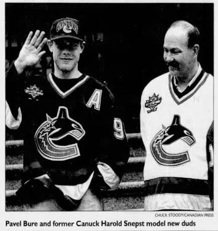
https://x.com/mikecommito/status/1797653216475447690?s=46&t=K0NiKZfgCBVUfeygnWCh-g
What was everyone’s initial reaction to the redesign?
by sam4999

https://x.com/mikecommito/status/1797653216475447690?s=46&t=K0NiKZfgCBVUfeygnWCh-g
What was everyone’s initial reaction to the redesign?
by sam4999
22 Comments
[Another interesting photo from that day in one of the replies:](https://x.com/geofferykehrig/status/1797703471090799026?s=46&t=K0NiKZfgCBVUfeygnWCh-g)
I remember it being almost universally hated in my elementary school lol.
The messier years didn’t help. This Jersey style was somewhat redeemed by the west coast express years though later on
I think the initial take was that it was shameless marketing for the Orca Bay group
Same reaction I still… WTF is that? A constipated whale pushing out half a C?
Literally the only jersey I have never owned.
Dark days
Love for the Orca
Fuck Mark Messier, Bi-otch
Really like the Whale
People don’t like change lol. I had the same feelings about the blue and green when it was unveiled. It was a stupid design choice to put the city’s name on it to, but I’m glad that’s been fixed.
I was hoping they’d go back to the 90s era colours and logo. I’m hoping they still do seeing as majority of the fans rock the modern alternate.
They have to be the ugliest jerseys in franchise history
Ya it took years to catch on. Maybe a decade
People hated it because most fans wanted the rink logo.
GOD Bure was cute.
I can’t believe this jersey has lasted nearly 30 years
Still hate it.
I was probably the target demographic, just coming into really understanding sports at the time. I loved them and they became my favourite team a couple years later. Nostalgia is powerful, and I still love this jersey. Blue and green make so much sense for Vancouver, but it’s good to have totally different colourways available and I really like both this and the skate/black-red-yellow.
Love the logo.
Disliked the colours. Too Avalanche. (Dark blue has some merit….)
Current blue & greeen version is excellent.
Free the Skate
Still duds ..bring back stick in rink or black skate please!
Didn’t Bure change back to #10 between the unveiling and the season opener? He wore #10 for the Tokyo games against the Ducks.
Vancouver has never bad bad colour combinations, this included. But the blue and green we currently have is our best colour combos. It truly represents our city and the PNW region.
The Orca whale logo has stood the test of time because it’s an awesome design. It’s our best logo in our franchises history.
I would like this logo (modified colors) on the shoulders of a Flying V jersey. They would win the cup immediately.
Best design in my opinion. Very unique and recognizable, and the current colors match the environment that much better.
oh wow I’m three days older than the Orca??? How wild!
I adore the Orca. I’m someone for whom a logo weighs HEAVILY in a decision to root for the team. The Orca drew me in… and here we are 🙂