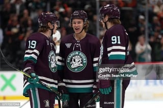
The report is claiming the colours don’t seem to be changing. Orange, black, and gold in the logo. No mention of the classic arrangement.
_Springfield
I heard it’s the old logo with modern colors.. which, hot take, I actually like. I love the modern colors, there’s nothing wrong with the old colors but modern colors with the old logo look good imo. Just look at our 3rd and RR jerseys. Also a black jersey for home games with the old logo would go sooo hard! Idk why no one ever talks about a black jersey
MDFan4Life
Amen!
Ok_Buffalo_1663
Nah. I prefer orange, black, and gold. Those colors are distinctly Orange County.
Cam-Dolezar
Orange at home. Plum on the road. Make it so.
Senior_Tone8439
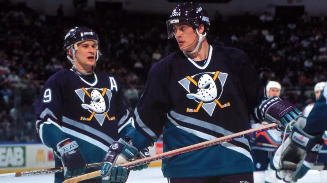
Nothing beats eggplant and jade 😫😭
buckyhermit
My gut feeling (and what I want to see) is that the Ducks will be using the 30th anniversary jersey stripes and design, but with different colours – orange home, white away, plum alternate.
I am a fan of the orange/gold and would love that compromise.
kdizzl12
Might be in the minority but the logo is basically all that matters. The eggplant and jade would obviously be a 10/10 but even black and orange is 9/10


8 Comments
The report is claiming the colours don’t seem to be changing. Orange, black, and gold in the logo. No mention of the classic arrangement.
I heard it’s the old logo with modern colors.. which, hot take, I actually like. I love the modern colors, there’s nothing wrong with the old colors but modern colors with the old logo look good imo. Just look at our 3rd and RR jerseys. Also a black jersey for home games with the old logo would go sooo hard! Idk why no one ever talks about a black jersey
Amen!
Nah. I prefer orange, black, and gold. Those colors are distinctly Orange County.
Orange at home. Plum on the road. Make it so.
Nothing beats eggplant and jade 😫😭
My gut feeling (and what I want to see) is that the Ducks will be using the 30th anniversary jersey stripes and design, but with different colours – orange home, white away, plum alternate.
I am a fan of the orange/gold and would love that compromise.
Might be in the minority but the logo is basically all that matters. The eggplant and jade would obviously be a 10/10 but even black and orange is 9/10