
If not allowed, please delete! I come in as a designer and friend ha
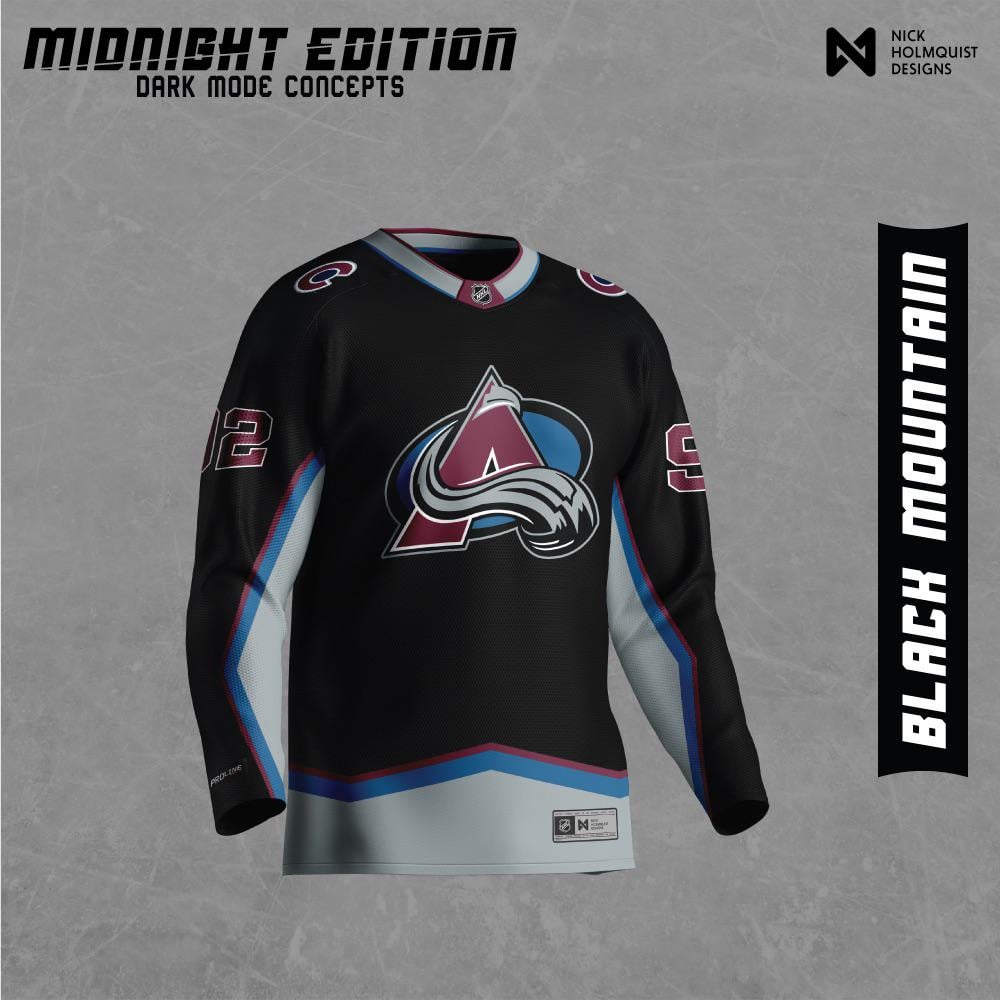
I decided to make a "dark mode" jersey for all NHL teams and wanted to share!
I'm mainly doing this for my benefit as a designer to learn more about how teams have constructed their jerseys, logos, and colors. This was a lot of fun and I hope you all enjoy!
by IslandTwig

31 Comments
Looks like a practice jersey. A dope practice jersey but still
Looks awesome, I’d call it the Black Diamond sweater.
It’s a cool look, I grant you that. But jerseys that employ black for teams that black isn’t really part of their color scheme (looking at you, NFL) leaves something to be desired. The grey in our color scheme, for instance, if used as the base for this dark mode concept, might not be too shabby.
I loved the cross check series jerseys and I’m always on the lookout for one since I missed it the first time around. This would be sick.
No thank you
Missed opportunity in the name. Black mountain? How about Black Diamond? No offense but black mountain sounds like a place in a fantasy novel. But it’s not bad looking. I’m still on the fence with stealth looks on clothing to be honest.
I would rock the hell out of that jersey
I’d buy that
Would have been great for when we played inside the Pepsi Center!
That aside, it looks great!
Personally I feel going with black alternate jersey has been played out in all sports for the last decade plus – it’s what everyone seems to default to. I’d like to see the Avs go a different, more unique direction.
Kudos though for the presentation style.
I loved your flames jersey, this one is not for me, not crazy about the black/gray combination but thanks for posting it anyway
Oh I really like that
The league doesn’t need another black jersey and it doesn’t really fit Colorado to me
Can we please get a new jersey variant or alternate this year…felt like it has been a minute since we got any kind of update
it feels kinda dark and dreary as opposed to sleek and badass, like the colors feel muted…i think playing with some silver accents (like the sparkly silver we use) as opposed to the swaths of grey could be cool. still sick work though, that’s a fun design project!
Maybe try and swap the grey and blue accents that would be hard as hell. This is dope as is though.
I went through and looked at all your concepts snd my top 3 in no particular order are Seattle, Sharks v2 silver numbers, and Minnesota
Normally I am against a black alternate sweater, however I feel this would be fitting now that Colorado has ditched the black helmets and pant shells, but still have black in their color scheme, that this would look great as an alternate. That’s if their current alternate wasn’t already one of the leagues best looking sweaters.
I think if you made it grey instead of black it’d look cleaner or all maroon but just ideas. Just think this doesn’t work with the avs color scheme unfortunately they don’t use black.
I like the concept but I think it would work better with a really dark shade of existing colors. I saw your wild concept and I liked the one you did in the comments with a darker green. Maybe try that with a dark blue or maroon for the Avs.
You realize you can’t use some’s ip and claim thr design as your own
I……don’t hate this
looks like a cool alternate or practice jersey
can we see 1 with Grey and burgundy swapped on collar, torso and arms?
Please send this to Sakic.
At first I was pretty averse to it, but I actually really like it, a nice change! I’d say being in more Burgundy, and trade a C for the a Howler Foot on the shoulders might really lock it down.
Like others have said, it’s kinda cool, but it does seem like a practice jersey a bit. I would love to see another version done for the Avs, because I gotta say I looked at your profile, and a lot of your jerseys look amazing.
The Kraken V2 and the Wild are fire. I also think the Panthers one looks unreal too, but as some said on the thread, it needs more red.
Overall fantastic job, you are very skilled at this.
Yes please
That’s sick
I vote for new practice sweater.
Would be OK if you used our logo. As it stands, absolutely not a fan
THIS FUCKS SO HARD
I LOVE IT