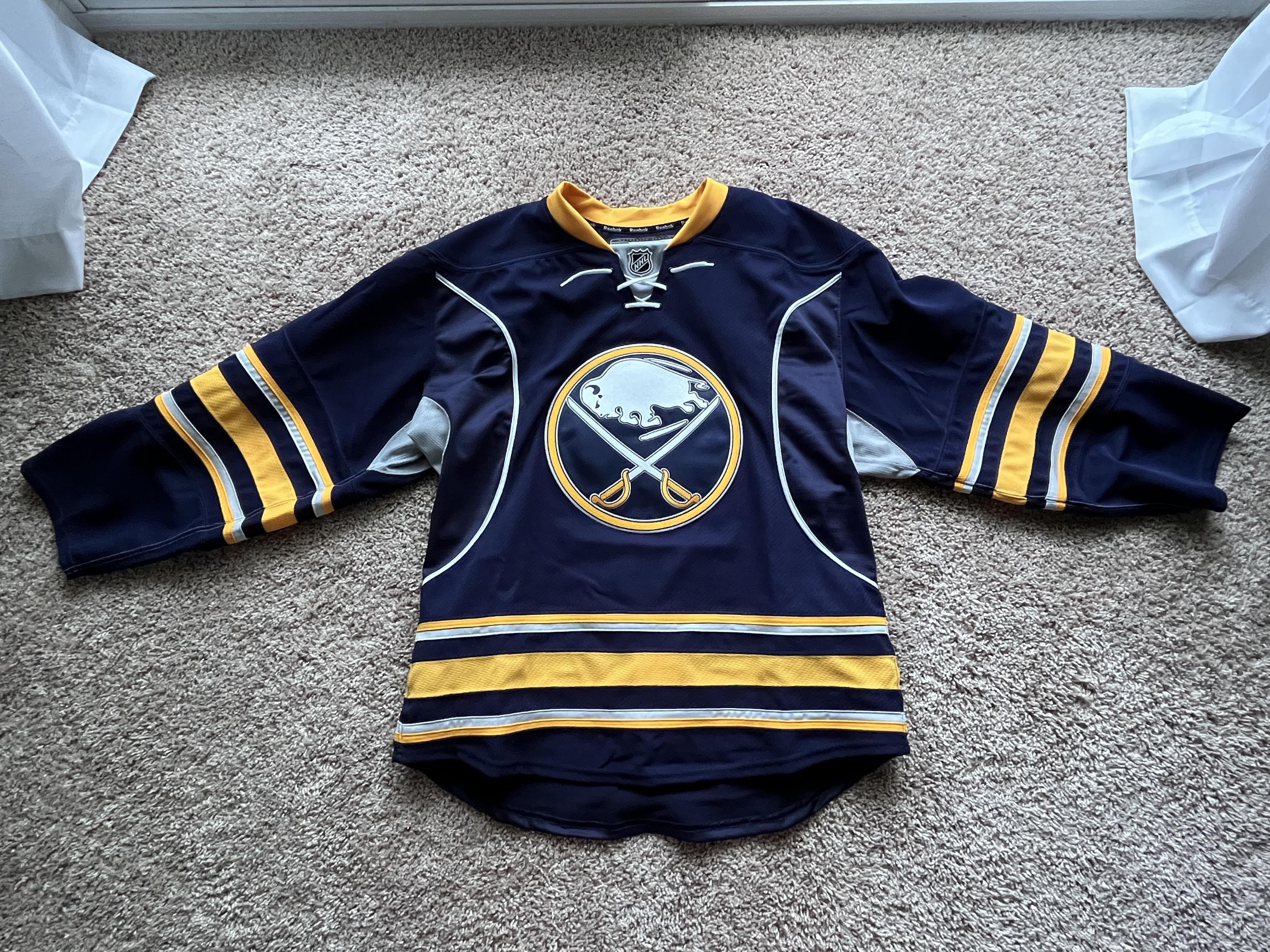
This is my Sabres Edge 2.0 jersey. I think the Reebok version was better than the Adidas version, but still…I’m prepared to get crucified in the comments.
I started getting DEEP into hockey when the Sabres wore these jerseys and even though they wore them during their worst era in franchise history, I admittedly have a soft spot for them.
by oddaffinity


12 Comments
That makes one of us
I didn’t mind the navy, but didn’t like the piping and the arm pits. Take that out and it’s pretty classy.
Hate them. Overdesigned with too much gray piping, unnecessary chest numbers, and the stupid gray armpits.
Definitely prefer the Adidas one without the armpit stains and grey piping, but I too love the navy. That logo had too much outline though. The one they did on the current royal ones is perfect.
The Reebok navy blue ones were an improvement over the slug, and then the Adidas navy blue ones were an improvement over the Reebok ones by removing the piping. I think they were fine, middle of the road jerseys, but the current royal homes are some of the best, if not the absolute best, jerseys in the league.
I don’t hate them but they aren’t at the top of the list that’s for sure
Look ok in person, look like black and yellow on TV.
Current jerseys are perfection imo
Well you were right about one thing, that’s an extremely unpopular take.
Love my jersey
I think I would’ve liked the Adidas Navy’s a lot more if they got rid of the numbers on the front, and simplified the logo like it is currently by getting rid of the grey outline/accents.
You could be correct on that take being unpopular
Shout out to 12 year old me that got my Ryan Miller jersey autographed by Patrick Kaleta and Jonas Enroth lmfaoo