Probably Boston/ Seattle. Would be a sick main logo for them in my opinion lol
88Problems88
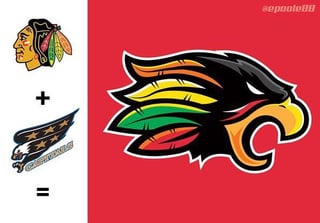
I like a few of them. But I think Blackhawks/Caps is my favorite
underwhelmingname0
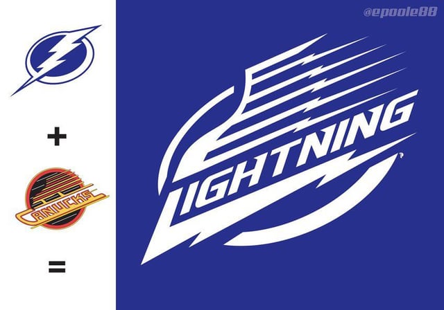
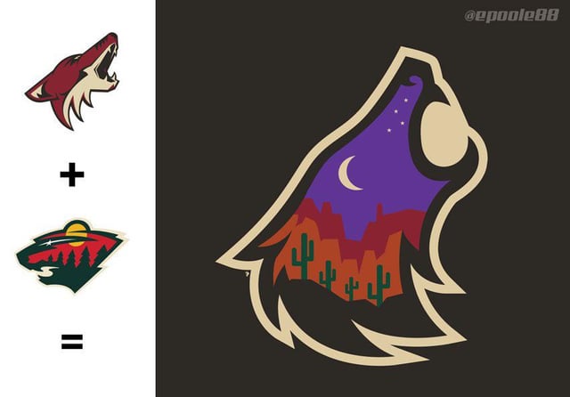
That lightning/canucks one looks pretty slick. Like the coyotes/wild one too cuz purple starry skies are dope
ahasick
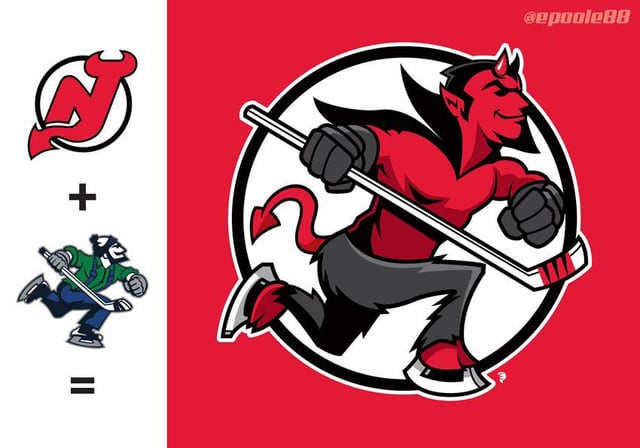
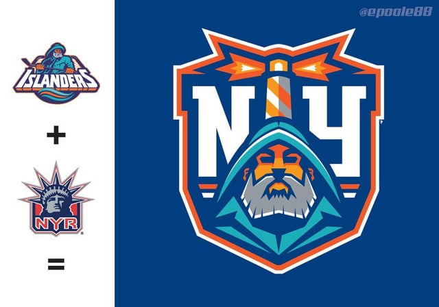
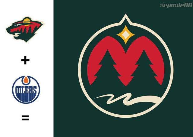
Lightning/canucks and islanders/rangers are nice. Devils/Canucks is pretty cool too
jfstompers
I like them all but the lightning one is awesome and the Canucks is nice too
lordmarboo13
2,3, 10 are fucking dope
russemeptd
Coyotes/wild for sure
OlTommyBombadil
Honestly most of them are pretty good in my book. The Wild/Coyotes one is fucking awesome.
Good job! I’m impressed
Simoslav
Can we just make that the Blackhawk’s official logo and avoid the inevitable debate we’re about to have across the next 5 years
think4yoself1
Boston/Seattle is my favorite of these, but in all honesty I like them all.
TroyStCroix
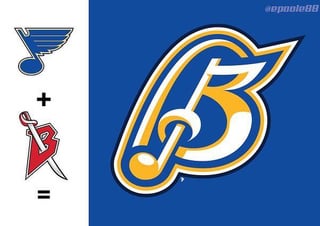
These are all super cool, great work by the artist. And although I’m a Blues fan and think the last one is awesome, that Canucks/Devils one takes the cake for me.
nightshift31
That canucks/ devils is perfect timing.
straightwhitemale6
Genuinely good art God damn. This is might end up being a resume 😂😂
DreadLordAvatar
Canucks sharks is superb
stx-177
These are all great!
I like the subtlety of 11, reminds me of the original wild logo.
luminellolimoncello
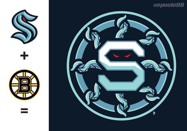
Kraken/Bruins, Devils/Canucks, Lightning/Canucks, and Hawks/Caps but my favourite is probably the Wild/Yotes.
PattenWoodworking
The Arizona coyote one is dope
dreadpyrateryan
Canucks/sharks & coyotes/wild are probably my favorite
HarkeyPuck
These are all great.
DreamerTheat
Whoa, loved the Coyotes and Devils!
Great job.
Putthebunnyback
There are some in there that are significant improvement from the actual logos. Vancouver, Arizona, and NYI especially.
ForeverJung
Damn, homie. You did some great fucking work here
smokeythesparky
wow, they are all great, but Chi/Was really stands out.
jdmay101
These are fucking incredible. Almost all of them are wins. I mean… God damn.
DivClassLg
Really cool
FedEx84
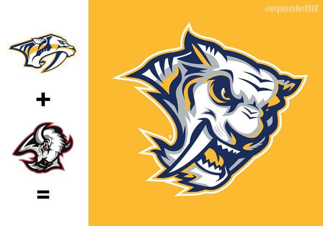
Am I the only one that thinks the Nashville/Buffalo looks like beast from beauty and the beast but with oversized fangs?
Bruhthatsunfortunate
No lie. The Blackhawks logo slaps pretty hard.
AppleSeed81
Vancouver+Sharks
neg_meat_popsicle
Can you do redwings/leafs these looks awesome
Rolley2001
These are all fucking dope. But Chi/Wash DC stood out to me
bbciv
So much playoff choking in one logo in the Sharks/Canucks one.

32 Comments
Probably Boston/ Seattle. Would be a sick main logo for them in my opinion lol
I like a few of them. But I think Blackhawks/Caps is my favorite
That lightning/canucks one looks pretty slick. Like the coyotes/wild one too cuz purple starry skies are dope
Lightning/canucks and islanders/rangers are nice. Devils/Canucks is pretty cool too
I like them all but the lightning one is awesome and the Canucks is nice too
2,3, 10 are fucking dope
Coyotes/wild for sure
Honestly most of them are pretty good in my book. The Wild/Coyotes one is fucking awesome.
Good job! I’m impressed
Can we just make that the Blackhawk’s official logo and avoid the inevitable debate we’re about to have across the next 5 years
Boston/Seattle is my favorite of these, but in all honesty I like them all.
These are all super cool, great work by the artist. And although I’m a Blues fan and think the last one is awesome, that Canucks/Devils one takes the cake for me.
That canucks/ devils is perfect timing.
Genuinely good art God damn. This is might end up being a resume 😂😂
Canucks sharks is superb
These are all great!
I like the subtlety of 11, reminds me of the original wild logo.
Kraken/Bruins, Devils/Canucks, Lightning/Canucks, and Hawks/Caps but my favourite is probably the Wild/Yotes.
The Arizona coyote one is dope
Canucks/sharks & coyotes/wild are probably my favorite
These are all great.
Whoa, loved the Coyotes and Devils!
Great job.
There are some in there that are significant improvement from the actual logos. Vancouver, Arizona, and NYI especially.
Damn, homie. You did some great fucking work here
wow, they are all great, but Chi/Was really stands out.
These are fucking incredible. Almost all of them are wins. I mean… God damn.
Really cool
Am I the only one that thinks the Nashville/Buffalo looks like beast from beauty and the beast but with oversized fangs?
No lie. The Blackhawks logo slaps pretty hard.
Vancouver+Sharks
Can you do redwings/leafs these looks awesome
These are all fucking dope. But Chi/Wash DC stood out to me
So much playoff choking in one logo in the Sharks/Canucks one.
Very cool. All are badass!
My favorite is the Canarks!