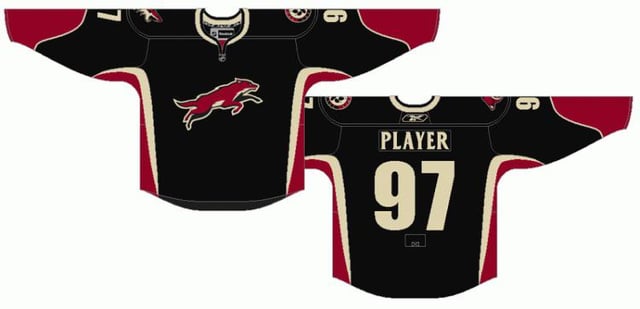
I dunno if we’re every going to see the running coyote again, apparently the team kind of considers it a mistake.
Throw a howling head on the chest though and those would look sweet.
Illustrious_Pickle71
I personally hated this logo so so much lol
TrunkBud
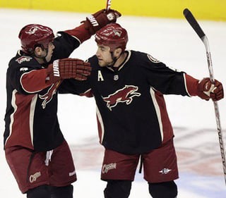
GOAT jersey. So clean.
DastardlyRidleylash
Eeeh. I’ve never liked these jerseys, they feel way too generic “Reebok Edge” for my taste. Heavy side paneling, no hem stripe, phantom yoke, inconsistent stripe thickness.
Feels like if so many fans didn’t like the running coyote logo so much that these would be forgotten pretty easily. I’d rather them do something new or homage an older Phoenix hockey franchise for a hypothetical new RR design.
TimmyHate
My take on how to make it a RR
1) Flip the colors so the body is red, with black accents.
2) Tweak the running coyote into a kachina style
3) Get rid of the pawprint and howling head logos on the shoulders and replace them with the old ‘head only’ logo looking forward on both shoulders.
ISuckAtFlying12
Jersey was decent but I think I just love that era of the coyotes more than the jersey it self tbh
Tpearson1998
If they brought these back as an alternate to the Kachinas with the red and black colors flipped, the howling Coyote logo on the chest, and the kachina coyote head on one shoulder, I would buy that literally in a heartbeat.


8 Comments
This would be insanely sick
I dunno if we’re every going to see the running coyote again, apparently the team kind of considers it a mistake.
Throw a howling head on the chest though and those would look sweet.
I personally hated this logo so so much lol
GOAT jersey. So clean.
Eeeh. I’ve never liked these jerseys, they feel way too generic “Reebok Edge” for my taste. Heavy side paneling, no hem stripe, phantom yoke, inconsistent stripe thickness.
Feels like if so many fans didn’t like the running coyote logo so much that these would be forgotten pretty easily. I’d rather them do something new or homage an older Phoenix hockey franchise for a hypothetical new RR design.
My take on how to make it a RR
1) Flip the colors so the body is red, with black accents.
2) Tweak the running coyote into a kachina style
3) Get rid of the pawprint and howling head logos on the shoulders and replace them with the old ‘head only’ logo looking forward on both shoulders.
Jersey was decent but I think I just love that era of the coyotes more than the jersey it self tbh
If they brought these back as an alternate to the Kachinas with the red and black colors flipped, the howling Coyote logo on the chest, and the kachina coyote head on one shoulder, I would buy that literally in a heartbeat.