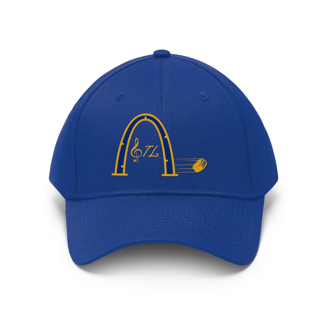
I recently started designing my own sports gear (less than a week) bc I don’t like the idea of paying so much at team stores. If don’t like them, please tell me why. Please remember I bleed blue too.
For me, I immediately think “McDonalds” with the arch. Maybe particularly because of its shape/orientation. I really like the clef in place of the ‘S’. It’d be cool to see STL over top the motion lines, like music notes, keeping the puck on the end.
Keep at it! Sports gear is way too expensive and I commend you for this endeavor!
micropterus_dolomieu
Cool idea! Very creative. Can you put the treble clef in italics too? Might help with cohesiveness. Maybe widen the arch so it’s a little more goal-like and have the puck passing through like its in the back of the net? I dunno, I’m not a graphic artist.
Lakekook
So, I happen to be a graphic designer and I totally don’t want to be a dick to a fellow blues fan. Please don’t take this personally.
1. The design is unbalanced. 2. The treble clef wouldn’t read as an ‘s’ to the average person. 3. the italic typeface doesn’t match the treble clef. 4. The 3 main elements (stl, arch, puck) visually don’t match, looks like clip art placed together.
I would just pay $30 for a team store hat honestly.
wewent2019
Very raw but on the right track. Keep at it! Also, use bold fonts or the lettering will come out dinky in the embroidery.
MrTuesdayNight1
I’d like to offer constructive criticism and hope you aren’t discouraged from continuing to grow as an artist.
The main issue is that the design isn’t really cohesive as stylistically, there are 4 different design styles going on here.
Smaller details: Pay attention to your line work which should be fairly consistent throughout but there’s some thick lines mixed in with really thin ones. Stay away from really thin lines on embroidery. Pay attention to ‘action’ as well. You have a puck that’s moving to the right, along with the TL which leans that same direction, but the Arch and treble are stationary or straight up and down. The typefaces are too different and the treble clef doesn’t make sense as a substitute for the S as if it were an S it would be facing backwards.
I recommend starting with picking two elements and working on making those consistent and cohesive and then adding additional elements as you go.
Keep working at it, though. We all started somewhere!
John_D_1
A lot of different things going on. But nothing really pulling it all together
STLBooze3
I personally thought the hockey puck was a flying potato at first until I zoomed in.
scottla03
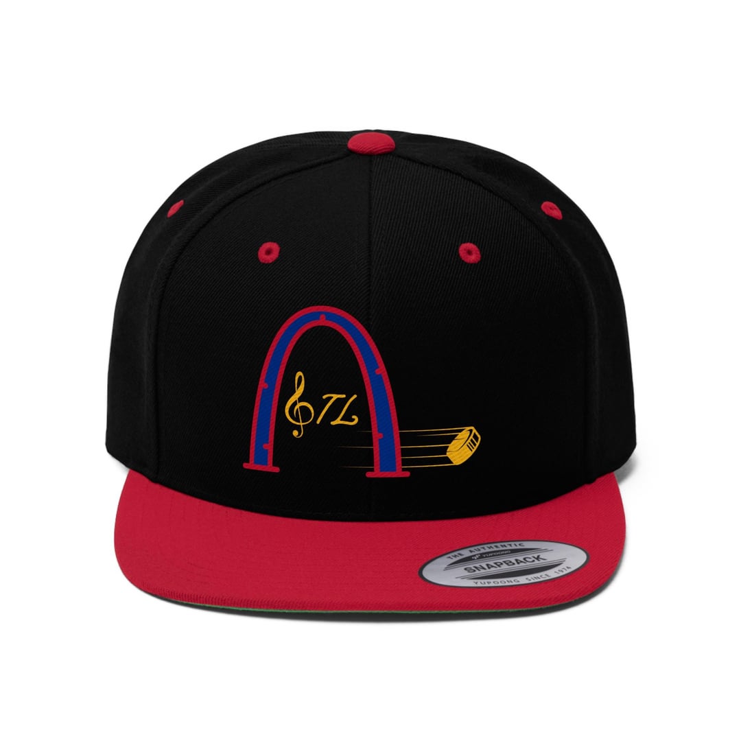
Something about the black and red hat makes it my favorite of the bunch


9 Comments
I like it ! Nice work!
For me, I immediately think “McDonalds” with the arch. Maybe particularly because of its shape/orientation.
I really like the clef in place of the ‘S’. It’d be cool to see STL over top the motion lines, like music notes, keeping the puck on the end.
Keep at it! Sports gear is way too expensive and I commend you for this endeavor!
Cool idea! Very creative. Can you put the treble clef in italics too? Might help with cohesiveness. Maybe widen the arch so it’s a little more goal-like and have the puck passing through like its in the back of the net? I dunno, I’m not a graphic artist.
So, I happen to be a graphic designer and I totally don’t want to be a dick to a fellow blues fan. Please don’t take this personally.
1. The design is unbalanced.
2. The treble clef wouldn’t read as an ‘s’ to the average person.
3. the italic typeface doesn’t match the treble clef.
4. The 3 main elements (stl, arch, puck) visually don’t match, looks like clip art placed together.
I would just pay $30 for a team store hat honestly.
Very raw but on the right track. Keep at it! Also, use bold fonts or the lettering will come out dinky in the embroidery.
I’d like to offer constructive criticism and hope you aren’t discouraged from continuing to grow as an artist.
The main issue is that the design isn’t really cohesive as stylistically, there are 4 different design styles going on here.
Smaller details: Pay attention to your line work which should be fairly consistent throughout but there’s some thick lines mixed in with really thin ones. Stay away from really thin lines on embroidery. Pay attention to ‘action’ as well. You have a puck that’s moving to the right, along with the TL which leans that same direction, but the Arch and treble are stationary or straight up and down. The typefaces are too different and the treble clef doesn’t make sense as a substitute for the S as if it were an S it would be facing backwards.
I recommend starting with picking two elements and working on making those consistent and cohesive and then adding additional elements as you go.
Keep working at it, though. We all started somewhere!
A lot of different things going on. But nothing really pulling it all together
I personally thought the hockey puck was a flying potato at first until I zoomed in.
Something about the black and red hat makes it my favorite of the bunch