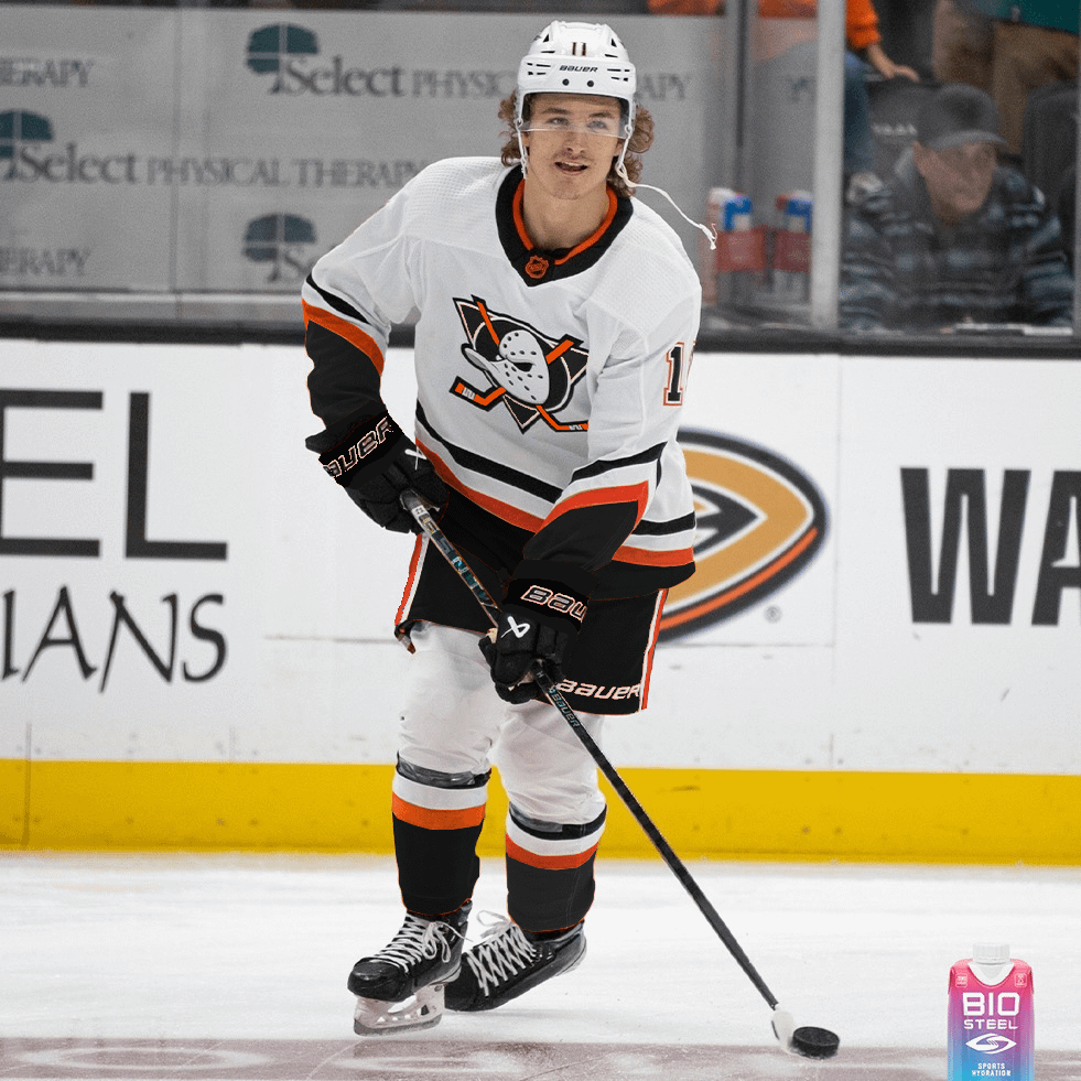
The reverse retro just looks so good to me. I’m not entirely sure why but it hit for me as well as the 25th did.
Firebitez
Honestly it’s executed really well. I think it would have worked as well but honestly I want the ducks to move away from the black.
stoobygainz
I’d buy one
ddabrums
Well done by you. Looks like a practice jersey to me.
As a side note we just overthink think this so much. We have the perfect home and away jerseys, let’s just freaking go back to them… it’s simple!
mylefthandkilledme
Nicely executed but pass
Chinchillan
I saw zegras and got my hopes up
StopCappingSMH
You guys are smoked for saying pass. This is so clean.🔥🔥🔥
Hokabuki
Give me teal and eggplant or give me death
KroganTiger
Oh man this is… really, really nice. I want it.
Thepickleweed
I think it works better than the RR. The orange works better as an accent imo. That said, add some goddamn colors. Black and orange never felt right for this team.
WubbaLubbaDubDub184
This as an alt, RR 2.0 as an away, then a black or orange version of RR 2.0 for home. Those black pants though all the way.

12 Comments
clean but look more like warm up/practice jerseys
Its done well, but just too Flyers to me.
The reverse retro just looks so good to me. I’m not entirely sure why but it hit for me as well as the 25th did.
Honestly it’s executed really well. I think it would have worked as well but honestly I want the ducks to move away from the black.
I’d buy one
Well done by you. Looks like a practice jersey to me.
As a side note we just overthink think this so much. We have the perfect home and away jerseys, let’s just freaking go back to them… it’s simple!
Nicely executed but pass
I saw zegras and got my hopes up
You guys are smoked for saying pass. This is so clean.🔥🔥🔥
Give me teal and eggplant or give me death
Oh man this is… really, really nice. I want it.
I think it works better than the RR. The orange works better as an accent imo. That said, add some goddamn colors. Black and orange never felt right for this team.
This as an alt, RR 2.0 as an away, then a black or orange version of RR 2.0 for home. Those black pants though all the way.