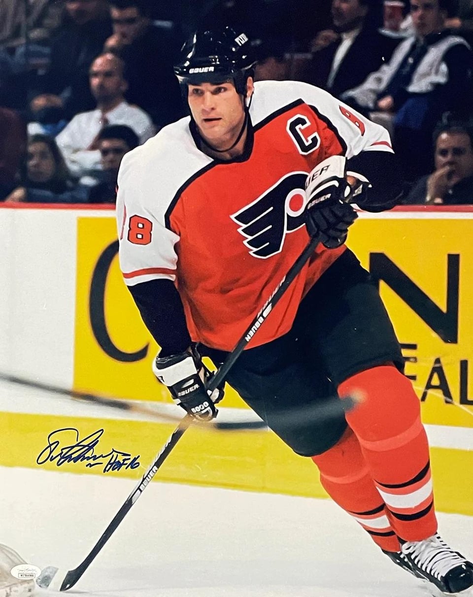

The biggest differences I see are there’s no black piping between the orange and white, the numbers are solid black instead of orange with black outline, and the logo seems to have an extra layer of whit outline around it.
I really feel like they just wanted to go back to the 90s jerseys but decide to make it a little different and came up short, and it just looks so bad. It’s close to being nice, but just not right. Wish they would have just done what the eagles did and recreates the old jersey instead of something similar to the old jersey.
by LVAthleticsWSChamps


2 Comments
Next year they NEED to outline the numbers also I can’t even come up with a defense for that captains letters. That does just look terrible.
how does desnoyers already look like he’s been in the league for 17 years